Opera 64 is faster, more private, and more fun
-
A Former User last edited by
@AlexeyGrinko, @kmielczarczyk The matter is that Opera after the second restart unlocks the fixed tabs and therefore they disappear if the parameter "Begin fresh with start page" is enabled in the settings.
If the "Retain tabs from previous session" option is enabled in the settings , then after the second restart, Opera simply unlocks the tabs that were "Fixed".
And this is definitely a bug! -
A Former User last edited by
New update - Opera stable 64.0.3417.61
;-)
The change log, and the announcement. -
A Former User last edited by A Former User
Hi @temkem, it is usually like that. It should be available after some time, a bit later
;-) -
andrew84 last edited by
Minimize button's focus is not fixed.
What's the point to release Stable version earlier and then release a bunch of patches to fix the known bugs?
-
andrew84 last edited by andrew84
@leocg My opinion it's because of hurry because Beta has entered 64 just a month ago and now it's Stable already. Usually it was ~1,5 months testing period between releases. The same was happening with 63 version when there were many patches after the release (I don't want even to mention about the versions skipping).
-
bartelsandreas last edited by
and will they ever fix the syncing problem between opera windows - opera mini on ios?
-
leocg Moderator Volunteer last edited by
@bartelsandreas Since Opera Mini for IOS seems to no longer is being developed, I don't really think they will fix anything.
But you probably should try to ask in the Mobile blog or in the Opera Mini for IOS section of the forum.
-
A Former User last edited by
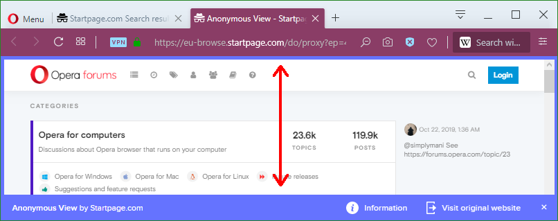
The search engine StartPage offers to visit websites anonymously:

To signal this mode, StartPage uses an unusual color, like Opera for its private windows:

I don't think the two colors are so bad: They have enough signal effect, without being too pushy (as red, orange for example). -
Rubulat last edited by
@yanta: May be they are not too pushy on the bottom line, but on the upper panel they are very annoying
-
A Former User last edited by
@Rubulat When Opera introduced this colour, I found it unpleasant at first as well. However, since then it hasn't happened to me that I close a window with dozens of tabs which content I have to rework and then realize that it was a private window whose tabs can't be restored (that's what I meant by signal effect).
-
Rubulat last edited by
@yanta: This signal effect takes too much attention. It's enough to use just another color to understand the differense between normal and private modes.
-
andrew84 last edited by andrew84
It'd enough to add some small detail for the signal effect for the private mode( address text field background color for example) instead of the whole violet toolbar. Moreover it looks more uglier in dark mode because the toolbar itself becomes dark violet but inactive tabs and 'new tab' buttons have exactly the same light blue effect on hover as in regular mode.
*Also they still didn't fix (at least here on Win8) the black loading tab's icon instead of white in light theme in private window. And switching the dark theme off in private windows makes the address bar text black. I'm reporting it since the reborn3 announcement (1 year soon) but they don't care. -
A Former User last edited by
https://get.geo.opera.com/pub/opera/desktop/64.0.3417.70/
Again there is no message from the developers, about the release of a new build only for MAC users. -
andrew84 last edited by
@temkem: What was the main point of the new commenting system for the blog, wasn't it made to improve the feedback channels for developers by integrating it with forum's comments? For me the feedback is still poor and there is still minimal activity from developers on forum, like previously in other words. But now it's more complicate to post comments in the blog.

