Opera for Android 65
-
ollie188 last edited by
@miyukiwork
Not too impressed.
I have no use for Chromebook, although I understand the need.
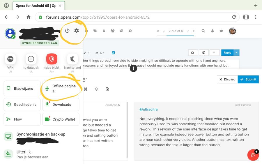
What I really don't like is the main menu pop up.
I don't want all those settings to pop up when all I want are settings.
I also don't care for the exit screen I've turned all that delete stuff off.
The last version was simpler and much easier to use
You're getting too fancy. Needlessly. -
avmon last edited by
Pressing and holding the back button in Opera to view the visited pages causes a forced close.
Instead, doing the same with the back button on the navigation bar works as expected.
LG G5 with Android 8
Opera for Android 65.1.3381.61266 -
werby last edited by werby
@miyukiwork Hello,
I wonder, what makes you believe that the new main menu is better or more useful than the old one?
Ι won't comment all those huge and useless buttons but I'm also wondering, what a 'brilliant' mind put the small "Exit" button so close to "Settings" one?Please, bring back the old menu or give us an option for that and keep in mind that it's just a mobile phone browser.
THX
-
A Former User last edited by
Not everything. It needs final polishing since what you were previously used to, was something that matured but needed a rework. This rework of the user interface design takes time to get mature. I for example indeed see power button and setting button are near each other very close. Another button
 has text written wrong because the text is larger than the buton.
 -
miyukiwork Opera last edited by
Thanks for your feedback about the new main menu. We'll re-evaluate the menu especially with the thoughts of one-handed usage.
-
avmon last edited by
@miyukiwork 8f 53 d9
The problem happens when holding down any of the 3 buttons (back, forward and home) which are now located within the three-dot menu.
-
A Former User last edited by A Former User
Like many others I ask to have the 'opera://flags' back since sometimes changing a flag can assist in diagnosis of a bug and even can make everything work as it should.
The alternative is not having these flags as is now the case.
A flag like disabling the "Android SurfaceControl" would have made Opera smooth at Xiomi and Samsung devices. See Opera stutter thread.
Example of why opera://flags should be considered.
https://bugs.chromium.org/p/chromium/issues/detail?id=1057459 -
bariton last edited by
@werby Exactly.
All we need is a hierarchic tree of options/functions.
Yes funny about the exit button, it should be on the far left side.My main problem about changes like this is the time and manpower that went into it. Its a waste.
It would be better to help the user with cookies/local storage and so on, the user should be able to decide what happens on their device, not some remote site. -
avmon last edited by
I do not see bad the new main menu except what has already been mentioned about the settings and exit buttons very close together but I also think that the icon of the person is not representative for a main menu and that the navigation buttons (back, forward, home) were better inside that menu.
-
A Former User last edited by
I don't consider this a waste of time. Reworking the menu to mature will take feedback and people were used to what was. This is normal and takes time.
Personally I don't think everything has to be displayed in the popup menu. Aa you see the image I attached, what I did remove before pasting the image could be in the settings. But it might be there to explain users that bookmarks can be saved by synchronized login. This is a one time thing in the beginning making people understand opera haa bookmarks saving and synchronize.
I prefer it over the old design. Even now. When pressing settings button indeed I too carefully slow down to not press exit by mistake.
-
miyukiwork Opera last edited by
We've released a beta version that includes some improvements for one-handed usage.
Please try and let us know what you think. -
A Former User last edited by A Former User
@miyukiwork here I have beta version 65.1.3381.61410,
Current opera non beta Version 65.1.3381.61266,
Beta was updated today, menu has no difference in my language, settings button and exit button still right next each other. Maybe another beta is coming.
Since I have a popup when pressing exit by accident I don't mind, but text to long inside the button is still existing, solution is better word in my language that does fit. 'Offline-pages' precisely fits but 'offline-pagina's' only 3 characters more causes button text overflow. The problem is at this moment I don't know a translation that is 3 characters less to make it work. Maybe I would translate it as 'offline-pagina' only, that's 2 characters less.
Offline-pagina's -> Offline-pagina
Or
Offline-pagina's -> Offline Pagina
Without the dash -
And Offline and Pagina spelled with capital like Crypto Wallet is spelled with Capital too. -
avmon last edited by
@miyukiwork Updated to 65.2.3381.61420 and the crashes after long pressing the buttons continues.
-
miyukiwork Opera last edited by
@ginger1984
Thanks for the suggestion! Shorter texts are better, but there are many different settings (large font, screen etc.) and devices, so reducing text by 2 or 3 characters might still not be enough.
We'll check with our translators to bring shorter translations as possible.
-
Referenced by
 avmon
avmon -
Locked by
 leocg
leocg