Opera 70 developer
-
andrew84 last edited by andrew84
Maybe I'm wrong, but I think that many users will use custom sites with pinned panel.
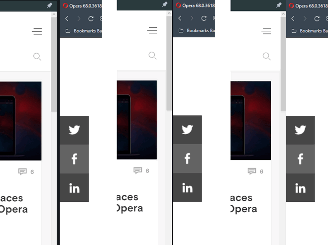
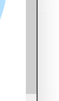
The vertical separator looks too bold to me. It's ok in light mode, but in dark mode that line is too wide. Maybe the thinner line will look better, or no line at all.

*by the way, in dark mode there's a black thin line visible if panels are not pinned and have the light background. Is it intended?

-
A Former User last edited by
When I try to see page source code, Opera becomes slow. I tested it in several sites.
-
A Former User last edited by
Some times Opera crashes and all videos, in all tabs and in all workspaces, crashes. I have a green screen in all video playing.
-
A Former User last edited by A Former User
Leocg, looks like you were wrong huh. Opera had little to no issue implementing PWA's into Opera. This way they can essentially disable the messenger's tab, and allow users to add or not add messengers that they want. Instead of forcing it to be bundled with the browser.
What opera should do now is remove the messenger section and place the custom site panels in that specific location instead. That way users will have all websites pinned in an orderly manner which is more cohesive and will look much more orderly.
-
A Former User last edited by
@andrew84: Tried it that issue does occur with PWA websites added to the sidebar in Opera.
Luckily Opera finally wised up and is implementing PWA into their browser just like Vivaldi and Whale etc did before them. Opera is a bit back on track to being useful like the other productivity based browsers. -
A Former User last edited by
@kened: Looks like Opera is finally making steps to catch up to VIvaldi and Whale, etc
-
ralf-brinkmann last edited by ralf-brinkmann
New Developer 70.0.3701.0 uploading.

Only Linux at the moment.
