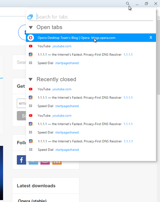
Where is the "Recently closed tabs/Tab menu" button on the top right?
-
andrew84 last edited by
@leocg said in Where is the "Recently closed tabs/Tab menu" button on the top right?:
This is mainly a forum for users to help each other. Although Opera employees read it and may reply eventually, we should not expect it to happen that often.
If I don't mistake, the new commenting system in the blog was implemented to improve the feedback between forum and blog, between users and Opera team.
-
leocg Moderator Volunteer last edited by
@andrew84 said in Where is the "Recently closed tabs/Tab menu" button on the top right?:
How many open tabs at the same time do you have daily, in average?
I have no more than 10, usually 3-4 tabs, often 1-2.Basically the same here. I usually don't have that many tabs opened at the same time.
-
A Former User last edited by
@leocg said in Where is the "Recently closed tabs/Tab menu" button on the top right?:
@andrew84 said in Where is the "Recently closed tabs/Tab menu" button on the top right?:
How many open tabs at the same time do you have daily, in average?
I have no more than 10, usually 3-4 tabs, often 1-2.Basically the same here. I usually don't have that many tabs opened at the same time.
I guess that's why this feature confuses me. When I first saw it, I immediately thought to myself "do people actually open so many tabs that they don't remember what they have open, requiring a search feature???"
-
andrew84 last edited by andrew84
@leocg said in Where is the "Recently closed tabs/Tab menu" button on the top right?:
Basically the same here. I usually don't have that many tabs opened at the same time
Consequently you don't need to search for open tabs ( most of the complainers here too), also you don't need Ctrl+Tab cycler as it seems, and Workspaces too.
@leocg said in Where is the "Recently closed tabs/Tab menu" button on the top right?:
Instant Search, as said, was removed for lack of use
I know and heard it many times already. Maybe it was not popular, but how does the TabMenu refers here.. if one feature is not popular, then it automatically means that some another one is not popular as well?
*As I stated before, they could just restyle the Tab menu and add the search field there and, as a result, no complaints at all (most probably only positive feedback because TabMenu would be more clear and easer to read, but the functionality would be the same + 'search' option aditionally). -
andrew84 last edited by andrew84
@leocg said in Where is the "Recently closed tabs/Tab menu" button on the top right?:
try improving tabs management
Obvious conclusion.
And not just a try, it really improved the tabs management, and 'Search in tabs' worsened it. -
dualdisc last edited by
I made an account only to repeat what everyone has said. Please bring the Recently Closed Tabs button back. At least you could allow the option to switch between the current Search in Tabs button and the Recently Closed Tabs button, or maybe have both buttons on there.
I've been using the current iteration of this browser for like 5 years now, and I loved having easy access to my recently closed tabs. It's almost an essential feature for me, especially when sometimes I have to close 10+ tabs, and might accidentally close one that I wanted to stay open.
Yes I know I can still use the Menu>History thing, but like, that 2 more clicks, and far more clunky to use. Come on. Yall replaced this perfectly good and very useful feature with this useless, redundant feature. Ctrl+TAB is already a thing that people can use. We don't need to have the button on there, too.
-
raphael-mioche last edited by raphael-mioche
This is just a personal theory and I’m sorry for my english text.
I know that this kind of functionality exists: Imagine if the developers had access to our usage patterns. The areas (UI) of our web browser where we click on the most. Then it's easy for them to determine what functionality we use, how often, etc.
So, considering the total number of Opera users, on this subject we are frequent users of this feature and maybe we represent a minority regarding this usage. So, it is not hard to believe that these same developers have chosen to remove/hide this feature in favor of another one because we do not represent, we do not reach, their goal in terms of percentage of usage.
Do not forget that in a capitalist world, new functionalities are the most important thing, so keeping old features is not beneficial: for the Opera employee and for the potential new user of this software.
-
andrew84 last edited by andrew84
@raphael-mioche there's such option in Settings, but I always keep it off.

I'm pretty sure they didn't expect that there will be so many complaints.
There were some words from Opera team regarding InstantSearch feature telling us that the feature was unpopular, but no words regarding the popularity of TabMenu. -
wemnael last edited by
Opera is free so I don't deserve anything. But I subscribe to this feature request. Maybe a dev. will read our message: Please add more than 3 tabs to the list of closed tabs. At least 10. Thanks
-
wemnael last edited by
For the moment, I installed Opera dev , witch has an option opera://flags/#search-in-closed-tabs-show-more . it is a button press, but it works well. How ever, I don't want a button because I don't want to click twice.
-
A Former User last edited by leocg
@leocg I'm honestly baffled at the way you've been responding to everyone in this thread. Not only are you coming across quite condescending, you're also making statements/arguments that are logically incoherent. You believe nobody needs more than 3 recently closed tabs? Ummmm, ~300 comments here complaining about this would seem to prove you categorically wrong. Who are you to tell people what they do/don't need??
You're also arguing that this useless new feature they've replaced the tab menu with is actually better - but you haven't given a single reason why it's better, or even when it will ever be used by any normal person who doesn't keep hundreds of tabs open at all times. Personally I can't have more than 25-30 tabs open simultaneously or Opera starts freezing & becoming unresponsive - even after upgrading to brand new laptop with 8 core CPU, so it's not my hardware. I have to prune my open tabs, and I used the feature constantly, every single day - but you're decreeing that I don't actually need more than 3 because you said so?!? GTFOH.
Then I see you arguing that the tab menu never should have been introduced in the first place, and doesn't belong in Opera. Wut? Like, everyone's entitled to their opinion, but you're commenting on a massive thread inundated with p***sed off users angry their favourite feature has been removed irretrievably, essentially telling a plethora of users that they're all wrong and have no reason to complain, and that this Useless new feature is better, despite not being able to provide a single reason why it's better, other than the rare user with hundreds of tabs always open who can't remember what tabs they have open where. Aside from the fact that this is beyond question a tiny minority of users, the simple fact is that if you have to open a search dialogue box and type in a search term/phrase to find what you're looking for, you've pretty much defeated the purpose of having the tab open to begin with. If you have to type in a search, you may as well just open a new tab and type in what you're looking for.
It's honestly hard to find words adequate to describe how utterly and bafflingly stupid this change is. Opera has been my default browser ever since I began using a PC on a daily basis, and I'm now thinking it's time to start test-driving alternatives. You can have your opinion (as boneheaded and absurd as it may be) but why are you seemingly incapable of even acknowledging that other people have legitimate grounds to complain about this moronic change? Even if you have a different (preposterous) opinion, the constant denial that anyone else's opinion is valid is just adding fuel to the fire. Even if you don't work for Opera, being a moderator one would think you should be aiming to prevent people getting heated, not actively inciting it. WTF man?
-
ericartman92 last edited by
I am very disappointed by how the moderation of this thread is done. Regardless of what opinion each of us has, I don't think it warrants such a condescending approach from our moderator. A bit disappointed in how this all business turned out to be.
-
A Former User last edited by
@vikont-0 said in Where is the "Recently closed tabs/Tab menu" button on the top right?:
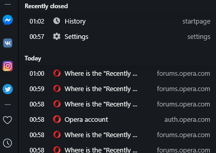
If you click on the clock symbol on the sidebar (on the left hand side), it will open a history tab, with Recently Closed tabs on top. Clicking on any of them restores a tab. It's the same functionality as before, just a different location...

Nope, it doesn't, it just shows the history (which is not the same as closed tabs).

And the functionality to access tabs of different devices is also completely missing now.

Why the regression?!
-
andrew84 last edited by andrew84
@shani-ace-0 said in Where is the "Recently closed tabs/Tab menu" button on the top right?:
it just shows the history
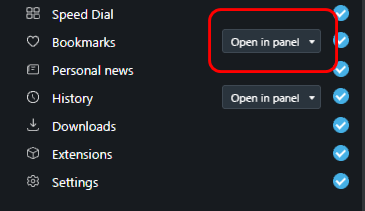
you should enable it in the sidebar setup, 'open in panel' option

