Opera 105.0.4970.16 Stable update
-
andrew84 last edited by andrew84
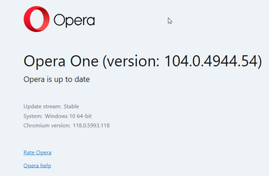
In my case (portable installation) the About page still tells that Opera is up to date and stuck on 104.0.4944.54 version.
-
milooshea last edited by
Suddenly both Opera for Windows and Opera Mini on my Android phone have become unusable. Since it doesn't respond at all once launched, I can't carry out any of the checks recommended on this forum. Relevant web pages work fine in Chrome. So, sadly, I'm uninstalling Opera and setting Chrome as my default browser. What a pain, after almost continuous use since the late 1980s. (Though there have been similar rough patches in the past. Houston - we got a problem.) Tried uninstall/reinstall, but can't get more than one step further.
-
thelittlebrowserthatcould last edited by
Please confirm what DNA-111903 [Lin] corrects. Grabbing and resizing is
still possible with the Debian build, including above the tab scrollbar. -
burnout426 Volunteer last edited by
When the flag at the URL
opera://flags/#component-based-scrollbaris enabled, the new scrollbar look was only showing on opera:// pages. It wasn't showing for regular web pages. The change fixed that supposedly. Not related to grabbing etc. -
neewuser last edited by
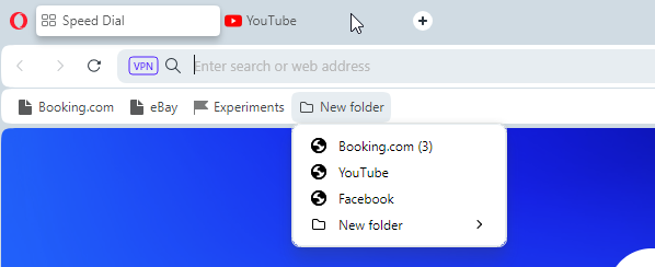
Bug> Middle click on Bookmark bar subfolders does not consistently function. You have to press 2-to-3 times in order to open the links. Or you have to guess where to press.
Related missing feature> You can not drag and drop a tab anymore to a subfolder in the Bookmark bar, in order to save it. It only work for the displayed folders on the bar, but not for the subfolders as it did before version v100. -
andrew84 last edited by andrew84
@neewuser I can't confirm the 1st part here. But I don't use the One version daily, so there's only few bookmarks and folders. Maybe the amount of bookmarks/folders plays a role here.
Regarding the 2nd part. I can't even drag and drop tabs here even into displayed folders on bookmarks bar. The black horizontal line doesn't appear here and the folder's dropdown simply closes.
*One more issue (inconvenience) I noticed is that when middle clicking to open bookmarks and the dropdown stays opened I can't close the opened background tabs because no 'x' is displaying. First need to close the dropdown. In pre One version it's possible to close the background tabs while the dropdown is expanded.
-
andrew84 last edited by andrew84
The tab strip is still messed up if quickly moving tabs (looks fixed in Dev).
https://forums.opera.com/topic/67741/tabs-overlap-one-another?_=1700307176362
the closing cross is still missing when quickly moving cursor over previous tabs while creating new tabs (looks fixed in Dev)
https://forums.opera.com/topic/67568/duplicated-close-tab-x-button-does-not-appearing/5?_=1700307200531 -
milooshea last edited by
Mysteriously has Opera for Windows started working normally again. Perhaps Opera server has been under attack/offline? No time to waste on this.
-
andrew84 last edited by andrew84
Not smooth theme switching while on SD page is now in Stable. Background flickers.
-
burnout426 Volunteer last edited by
@andrew84 said in Opera 105.0.4970.16 Stable update:
*One more issue (inconvenience) I noticed is that when middle clicking to open bookmarks and the dropdown stays opened I can't close the opened background tabs because no 'x' is displaying. First need to close the dropdown. In pre One version it's possible to close the background tabs while the dropdown is expanded.
Yeah. Looks a like a consequence of only showing the X on tabs when you mouse over them. Might be possible to fix mouseover events on tabs when a menu is open.
-
andrew84 last edited by
@burnout426 Seems so.
Another one thing I don't like is that the closing cross is small and at first sight users need to be very precise.
The highlighting box helps here, but the box looks ok only in light theme for active tabs and partially Ok for background tabs in dark mode.
In light theme on background tabs and in dark mode for active tabs the highlighting box is almost invisible.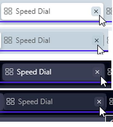
-
A Former User last edited by
This blue line would be a good indicator of an active tab. It would be much faster to find the active tab when we have many tabs open.

-
andrew84 last edited by andrew84
Please, add option to turn off the 'tab island' feature completely.
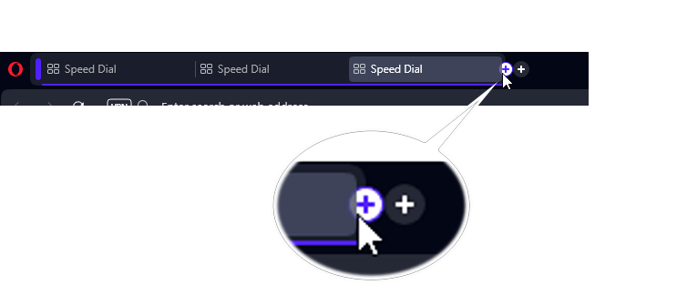
I don't use tab islands, but I noticed that single tab's blue underline is shorter if the tab is duplicated in 'island'

Also, if last tab in island is active while collapsing island, after expanding the island again the + button will be behind the tab.
-
andrew84 last edited by andrew84
@andrew84 and additional indicators are absolutely necessary, i.e. naming and color for grouped tabs.
*for example the following color scheme.
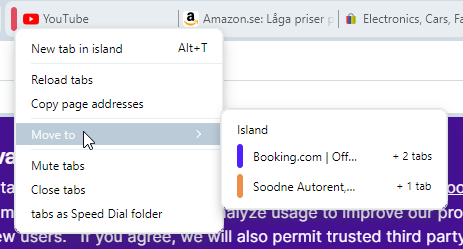
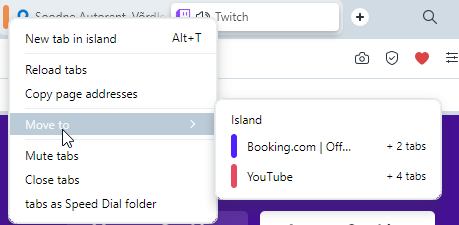
https://forums.opera.com/post/310362Also, maybe I'm understanding smth. wrong but I don't understand a bit the tabs counter in move to context menu..
I created 3 islands
1st contains 3 tabs, 2nd contains 5 tabs, 3rd contains 2 tabs
the blue island's context menu offers me the following

red's
yellow's
-
burnout426 Volunteer last edited by
@andrew84 said in Opera 105.0.4970.16 Stable update:
*One more issue (inconvenience) I noticed is that when middle clicking to open bookmarks and the dropdown stays opened I can't close the opened background tabs because no 'x' is displaying. First need to close the dropdown. In pre One version it's possible to close the background tabs while the dropdown is expanded.
Filed DNA-113321 for this. Not sure if it's an easy fix or not to accept mouseover events on the tabs while a menu is open. Guess we'll see.
-
andrew84 last edited by andrew84
Interesting, why the island is automatically closes if there's only 1 tab left?
The behavior should be optional, I guess.
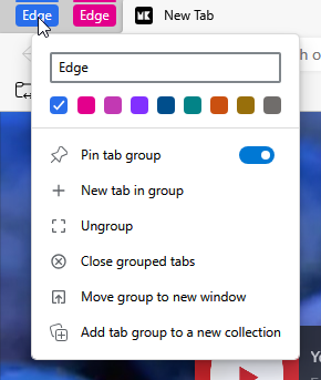
Maybe I can keep 1 tab temporarily and later I'll add more.*Edge allows to keep only 1 tab in group and this is logical in my opinion.

**and I think that tab island should be automatically pinned after creation(like in Edge).
