[Opera One] white address bar in dark theme private mode
-
whisperer last edited by
Still not fixed in version 103.0.4928.34.
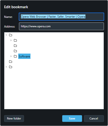
BTW, when I right-click a bookmark on the bookmarks bar and choose Edit, I get an even worse result:

As with the address bar, this has been the case for a long time.
-
Kallenavn last edited by
Its clear that Opera staff doesnt read this forum. Please report this as an issue for every update its not fixed.
Menu -> Help-> Report an issue -
whisperer last edited by
Still not fixed in Opera One version: 104.0.4944.33
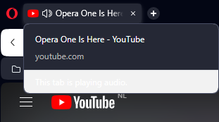
BTW, hovering over a tab that plays audio, shows "This tab is playing audio" in white text on whitish background.

-
shagratt last edited by
Still not fixed. At this point I think Opera Devs just dont care or people in charge to report problems from this forums to the devs do a really poor job
-
whisperer last edited by whisperer
Still a white address bar in Opera One version 105.0.4970.13.
Other theme issues are fixed, like the "This tab is playing audio" text, the world map of the VPN setting, editing bookmarks by right-clicking bookmarks in the bookmarks bar.
-
nnq2603 last edited by nnq2603
@whisperer Apparently they purposely hang on to the white address bar in darkmode for some unknown reasons(?) Even the possibility Leocg mentioned above might be true, like, some of them really think the private mode should be visually standout compare to normal mode, and standout in white
It's just super weird, because instead of providing a different dark color theme for private mode to make it distinguishable from normal mode, they decided to choose a white color for dark theme. It doesn't make any sense. If there're 2 separated color themes, one for light and one for dark according to windows theme, then white bar should only appear in light theme of opera, not dark one. There's zero sense to this color choice of pure white at all. It's all messed up.
If they're too stuck up with the idea of private mode theme need to be distinguishable from normal mode theme, then do in the way Brave or Vivaldi did. They have private/incognito mode in distinguishable color theme, and still suitable for dark theme. Of course the color choice of Brave or Vivaldi (private mode) might not fit to everyone taste, but in general, it's still better than pure white. Opera One pick the worst choice of color, by far.
-
admagnificat last edited by
Indeed, it now late 2024, and the white address bar in dark theme private mode persists.
I do hope that this can be changed to black soon.
Many thanks to all who have commented on this, and many thanks in advance (I hope!) to the developers who will hopefully fix this someday!
-
Referenced by
 whisperer
-
nnq2603 last edited by nnq2603
@Pyll0 @Kallenavn @whisperer Quite a surprise. Today, Opera One build 119.0.5497.40 has already changed this questionable UI decision and it's dark in darkmode now. No longer white bar in dark mode Opera. Thanks to the new themes they introduced today.

-
Kallenavn last edited by
Too late for me. Uninstalled opera on all my devices and jumped to Vivaldi instead. Simply not interested in using products from someone who takes that long to fix something so obvious. Also they pulled a similar one on their gx browser and told me it was by design when making a perfect dark theme suddenly cluttered with white.
Aftet using Vivaldi for a while i found it to be better
at everything. You can literally make your own dark theme, use custom add block filters to be closer to ublock, better customizable ui etc. It's based on chromium like opera. And the devs actually listen to the users and don't ignore them for years when obvious design flaws is reported. Its basically everything i wish opera was. -
Pyll0 last edited by Pyll0
just to come back, shout out to the devs, and wanted to close this topic with a perfect ending. a journey that takes about 2 years. what a dark address bar...
