• Login
    • Search
    • Categories
    • Recent
    • Tags
    • Users
    • Groups
    • Rules
    • Help

    Do more on the web, with a fast and secure browser!

    Download Opera browser with:

    • built-in ad blocker
    • battery saver
    • free VPN
    Download Opera

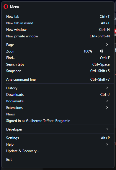
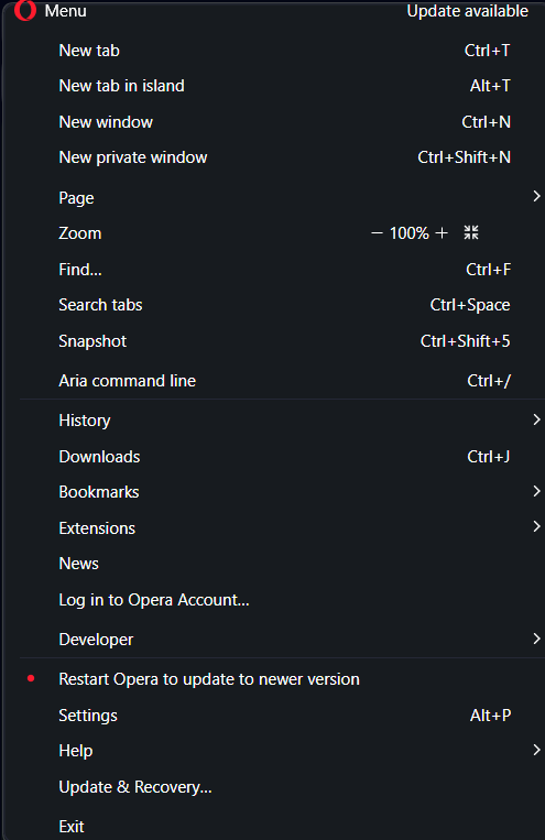
    General Opera One Appearance Feedback Topic

    Appearance
    appearance feedback opera one
    71
    279
    142638
    Loading More Posts
    • Oldest to Newest
    • Newest to Oldest
    • Most Votes
    Reply
    • Reply as topic
    Log in to reply
    This topic has been deleted. Only users with topic management privileges can see it.
    • kimbakat
      kimbakat last edited by leocg

      The tabs should be connected to the page..not over a valley and thru the woods to get to the other tab.
      It,s so messy when you are going from Tab to Tab that you have to look over 2 rows of buttons and bookmarks..to switch tabs. It's visually messy and slows the user down. What jerk programmer thinks that is efficient or looks good?

      Please allow the user to design their toolbars. I dont know why all these browser would put the tabs at the top? The content of the tab should be connected to the pages...which is on the bottom part of the browser.

      Also,, having your bookmarks (or the option to) wrap so that you have access to a second or third row.

      This way I can see all my bookmarks on 3 rows.

      Reply Quote 1
        flaviu2 1 Reply Last reply
      • kvrga
        kvrga last edited by

        There are just too many things that changed simultaneously. At least there should exist Opera One theme that looks exactly as the version of previous version.

        Reply Quote 2
          1 Reply Last reply
        • flaviu2
          flaviu2 @kimbakat last edited by

          @kimbakat
          Excellent tought.
          It is too much space between tab and address bar !!!!!!!!!

          Reply Quote 0
            1 Reply Last reply
          • VikDumagon
            VikDumagon last edited by

            I think the new modular design creates a lot of visual clutter and, for people who have a hard time focusing and being organized, it can really be an impediment.
            I don't think the messenger apps need a square around them, nor do I think the search bar and the bookmarks bar need to be separate.
            I think opera could benefit from a design similar to Sidekick. Opera has, definitely better features, but a simple design goes a long way.

            Reply Quote 1
              1 Reply Last reply
            • Tokeiburu
              Tokeiburu last edited by Tokeiburu

              Hello,

              So it's been a couple weeks since Opera had a big UI update, and now there's a 4 pixel thick border around the content inside the window being extremely annoying. I'd like to know how to get rid of it and from what I've been finding online, it doesn't seem to be possible? It feels like the Opera team is trying to make their browser worse on purpose somehow? I don't get who in their right mind thought this would be a good idea. To clarify, this is what I'm talking about (it even hides part of the scrollbar, just why...):
              alt text

              Also, it's not possible to close the window anymore by dragging your mouse to the top right corner of your screen because there's another annoying extra border on top of the window for whatever reason:
              927ad1bc-064a-4f09-988e-b855e761e4cb-image.png
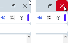
              That's practically a default design by Microsoft since they released their OS, and to suddenly change a behavior like that for a border is beyond me... There's a reason Microsoft designed windows that way: it's practical.

              Similarly, you can no longer resize the windows from the top border:
              c1ed1e0b-5097-4650-8184-95664e3d810c-image.png

              That's yet again another Windows feature that's been removed because of this border. This whole new UI is absurd and really frustrating for a user like me. Please conform yourselves with the other Windows applications and stop trying to reinvent the wheel.

              I could probably fix all those issues with a custom UI, but I'd rather complain here a bit in hopes you guys fix those problems and future users won't have to suffer or drop the browser entirely for something so silly.

              Thank you and please have a nice day.

              Reply Quote 4
                1 Reply Last reply
              • flaviu2
                flaviu2 @DarthGTB last edited by leocg

                And in this "new" design, everything is crooked:

                692b6fb9-37dc-4f81-9533-ed6b53f8e67d-image.png

                "Nice" huh ... chinese thing !!!

                Reply Quote -1
                  DarthGTB 1 Reply Last reply
                • DarthGTB
                  DarthGTB @flaviu2 last edited by

                  @flaviu2 sorry, what Chinese thing?

                  I legit don't know what you want to show in that screen shot. If it's the misplacement of the Opera menu header, you clearly have an update there. Maybe update the browser before reporting a bug. That one was also already fixed

                  b57a4508-b70f-4082-83b3-657a287f9f17-image.png

                  Reply Quote 0
                    flaviu2 2 Replies Last reply
                  • flaviu2
                    flaviu2 @DarthGTB last edited by

                    @darthgtb
                    Yes, you were right, I had an older version. The updated version is better, and, if they make it thinner the tabs+address bar area, this browser will not look bad. But I doubt they will listen to us.

                    Reply Quote 1
                      1 Reply Last reply
                    • flaviu2
                      flaviu2 @DarthGTB last edited by

                      @darthgtb said in Small white dots next to tab islands:

                      what Chinese thing?

                      I mean Chinese cheap bad thing. Look how Opera "One" has everything rounded ... its not tidy nor nice. Like a Chinese cheap not reliable thing.

                      Reply Quote 1
                        DarthGTB 1 Reply Last reply
                      • DarthGTB
                        DarthGTB @flaviu2 last edited by

                        @flaviu2 I see. You are referring to Opera as something that's low quality, like a Chinese knock off product.

                        It's not that bad, honestly. Their mistake was to do the rebranding on version 100. They wanted to have a nice round version number to make it memorable and that meant they were pressed by time, delivering a product that wasn't well tested yet.

                        Nobody remembers without checking out when was the change to using a fork from Chromium, if version 12, 13 or 14, but everyone will easily remember version 100 as when they rebranded the browser to Opera One, which is honestly irrelevant.

                        I for one don't mind the redesign. I noticed Edge and Chrome did the same with the rounded edges recently. During versions 101 and 102, I stopped using Opera due to the sheer amount of bugs, but 103 is bearable and I'm back using it.

                        The one redesign I don't like is Speed Dial. The tiles got smaller since v100 and since v103 the tiles bounce a couple times before actually triggering the click. Now, that is annoying.

                        Reply Quote 1
                          flaviu2 1 Reply Last reply
                        • flaviu2
                          flaviu2 @DarthGTB last edited by

                          @darthgtb
                          I agree with few things you said. And another one: its confusing to have address bar splitted so much by tabs, I cannot associate the view with tab. But I don't think they will do something about it.

                          Reply Quote 1
                            DarthGTB 1 Reply Last reply
                          • DarthGTB
                            DarthGTB @flaviu2 last edited by

                            @flaviu2 what do you mean? Would you rather have one window for each page like it used to be in the 90's?

                            Reply Quote 1
                              flaviu2 1 Reply Last reply
                            • flaviu2
                              flaviu2 @DarthGTB last edited by

                              @darthgtb said in Small white dots next to tab islands:

                              Would you rather have one window for each page like it used to be in the 90's?

                              No, just to connect (visual) the active tab with address bar.
                              P.S. Was an irony?

                              Reply Quote 0
                                DarthGTB 1 Reply Last reply
                              • DarthGTB
                                DarthGTB @flaviu2 last edited by

                                @flaviu2 it wasn't irony. I still don't understand what you mean. The selected tab is clearly the one showing the page up

                                Unless you are colour blind, which would explain you not seeing the highlight. Version 104 made the highlight too dim

                                Reply Quote 0
                                  andrew84 1 Reply Last reply
                                • andrew84
                                  andrew84 @DarthGTB last edited by

                                  @darthgtb maybe he means that tabs are like 'islands' or buttons now. Previously an active tab was like a part of the address bar.
                                  2023-11-06_141016.png
                                  2023-11-06_141319.png

                                  *I'd also prefer the previous style

                                  Reply Quote 0
                                    DarthGTB 2 Replies Last reply
                                  • DarthGTB
                                    DarthGTB @andrew84 last edited by DarthGTB

                                    @andrew84 Ah, I see

                                    Maybe it could be possible with the islands. Like, make the whole island also connect like that, but with a different colour and the selected tab with the same colour. If it's not the selected island, let the island look like they do now, floating

                                    I agree, that could make it more visually pleasing.

                                    Reply Quote 0
                                      andrew84 1 Reply Last reply
                                    • andrew84
                                      andrew84 @DarthGTB last edited by

                                      @darthgtb I don't think that smth. will be changed regarding this style.

                                      I don't understand why there should be so big gapes above and below the tabs. Tab's height should equal tab island's height. And inside tab island the tab can be slimmer. https://forums.opera.com/post/323532

                                      I don't understand why I have to suffer even if I don't use tab islands at all.

                                      Reply Quote 1
                                        hucker 1 Reply Last reply
                                      • hucker
                                        hucker @andrew84 last edited by

                                        @andrew84 Tabs shouldn't float, they should be attached. Go back to Opera 99 style. Get rid of the new age crap.

                                        Reply Quote 1
                                          DarthGTB 1 Reply Last reply
                                        • DarthGTB
                                          DarthGTB @hucker last edited by

                                          @hucker don't actually do that though. It's preferable you switch to another browser instead

                                          Reply Quote 0
                                            hucker 1 Reply Last reply
                                          • 10Boss01
                                            10Boss01 last edited by

                                            Problems with window size and website scrolling. The developers did not make the Opera window full screen and now we have that the page scroll column (1 pic)on the side has a couple of pixels. Therefore, now, when we try to quickly move the mouse cursor to the side and drag the slider down, we pull the Opera window itself and drag it across the entire desktop. Bravo.
                                            And the second rounding of the page working area, are you serious(2 pic)? On some sites this garbage is killing books/numbers. I wonder if the development department that sits there is managed by a VERY effective manager?
                                            1.PNG
                                            2.PNG

                                            Reply Quote 1
                                              1 Reply Last reply
                                            • First post
                                              Last post

                                            Computer browsers

                                            • Opera for Windows
                                            • Opera for Mac
                                            • Opera for Linux
                                            • Opera beta version
                                            • Opera USB

                                            Mobile browsers

                                            • Opera for Android
                                            • Opera Mini
                                            • Opera Touch
                                            • Opera for basic phones

                                            • Add-ons
                                            • Opera account
                                            • Wallpapers
                                            • Opera Ads

                                            • Help & support
                                            • Opera blogs
                                            • Opera forums
                                            • Dev.Opera

                                            • Security
                                            • Privacy
                                            • Cookies Policy
                                            • EULA
                                            • Terms of Service

                                            • About Opera
                                            • Press info
                                            • Jobs
                                            • Investors
                                            • Become a partner
                                            • Contact us

                                            Follow Opera

                                            • Opera - Facebook
                                            • Opera - Twitter
                                            • Opera - YouTube
                                            • Opera - LinkedIn
                                            • Opera - Instagram

                                            © Opera Software 1995-