General Opera One Appearance Feedback Topic
-
canadagoose4everreturns last edited by
@himmelsheriff Whereas I don't quite agree with you, I admire your loyalty and the fact that you make some very good points.

-
canadagoose4everreturns last edited by canadagoose4everreturns
@habsfan said in General Opera One Appearance Feedback Topic:
they could have least put in a 'Classi Mode' button that let you have the features...but keep the look/layout of what you're used to.
Now here is a suggestion I can get solidly behind. Why not provide an easy way to either opt out or revert to the former UI? This would have kept everyone happy. BTW: there was a time I was also a Habsfan but that was back in the days of Yvon Cournoyer, Guy Lapointe, Serge Savard, Pete Mahovlich and of course Guy Lafleur. I miss that team and the matches with my Leafs. Since moving south of the border, I haven't kept up much. Take care.
-
hucker last edited by hucker
I'm watching the new Operas on a secondary computer, hoping it gets reverted to the decent old interface, and forcing version 99 to stay on my main computer.
I don't want rounded corners on everything like a Mac, I use a real computer, not a kid's toy. My monitor is LCD, it has square corners. Rounded corners make me think I'm on an 80s CRT TV.
I don't want to have to hover over a tab and then find where the hidden X is.
Is there a way to turn off the new interface changes so I can enjoy any bug fixes etc I'm missing out on?
-
hucker last edited by hucker
There's no point in these grumbles. Grumble anywhere and your post gets put in here by a moderator without your permission, and they don't even tell you they've done it. It's the cupboard at the end of the hall nobody looks in. The designers have already made their silly design, they won't back down, they worked hard on messing it up. Until one gets fired, Opera is going to be rubbish. Time to leave.
-
hucker last edited by
@marinadze said in General Opera One Appearance Feedback Topic:

this color is very unpleasant for the eyes
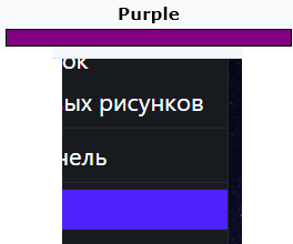
It's blue. Nobody would call that purple, even my photo editor.
-
andrew84 last edited by andrew84
@hucker color picker suggested me #5021ff.
After searching for color name I also was suggested a close tone #5218FA which called 'han purple' and refers to Han Dynasty of China.
https://www.color-name.com/han-purple.color
If Opera also has some relations with China, maybe the've used the similar color, who knows...*If I insert #5021ff and search for name on the site above, it also offers 'han purple' name. Also 'chinese purple'.
-
hucker last edited by
@vegelund said in General Opera One Appearance Feedback Topic:
Put that colour next to what you call purple and show us.
https://en.wikipedia.org/wiki/Purple

-
hucker last edited by
@andrew84 said in General Opera One Appearance Feedback Topic:
@hucker color picker suggested me #5021ff.
After searching for color name I also was suggested a close tone #5218FA which called 'han purple' and refers to Han Dynasty of China.
https://www.color-name.com/han-purple.color
If Opera also has some relations with China, maybe the've used the similar color, who knows...*If I insert #5021ff and search for name on the site above, it also offers 'han purple' name. Also 'chinese purple'.
Interesting, that page shows blue for the description, yet the vase is really purple.
Go into a photo editor and into the colour selector. Set it to 255 Blue 0 Red 0 Green. Now slide up the Red. I would say purple once it's past about halfway.
-
hucker last edited by hucker
@vegelund I propose RGB 0 0 255 is blue. 255 0 0 is red. 255 0 255 is purple. 128 0 255 is halfway between purple and blue, so blueish purple.
The colour in question is 80 33 255. The 33s can account for just making it lighter, more white. So it's really a brighter version of 47 0 255, which is a third of the way from blue to blueish purple. So not even blueish blueish purple (if that sounds odd, consider north northwest).
This is now off topic for the off topic thread, so an admin will shift these posts to colour interpretations.
-
hucker last edited by
@vegelund said in General Opera One Appearance Feedback Topic:
I propose Purple Heart.
Actually, that website says 5021FF is Purplish blue. So blue but slightly off. Not purple.
https://colors.artyclick.com/color-shades-finder/?color=#5021FF
-
A Former User last edited by
@hucker said:
Actually, that website says 5021FF is Purplish blue. So blue but slightly off. Not purple.
https://colors.artyclick.com/color-shades-finder/?color=#5021FF
Nope, the Opera color is not that blue.
-
hucker last edited by
@vegelund said in General Opera One Appearance Feedback Topic:
@hucker said:
Actually, that website says 5021FF is Purplish blue. So blue but slightly off. Not purple.
https://colors.artyclick.com/color-shades-finder/?color=#5021FF
Nope, the Opera color is not that blue.
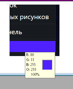
I saw 5021FF written up there, I just checked, my photo editor agrees, the Opera colour is exactly that one:

-
A Former User last edited by A Former User
My address bar highlight looks different. But could be my eyes are tired or the Iris color management plays a trick.
Either way, I dislike this color for the purpose used.
-
hucker last edited by hucker
@vegelund said in General Opera One Appearance Feedback Topic:
My address bar highlight looks different. But could be my eyes are tired or the Iris color management plays a trick.
Either way, I dislike this color for the purpose used.
Printscreen, place into photo editor, it'll tell you the exact RGB value.
Not sure what you mean by "Iris color management" - have you told your graphics card to change the colour tones to your personal preference? Not sure if a screengrab would take it before or after that adjustment.
Does Opera actually not let you change the colour? They do know what the word "preferences" means?
-
flaviu2 last edited by
@vasevase
Thank you put here graphically the UI issues. I don't think they hear us, they don't care about our opinions, if we read this from they home page:Opera offers a complete web experience you can’t get from system defaults such as Chrome, Safari and Edge.
Pity, Opera was my browser for years, now, I cannot simply use it, on my work laptop I cannot install it due to AI feature ...

Sad, sad, sad !
I thought they wanted to build something efficient and reliable, but they go for fancy ... they did a futuristic GUI (which nobody likes) instead of efficient browser.
-
A Former User last edited by A Former User
@hucker said:
Printscreen, place into photo editor, it'll tell you the exact RGB value.
Not to argue what is blue or purple, just to make sure we are on the same page.
Photoshop pulls color="#5818f8" for all Opera purple visible.
Iris is a screen color app I use for nighttime or low-light environments. Usually dropping temperature from 6500K to ca. 3900K.
Warmer screen color temperature makes the color we are discussing look more purple, but it does not influence the value Photoshop gets.

-
FelipeAC last edited by
The colors are unbearable, at first I could tolerate the purple color in some parts but the one that is now everywhere in the interface is unbearable
-
VEGM last edited by
Hi! My Opera just updated to Opera One and the appearance has changed a lot, but I just don't feel comfortable with it and was wondering if there's a way to go back to the previous one. What makes me dislike it so much is how the sidebar was alterated (why are the icons so crammed?? and whats with the transparent like square surrounding the messengers?), the horrible new highlight color (kind of a vibrant blueish puple? I really liked the calm blue I had right before the update to Opera One!) and how the tabs feel smaller, many things feel quite smaller actually! This isn't efficient, and it's quite a bother to randomly have everything look so different when I'm trying to do my stuff as normal. It would be totally fine if we could choose the appearance, I'd simply pick the one I had before this bothersome update, but it seems that isn't the case. It would be really nice if we could choose tho, I felt so calm and happy with my browser and I really don't want to change it again now that everything feels so intense and uncomfortable, kind of out of order I guess? And it seems I'm not the only one who despises this new appearance. It would be very appreciated if you'd listen to us and give a solution or an alternative, thank you very much!
