General Opera One Appearance Feedback Topic
-
andrew84 last edited by
As for the items highlighting.. I'll write the same I wrote many times when the dark theme was yet implemented.
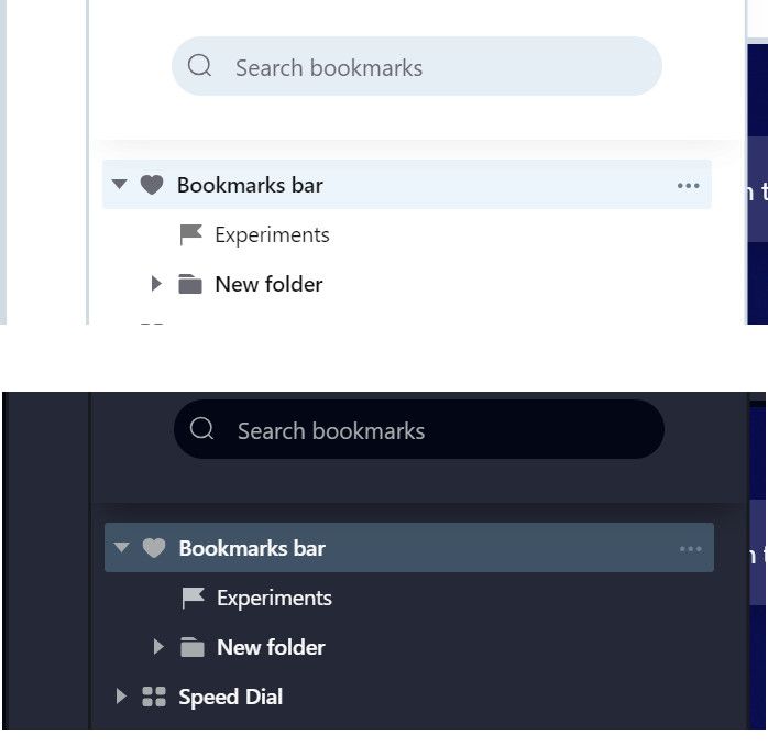
In sidebar panels for History and Bookmarks I see the nice and pleasant to eyes looking highlighted items. In light mode Opera's inherent light blue and in dark theme dark navy colors. Why the purple in other places and the same color in both dark/light theme?
-
andrew84 last edited by
@himmelsheriff said in General Opera One Appearance Feedback Topic:
GX so I only know screenshots. But that looks quite weird but it's rather like the old one, doesn't it?
I don't know how the GX looks now.
I installed it once when it was presented and launched few times later, disliked and then deleted completely. I remember it's all dark with the bright controls and buttons (similarly to gaming interfaces and gaming peripherals).
Now the One version looks similar to GX.I'm fan of calm tones.
I see for example them on youtube page dark mode, I see that developers took care of users to make it pleasant to eyes in dark environment.I'm also fan of unified colors and color themes/styles. If they implement significant UI changes, then all needs to be reworked. Now we have the bright purple( or blue, violet) here, calm and different tones for dark/light mode there in the sidebar panels, and still the old light blue color in settings. So 3 different color schemes in similar places.
-
stolis last edited by
@himmelsheriff It's very simple. They were just enjoying opera as it was and now, with this messed up "upgrade" everybody got crazy.
-
A Former User last edited by
@stolis I don't actually, at least not the way you think, I'm afraid. Maybe it's a matter of mentality. I appreciate new design and look generally, others may like old and trusted one better. None is better than the other. But the new design definitely keeps me with Opera.
-
stolis last edited by
@vegelund After this, I would just say they're playing around and completely stopped paying any attention on their users.
-
A Former User last edited by
@andrew84 said in General Opera One Appearance Feedback Topic:
Edge has more compact top now comparing to 'One' version.
At the same time buttons and tabs are bigger/clear in Edge, in 'One' version it's the wasted space.
I also noticed that Edge Canary offers option to try new style (I assume its chromium 2023 refresh). When I enable the toggle, the ugly content border appears also in Edge.In my usage I found Edge looking dated, actually. And I felt overwhelmed with all the buttons and icons that mostly are meant to urge users into Microsoft services.
But I have to admit, that I normally avoid anything Microsoft, even rather using Google for anything.
Anyway, what you tell about rounded borders may suggest, that Opera even is ahead of the pack with its new design. I feel it's a breathe of fresh air, but not so much that it's so different from how it used to be.
So maybe people who don't the new look might consider using Vivaldi which can be customized so much that it resembles pre 100 Opera. That's the most natural alternative I'd say. -
A Former User last edited by leocg
@himmelsheriff ...I cant speak on the AI as I won't use either of them...Opera is more complicated to setup an account that Edge, Edge does have Speed Dial with an extension...yes it's a small extra step, but the extension is far superior to Opera's native Speed Dial allowing for multiple custom SD layouts that can be switched back and forth (for example I have a Work and Personal Speed Dials) with a simple button click (a drop down list from the SD home page...the SD was a feature that kept me on Opera One despite my distaste for it, but once I found the extension I was gone from Opera...the look of Edge (and used to be Opera as well) is more professional and clean...One looks more like it belongs on some custom built kids themed PC with all the goofy colours and rounded shapes...and since it's such a drastic change from the version prior, it's just plain irritating to use as everything that you got used to over many versions has to be figured out all over again...nah this is a big miss for me...they could have least put in a 'Classi Mode' button that let you have the features...but keep the look/layout of what you're used to.
-
A Former User last edited by
@habsfan said in General Opera One Appearance Feedback Topic:
Opera is more complicated to setup an account that Edge, Edge does have Speed Dial with an extension...
Yes, really? I've made a totally different experience. Unless you already have an existing account, there's a lot to do with Microsoft. And you don't log into a account for only synchronizing but for their whole stuff. I absolutely avoid Microsoft if only possible, even prefering Google by a wide margin. Especially as it's one of the most anti-competitive companies in tech.
But if you don't like Opera's speed dial and prefer the Edge one with extension why bother with Opera anyway? Why not just use Edge instead of registering for Opera (which you find so difficult) only to tell people that you think Edge is superior? I don't geht that really.
-
A Former User last edited by
@canadagoose4everreturns ...lol, I'll give you a nod for that opening line...and an up vote as well as you sound like one of the sane Leaf fans
 ...I will note one thing with Edge that was keeping me from it was the lack of a Speed Dial, but after a quick search in the 'Extensions' I found one that was even better than the native feature in Opera. I use my laptop at home as well as work, and the SD extension allows for (with a quick selection from a drop down menu on the SD home page) to select from different SD's. So I have a Work Speed Dial, and a personal Speed Dial...so I just imported the bookmarks from a personal PC and one from my work laptop and now I have a quick to one of each. This is nice so you done have one huge SD listing like I used to have in Opera. There may have been a way to do this in Opera, but if so, it wasn't this slick. I don't recall the extension, but it had threw purple/blueish lines as an icon I believe.
 -
andrew84 last edited by andrew84
@himmelsheriff I'm just trying to understand why the rounded borders which consume display's space are cool?
You might notice that monitors/TV manufacturers try making display's bezels as thin and as less noticeable as possible.
When you watch some science fiction movies or play games, you'll see displays without bezels at all. I thought we're moving in this direction.
But instead I'm offered additional borders which make the UI look heavier (my opinion).
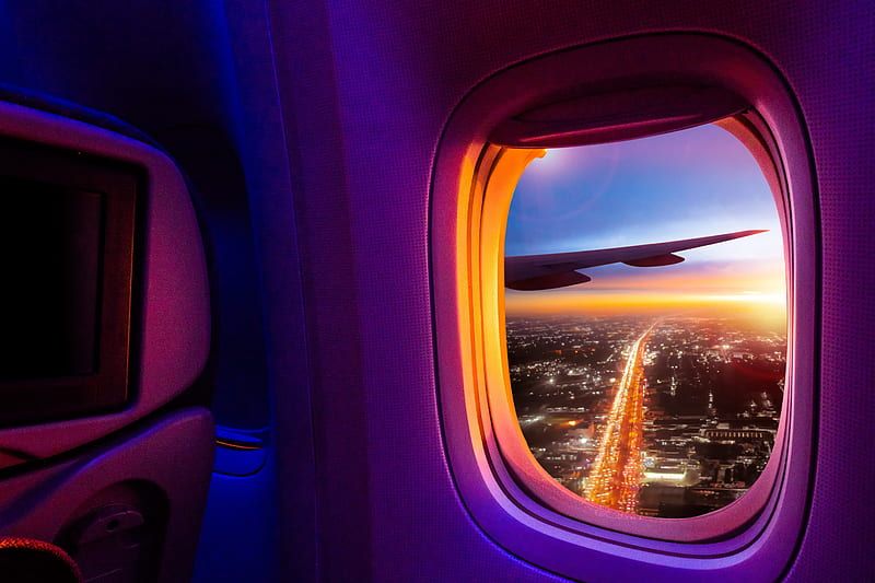
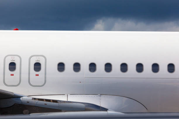
As already was mentioned, I'd understand the new UI's idea if the modules would float above the background like on their promotional video. https://forums.opera.com/post/314292Edit;
Maybe the designer is fan of aircraft porthole windows
-
 canadagoose4everreturns last edited by
@himmelsheriff Whereas I don't quite agree with you, I admire your loyalty and the fact that you make some very good points.
")
-
canadagoose4everreturns last edited by canadagoose4everreturns
@habsfan said in General Opera One Appearance Feedback Topic:
they could have least put in a 'Classi Mode' button that let you have the features...but keep the look/layout of what you're used to.
Now here is a suggestion I can get solidly behind. Why not provide an easy way to either opt out or revert to the former UI? This would have kept everyone happy. BTW: there was a time I was also a Habsfan but that was back in the days of Yvon Cournoyer, Guy Lapointe, Serge Savard, Pete Mahovlich and of course Guy Lafleur. I miss that team and the matches with my Leafs. Since moving south of the border, I haven't kept up much. Take care.
-
 hucker last edited by hucker
I'm watching the new Operas on a secondary computer, hoping it gets reverted to the decent old interface, and forcing version 99 to stay on my main computer.
I don't want rounded corners on everything like a Mac, I use a real computer, not a kid's toy. My monitor is LCD, it has square corners. Rounded corners make me think I'm on an 80s CRT TV.
I don't want to have to hover over a tab and then find where the hidden X is.
Is there a way to turn off the new interface changes so I can enjoy any bug fixes etc I'm missing out on?
-
hucker last edited by hucker
There's no point in these grumbles. Grumble anywhere and your post gets put in here by a moderator without your permission, and they don't even tell you they've done it. It's the cupboard at the end of the hall nobody looks in. The designers have already made their silly design, they won't back down, they worked hard on messing it up. Until one gets fired, Opera is going to be rubbish. Time to leave.
-
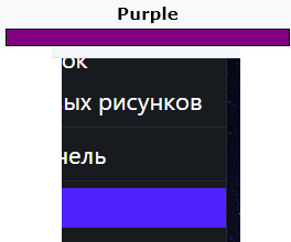
hucker last edited by
@marinadze said in General Opera One Appearance Feedback Topic:
this color is very unpleasant for the eyes
It's blue. Nobody would call that purple, even my photo editor.
-
andrew84 last edited by andrew84
@hucker color picker suggested me #5021ff.
After searching for color name I also was suggested a close tone #5218FA which called 'han purple' and refers to Han Dynasty of China.
https://www.color-name.com/han-purple.color
If Opera also has some relations with China, maybe the've used the similar color, who knows...*If I insert #5021ff and search for name on the site above, it also offers 'han purple' name. Also 'chinese purple'.
-
hucker last edited by
@vegelund said in General Opera One Appearance Feedback Topic:
Put that colour next to what you call purple and show us.
https://en.wikipedia.org/wiki/Purple
-
hucker last edited by
@andrew84 said in General Opera One Appearance Feedback Topic:
@hucker color picker suggested me #5021ff.
After searching for color name I also was suggested a close tone #5218FA which called 'han purple' and refers to Han Dynasty of China.
https://www.color-name.com/han-purple.color
If Opera also has some relations with China, maybe the've used the similar color, who knows...*If I insert #5021ff and search for name on the site above, it also offers 'han purple' name. Also 'chinese purple'.
Interesting, that page shows blue for the description, yet the vase is really purple.
Go into a photo editor and into the colour selector. Set it to 255 Blue 0 Red 0 Green. Now slide up the Red. I would say purple once it's past about halfway.