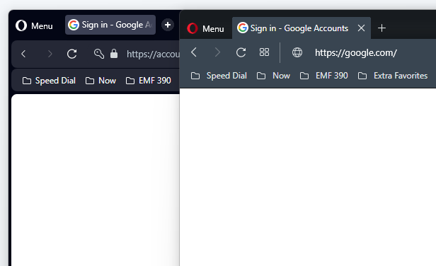
Web page content's border and new modular design.
-
andrew84 last edited by
@karolnow yep, there's already complains regarding this
https://forums.opera.com/post/307564 -
jcmlny last edited by
@andrew84 said in Web page content's border and new modular design.:
The border around web page content bothers me
The border around web page content and the bookmarks bar really bothers me to the point that I cannot use it
 ... One of the things that I love about Opera Browser is that everything blends so clean and sleek that is simple to the eye, with Opera One looks so rounded and too busy, ... I hope Opera give us an option to allow to remove rounded edges and change colors of the background ...
-
andrew84 last edited by andrew84
@jcmlny Yes, I didn't get the visual idea of the 'bubble' design.
When sidebar enabled there will be double border (between screen and sidebar + between sidebar and web page)I described here that maybe it'd better to have blurred modules on full screen wallpaper. https://forums.opera.com/post/307511
But personally I prefer the previous flat solid design. It just needed to polish and add some visual effects*And the border is seen even on full screen video >https://forums.opera.com/post/307564
-
MaximilianTH last edited by
@jcmlny And I personally like the new design much more than the old one. This all is just matter of taste. Hope the do not remove the new design. Though I 100% agree it would be nice to make it customizable and have different options. Perfect if via custom CSS.
-
andrew84 last edited by
@markmbha said in Web page content's border and new modular design.:
The design is clean and functional.
So what function of the border on full screen video/content? It means cleaner video or what?
-
Generosus last edited by
Agree. Trying to make Opera "prettier" is not making it better, rather more cumbersome to navigate and use. The modular design is distracting, it's removing useful working space, and serves no useful purpose at this point.
-
AlizaNaomi last edited by
@jcmlny i miss the clean look of the borwser its just so bulky and ipad like now , its gross
-
A Former User last edited by
Let's be honest, the new design is crap. So much crap that I installed Opera GX for the first time. I'm even thinking about switching to Chrome.
-
flaviu2 last edited by
@markmbha
I do not agree. Looks like a Chinese cheap thing, all things rounded, the view not stretched along the screen (from left to right), spaces between tabs / address bar / view, spaces between tabs and context menu, if you don't move fast, you lose the menu ... suddenly, everything become annoying.Pity, it was a good browser. It is ruined.
-
flaviu2 last edited by
@generosus
Very good observation! They tried to make the browser prettier, and the outcome is that suddenly, it's hard to use it, especially for business purpose.So, if you want to use Opera browser to watch cartoon, yes, could be fine, but for daily work, it is distracting and annoying.
-
flaviu2 last edited by flaviu2
@maximilianth
Yes, the design is matter of choice, I agree, but to see if this new design is better or not, please check the functionality and you will see. There are more drawbacks for this new design, and I will mention just one of it:The working view is not stretched from left to right side of the display, and because of that if you have the mouse pointer in that dead and useless (and ugly) space, you will scroll in vain.
So, it is better design ? Take the conclusion for yourself.
P.S. Do you thing that much space between tabs and address bar is looking good ? It looks like they are different windows ... ugly !
-
rahidt last edited by
Missing the old solid design. They should have focused more on the performance rather than silly designs. They removed start page. I dont understand the reason behind such design. Opera should allow customizable design. Otherwise more users will leave opera
-
martin-s last edited by
one simple rule: do something new, do it and the ability to turn it off! I hate the white frame. the cursor gets on it and the scrolling does not work and it looks cheap and out of place
-
flaviu2 last edited by
@rahidt said in Web page content's border and new modular design.:
Missing the old solid design. They should have focused more on the performance rather than silly designs.
Yes, I agree, better to have a performant browser than a fancy one and inefficient !
-
tnt8897 last edited by
I am really not liking the new border. It is quite distracting and provides no value. Really feels like a step backwards.
If the devs really like it and want to keep that that's fine, just give us a way to turn it off.