How to use Tab Islands in Opera One Browser
-
Opera Comments Bot last edited by
Opera Browser’s Tab Islands feature helps you keep tabs arranged in groups by context, making your browsing experience smoother and easier.
Read full blog post: How to use Tab Islands in Opera One Browser
-
andrew84 last edited by andrew84
Wow, how the tab islands are hyped here. Taking into account that previously we were said that Opera doesn't need tab stacking because workspaces are for these purposes. Btw, I also think that workspaces (which was relatively unique feature ) is a better solution if there is a wish to 'filter' opened tabs.
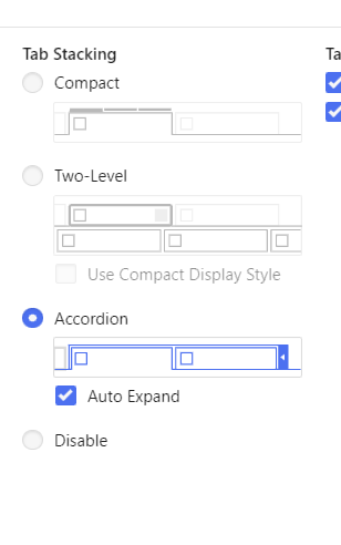
Usually I don't have huge amount of tabs opened, so I don't need much the tab stacking feature (workspaces is my choice if I really want to reorder my tabs). But I saw user requests regarding the tab stacking feature and complaints that other browsers have the feature. Usually Vivaldi is mentioned. I checked how it looks there and discovered that the tab islands analogue called 'Accordion' is just one of the options for tabs stacking.

-
hubim last edited by
In new Opera One tabs there is no visible "close" button ("X") on touch screen.
I need to use mouse or ctrl+w schortcut.In older version "x" button was alway visible.
-
ryanbreed last edited by
This is an awesome solution for tabaholics! Absolutely brilliant. I've been using Opera for many years and it's always been ahead in UI and everyday tools. Keep up the good work!
-
rick2 last edited by
How about those of us who have lots of open tabs, don't want to use islands and were very happy with the scrollable tab bar?
I know we can reenable it in settings but it' practically unusable in Opera One:
- It won't automatically scroll when you open a new tab
- When you drag a tab to reposition it, where it ends up is a mistery becaouse Opera One won't show you where you're dropping it
For these reasons I had to donwgrade (again) to Opera Beta 99 for my personal use.
I do use Opera One Stable for work related issues, I don't have so many tabs open so I just disabled Islands but I really miss scrollable tab bar as I still have enough open tabs to make their favicons pretty small
That and the new tab bar which is very space inefficient compared with previous versions. -
illuminari last edited by
@hm55: did you consider turning off the automatic creation of islands in the settings-bar?
-
A Former User last edited by
Please bring back the "X" to close individual tabs on touch screen. They disappeared when I installed Opera One, and the context menu can be tricky to use in touch mode. if this isn't fixed soon, I'm going to have to change to an older version of Opera or use a different browser. This change to Opera One should have had a lot more user testing. This is extremely disruptive. I do not want to use islands with my current project, and the tab problems have sevrrely impacted workflow.
-
rmreddicks last edited by
these tab islands are terrible for my usage. How do I turn them off or roll back to a previous version of opera?
-
DmitryDoe last edited by
great feature, helps me to quickly find the needed tab, meanwhile doesn't make me to put effort into manual tab grouping
-
shayan-01 last edited by
Operating system: Windows 10
Before the update:
If we had lots of opened tabs we could still see the "X" button when we hover over a tab.After the update:
But after the update, it doesn't show the "X" button when there are lots of open tabs even we hover over a tab. -
ryanbreed last edited by
@shayan-01 FYI middle mouse button (or press the mouse scroll) closes a tab
-
zokusai last edited by
An "afraid-to-close-tabs user"? Hahaha... You are the best!! Just what I needed.
-
jolp last edited by
I was experimenting the same confusion that most people here (If ain't broken, don't fix it!) and all I had to do was turning this complicated and unnecesary islands off and then access the opera://flags menu to get my scrolling bar back again.
I hope it helps! -
shayan-01 last edited by
@ryanbreed Thank you, I didn't know this. But I'm not comfortable with this solution.
Opera browser's UI is the best in my opinion and I expect it to be perfect.