Opera One (100.0.4815.2) beta
-
thatoneunoriginal last edited by
@thatoneunoriginal: I downloaded the Beta version, is there any way to import things like the speed dial options from the Developer Build to the Beta Build?
-
KeivMS last edited by
Loving the islands, but their implementation is very buggy. Browser crashes, taking my pinned tabs in each of the three workspaces.
Have to repopulate those workspaces with the pinned tabs after each crash.Opera Version: 100.0.4815.2
OS: Win 11 22H@ (OS Build 22621.1778) -
rick2 last edited by
@rolandm-0: Same on Fedora 38, opera-beta-100.0.4815.2-0
Almost anything with audio crashes: whatsapp and youtube immediately, mattermost when you receive a notification or start/join a call.
Also, no scrollable tab list (turning it on from opera://flags makes opera very crashy, can't manually reorder tha tabs)Going back to 99 for the moment.
-
spiryts last edited by
For now it's work, but Tabs drag and drop between windows doesn't work,
what with that strange empty space between tabs and upper edge of screen ?,
and why did you remove home button ?. -
SiMcarD78 last edited by
@thatoneunoriginal: Developer version updates only to another developer version.
-
fantomlightning last edited by
A complete POS, dropped tab bar scrolling. My tabs are impossible to navigate with how small they've gotten. Who thought this was a good UI choice???
-
A Former User last edited by
Few issues noted with Opera One (100.0.4815.2/0)
-
Checkbox for "Show Bookmarks bar" is invisible in Dark theme on Bookmarks page
https://1drv.ms/i/s!AlMXGs1AwxHHoGEy-5WyVzB3Oukl?e=LqZK48 -
The bottom border for address bar is split into 2 zones and there is gap when the window sze is bigger but fine when the window size is smaller
https://1drv.ms/i/s!AlMXGs1AwxHHoGIVtqYfhdU2LKXn?e=V7JvlJ (gap visible)
https://1drv.ms/i/s!AlMXGs1AwxHHoGDDUN9Qb5iJZi4V?e=EjfAyZ (gap not visible) -
Unable to select or close tabs when using Touch screen (video below)
Works fine on Stable as close button is always visible but not in Opera One
https://1drv.ms/v/s!AlMXGs1AwxHHoF-RZIuoOhhNxsgo?e=faJKJ9
-
-
stolis last edited by
I don't use to have too many tabs open, so I have no need of this islands feature. I hope there will be an option to disable them and just keep the good "old" fashion look.
And please don't do the mistake to remove the home button , 'cause it's very useful to a lot of users as you can read in comments.
The basic stuff that makes a program looks good is (first of all) functionality, followed by a friendly UI and customization.
Unfortunately it seems that you've stopped giving any attention to all of the above on every "major upgrade" you're trying to make on Opera. It's a pity. -
stolis last edited by stolis
@leocg That's good news. I don't really mind with the UI new look. I can live with that.
I want to believe there will be changes if they try to listen users requests. Like the return of home button for example, that a lot of people like and use.
And it's obvious that on upgrades, there will be changes like UI changes or new features added. They are welcomed and if users like them or not it's something they'll see in posts.
The problem is that on the same time they remove stuff or other features that users are familiar with and like them. Not listening on users and bring them back is their biggest mistake and it seems like they've not learned from the past. That's my (personal) opinion as a 10 year+ user of Opera.
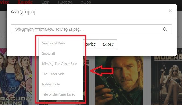
At list I hope they fixed the (hard to read) suggestions dropdown. Which by the way was fixed and all of a sudden came back. It's really hard to understand how they manage to recreate fixed bugs.
-
frk34 last edited by
With a Surface Pro 3, using the touch function, it's impossible to access open tabs and switch from one tab to another. The only "visible" and active tab is the last one opened after pressing the "+" key.
Touch works well because I can access all the browser's functions...except for the tabs that are already open....
By using the mouse, everything works perfectly (including access to tabs... ) -
Locked by
 leocg
leocg