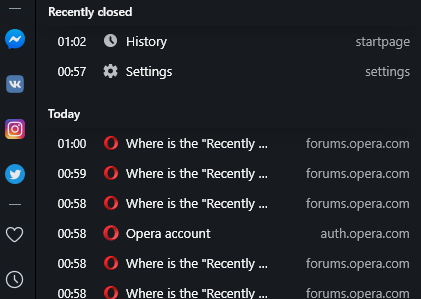
Where is the "Recently closed tabs/Tab menu" button on the top right?
-
acts432 last edited by
@leocg, @sgunhouse
Please appeal to restore this feature.
(last Closed tab menu) -
roberto64 last edited by
@leocg Is this all they have to say? The theme of this thread is very clear:
You should consider the claim of many users and give a positive response:
Please: Bring back the "Recently closed" button on the top bar on the right!!There are many more users who claim it, but they do not take the trouble to write it in the forums, but many of us do not like this change!
Please answer that !!
-
leocg Moderator Volunteer last edited by
@roberto64 They who? If you are talking about Opera, they usually don't comment on requests and/or suggestions.
-
roberto64 last edited by
@leocg said in Where is the "Recently closed tabs/Tab menu" button on the top right?:
They who? If you are talking about Opera, they usually don't comment on requests and/or suggestions.
Well they should in this case. There are many complaints that warrant a response. Especially considering that this same thing was much demanded a few months ago...
-
leocg Moderator Volunteer last edited by
@roberto64 I've been using Opera and around here for more than twenty years and every time a new feature is added or removed/changed, there are lots of complaints. Sometimes more, sometimes less.
-
vikont 0 last edited by vikont 0
If you click on the clock symbol on the sidebar (on the left hand side), it will open a history tab, with Recently Closed tabs on top. Clicking on any of them restores a tab. It's the same functionality as before, just a different location...

-
roberto64 last edited by
@vikont-0 Yes, I have seen it, thanks for your reply vikont. But before it was all together (closed tabs and tabs on other devices) in a single access much more convenient and practical to find tabs.
Now, they are not only separated, but also to see tabs on other devices opens them in a very impractical large window compared to the immediacy it had before accessing everything.
And on top of that, they replaced access to all of this with a search popup that adds nothing, and to top it off, it doesn't even take dark mode.
They are all negative details compared to the practicality of the previous access.
Those of us who have used Opera for a long time, largely love it for those practical details, such as the fact that you can go back to the beginning of a page by clicking on its tab ... it's as if they took that away from us. The improvement is not understood.
And on top of that is a change that was resisted many months ago, by many users: just look at the number of visits from these threads ...
It is incredible that they do not listen to many people, it is not something that a couple of users crave because they do not like a detail, it is something that makes the browser less practical ... and it seems that they do not care.
Thanks vikont, I still appreciate your message. -
jolang last edited by
@vikont-0 said in Where is the "Recently closed tabs/Tab menu" button on the top right?:
If you click on the clock symbol on the sidebar (on the left hand side), it will open a history tab, with Recently Closed tabs on top. Clicking on any of them restores a tab. It's the same functionality as before, just a different location...
Thanks for that! But still, that is not that user-friendly.
-
leocg Moderator Volunteer last edited by
@roberto64 It has happened before.
As I said, every feature removed or changed has users asking why it happened and to not remove it.
-
leocg Moderator Volunteer last edited by
@roberto64 This is mainly a forum for users to help each other. Although Opera employees read it and may reply eventually, we should not expect it to happen that often.
-
leocg Moderator Volunteer last edited by
@roberto64 I'm saying that if they are do things based only on complaints, they probably would do nothing.
-
JKS258 last edited by
@donq No it doesn't, but this thread, unless I'm mistaken, is solely about the restoration of the "Recently Closed Tabs" icon, for which a solution was found above. I'm not familiar with the issue of lost shortcuts, but that may be addressed in a different thread. Hope you find it....
-
A Former User last edited by
I'm saying that if they are do things based only on complaints, they probably would do nothing.
That is not true and not relevant. In this case they've simply cut the functionality (#search-in-open-tabs) for the sake of cutting.
