Where is the "Recently closed tabs/Tab menu" button on the top right?
-
iuliug last edited by
It is remarkable how needlessly anti-consumer some company become and stubborn to remain.
-
jolang last edited by
O70, and the tip with flags not working again.
Opera devs had lost the spirit of the good old Opera. Now they are stubborn and ignore what the community needs at all.Please return to recently closed tabs icon !!!
@roberto64, we should not ask them or beg them. We are the users. We'd rather uninstall this user UNfriendly browser made with hate by unfriendly devs.
-
A Former User last edited by A Former User
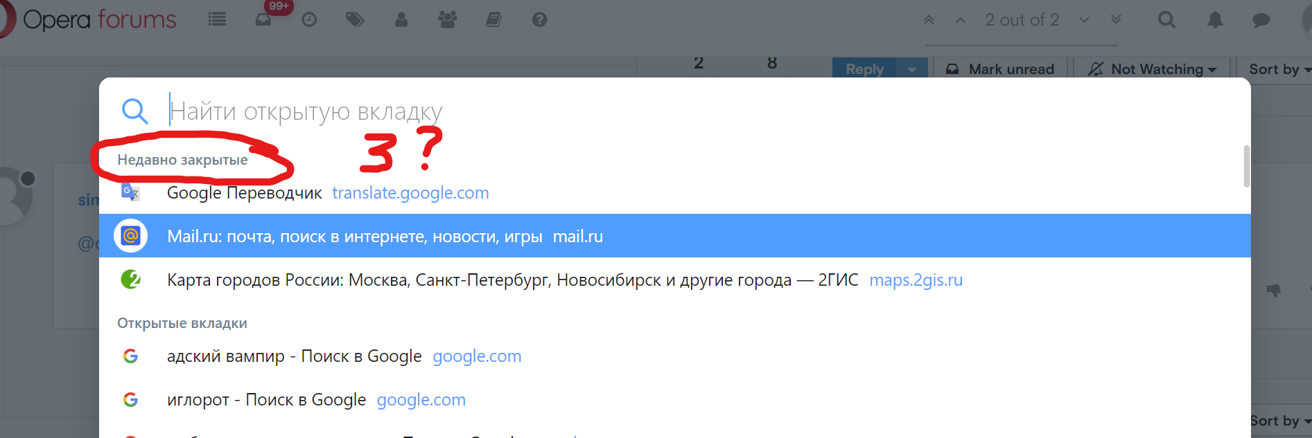
The new popup is terrible designed. And there is no way to turn back the old one with Opera 70.
The unnecessary large size, the inconvenient placement (far away from the button), only 3 rows of the last open tabs, the search bar and open tabs take a lot of space and it absolutely useless for people who do not open a lot of tabs. And it's modal popup, it's breaks the flow of the work with the sites.
Stop do changes for the changes.
Bring back the old menu. I absolulty don't like this modal popup.
-
A Former User last edited by
How many opinion needed for fix design mistake?!
Opera Developers team never changes...Maybe does you think people haven't variants for choosing browser?
-
jolang last edited by jolang
@anonan said in Where is the "Recently closed tabs/Tab menu" button on the top right?:
I absolulty don't like this modal popup.
Modal windows is an arguable UI approach and may be used in a situations when you need the user to stop and think before doing next step. Definitely not this situation! And you're right, it's far away from the button so it's not only logical and visual connection broken, it consumes more time since the user needs to move the cursor and target it.
-
acts432 last edited by
@leocg, @sgunhouse
Please appeal to restore this feature.
(last Closed tab menu) -
roberto64 last edited by
@leocg Is this all they have to say? The theme of this thread is very clear:
You should consider the claim of many users and give a positive response:
Please: Bring back the "Recently closed" button on the top bar on the right!!There are many more users who claim it, but they do not take the trouble to write it in the forums, but many of us do not like this change!
Please answer that !!
-
leocg Moderator Volunteer last edited by
@roberto64 They who? If you are talking about Opera, they usually don't comment on requests and/or suggestions.
-
roberto64 last edited by
@leocg said in Where is the "Recently closed tabs/Tab menu" button on the top right?:
They who? If you are talking about Opera, they usually don't comment on requests and/or suggestions.
Well they should in this case. There are many complaints that warrant a response. Especially considering that this same thing was much demanded a few months ago...
-
leocg Moderator Volunteer last edited by
@roberto64 I've been using Opera and around here for more than twenty years and every time a new feature is added or removed/changed, there are lots of complaints. Sometimes more, sometimes less.
-
vikont 0 last edited by vikont 0
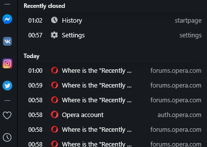
If you click on the clock symbol on the sidebar (on the left hand side), it will open a history tab, with Recently Closed tabs on top. Clicking on any of them restores a tab. It's the same functionality as before, just a different location...

-
roberto64 last edited by
@vikont-0 Yes, I have seen it, thanks for your reply vikont. But before it was all together (closed tabs and tabs on other devices) in a single access much more convenient and practical to find tabs.
Now, they are not only separated, but also to see tabs on other devices opens them in a very impractical large window compared to the immediacy it had before accessing everything.
And on top of that, they replaced access to all of this with a search popup that adds nothing, and to top it off, it doesn't even take dark mode.
They are all negative details compared to the practicality of the previous access.
Those of us who have used Opera for a long time, largely love it for those practical details, such as the fact that you can go back to the beginning of a page by clicking on its tab ... it's as if they took that away from us. The improvement is not understood.
And on top of that is a change that was resisted many months ago, by many users: just look at the number of visits from these threads ...
It is incredible that they do not listen to many people, it is not something that a couple of users crave because they do not like a detail, it is something that makes the browser less practical ... and it seems that they do not care.
Thanks vikont, I still appreciate your message. -
jolang last edited by
@vikont-0 said in Where is the "Recently closed tabs/Tab menu" button on the top right?:
If you click on the clock symbol on the sidebar (on the left hand side), it will open a history tab, with Recently Closed tabs on top. Clicking on any of them restores a tab. It's the same functionality as before, just a different location...
Thanks for that! But still, that is not that user-friendly.
