[Solved]Bring back the "Recently closed" button on the top bar on the right
-
andrew84 last edited by andrew84
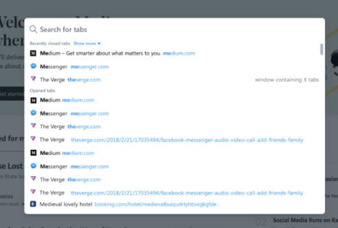
@ericartman92 If they polish the new 'search in tabs' popup correctly, then it will be an acceptable alternative to the removed TabMenu (worse but acceptable). Currently there are only 3 last closed tabs visible and no dark theme support. On their blog's screenshot I saw the 'show more' dropdown which probably will allow to view more closed tabs in future. Personally I think there should at least 10 closed visible (like in OMenu>History) + 'show more' dropdown. I think that 'open tabs' must be collapsable too (like in the old TabMenu) and if 'open tabs' are collapsed, then the whole height of the popup can be used for the 'closed' tabs.

-
ericartman92 last edited by
@andrew84 well, we'll see how it goes. Until then, I don't think it's a worthy substitute.
-
ericartman92 last edited by
@andrew84 remember that it should also "remember" your choices as to what should stay collapsed and what not in order for it to resemble the current feature.
-
andrew84 last edited by
@ericartman92 said in Bring back the "Recently closed" button on the top bar on the right:
should also "remember" your choices
Sure, like it works in TabMenu.
-
leocg Moderator Volunteer last edited by
@superduper said in Bring back the "Recently closed" button on the top bar on the right:
I personally think that the #search-in-closed-tabs flag will keep the button
If you mean the tabs menu one, it will not. However you will be able to search your closed tabs.
-
A Former User last edited by
@ericartman92 I don't think stopping updates is a viable long term solution. I did stop updates once myself when I wanted the "copy to Notes" feature kept. It was in version 12 something. I held on to it for about 3-4 months, but eventually had to start updating, because things did not work right.
-
A Former User last edited by
Removed the only option that made you prefer Opera. Madmen. A moderator with the rhetoric "No one needs" is also quite indicative.
-
A Former User last edited by
@andrew84 It looks to me like the "Search for tabs" option is functionally the same as the "Recently closed" one. Moreover, it offers a choice of showing more than just 3 closed tabs. So, it looks to me like the feature will go on even in the version 70, albeit under a different name. But who cares about the name?
By the way, how do you get version 70? Mine is only 68 something.
-
roberto64 last edited by leocg
Please: Bring back the "Recently closed" button on the top bar on the right!!
-
avmon last edited by avmon
Incredible but they have eliminated the option to continue using it in Opera 70.
Was it so difficult, at least, to leave the flag to continue using the button?Why their effort to eliminate useful functions?
Do you want us to move from Opera to another browser? -
A Former User last edited by
@avmon They sure did. The put instead that sorry substitution "Search in closed tabs," in which only three closed tabs are shown. I downloaded Vivaldi browser. It seems to have the same functionality and does have the Closed tabs button.
I simply don't the reason why they would shoot themselves in the foot like this.
-
roberto64 last edited by
You should consider the claim of many users and give a positive response:
Please: Bring back the "Recently closed" button on the top bar on the right!!There are many more users who claim it, but they do not take the trouble to write it in the forums, but many of us do not like this change!
-
A Former User last edited by
While the recently closed tab feature is something I am missing it's not that world ending.
On the other hand the thing that actually bothers me is that I used that button to show open tabs on other devices in simple manner.
Now I have to enable sidebar, click on tabs, click on device, click tab I want to open, disable sidebar. So instead of getting simple drop down menu and getting the tab I want in 2 clicks I have to go through loops and hoops from one side of screen to another like some demented hamster in his wheel.
So please, either revert or give us an option to enable additional button/s for tab explorer on device (in that drop down menu it was) and/or closed tab list.
-
rocketank last edited by rocketank
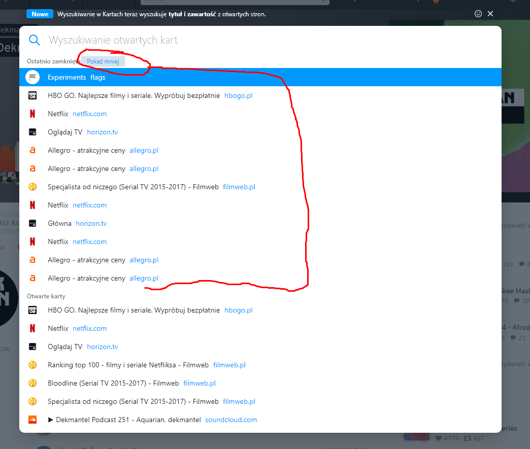
Check this out. There will be show more button. Quite more acceptable...
Opera Developer v71.0.3763.0
You have to enable #search-in-closed-tabs-show-more in flags.
-
csongor242 last edited by
What was their problem with the drop-down "recently closed" tabs? Why they had to change it to this full-window thing? I never used the search for open tabs function, not once, but I use the recently closed constantly and I think it was pretty good as it was, just click on the droppdown and you barely have to move your mouse. Now it does this whole darkening the background animation and all, and it's just irritating. Why do they have to overcomlicate everything?
-
the.illidan last edited by
i'm not restarting my browser so it can't update, waiting for version with recently closed tabs
-
ericartman92 last edited by
I never thought this thread would find so many people that miss this feature. Let's hope our opinions are heard by the people making the decisions, although we all know the chances are pretty slim.
Anyway, what people seem to forget when saying "why do you even need to have many tabs" is
a) we might not have them all open, but we go through a lot of them. My personal work is somewhat related to research and I go though many web pages and I do need to go back to a closed one, or check which one I closed and so on. I think what we initially had was a very solid feature with a very normal and relatable use case to it. In my view, it should not have been removed, but, alas, it has.
b) honestly, I find it quite arrogant that people tell others that "the feature had no use and it's right that they removed it". It is obviously irrational, since it did in fact have use, as proven by the number of people complaining about its removal.I am sad that opera had made these decisions, I can't demand an explanation from them, but as a software developer, they could have at least told us in a sentence or two how the workflow should now be, or of they have an alternative in the making and we need to wait.
-
A Former User last edited by
Nothing that I could at to this, but only second it a countless number of times. I simply see not reason why such a useful feature could be taken off, unless it's some sort of a social experiment.