Opera 69.0.3686.0 developer update
-
andrew84 last edited by andrew84
Suggestion regarding the custom site panel.
What about a really custom web panel where I can open any site?
There can be few simple controls at the top: address field, refresh, back/forward. At the bottom there could be zoom option and buttons: 'open current page in browser new tab' and 'open current browser's tab in panel'. Also, custom sites can be collected there to not to clutter the sidebar.

P.S. I saw similar panel in Extension (called 'web panel' https://addons.opera.com/en/extensions/details/web-panel/), but it shows that it was not checked by moderators and I like when such things are integrated and look in one style (like History/Bookmarks panel)
-
andrew84 last edited by
No fix for scrollable context menu (https://blogs.opera.com/desktop/2020/05/opera-69-0-3679-0-developer-update/#comment-209470)
and
for the appearing/disappearing cross on first speed dial tab
https://forums.opera.com/post/207206 -
burnout426 Volunteer last edited by
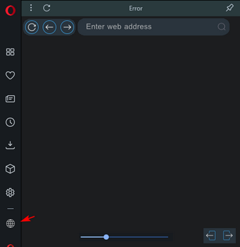
For the custom site panel, I tried adding
data:text/html;charset=utf-8,test. It gets added, but the icon is invisible on the sidebar. If I click it, it'll load "something went wrong" in the panel. If I then click "open in new ", it loads about:blank.Same situation but with
opera://settings/siteData. "Something went wrong" again and "open in new tab" opensopera//settings/siteData(notice the missing:.Same situation but with
file:///C:/Users/username/Desktop/test.html. "Something went wrong" and "open in new tab" opensfile///C:/Users/username/Desktop/test.html(notice the missing:again)Tried
javascript:alert('test')%3Btoo. "Something went wrong" and "open in new tab" opens about:blank.Tried
chrome-extension://llaficoajjainaijghjlofdfmbjpebpa/newtab.htmltoo for FVD Speed Dial's page. "Something went wrong" and "open in new tab" openschrome-extension//llaficoajjainaijghjlofdfmbjpebpa/newtab.html(notice the missing:again)I also noticed that the limit in the UI for site panels seems to be 5 at the moment.
-
A Former User last edited by
Sites panel is really useful. For now, only five are allowed. But is fine.
-
A Former User last edited by
@kened: Opera totally crashes when I try to remove one panel. I had to reinstall Opera.
-
andrew84 last edited by andrew84
@burnout426: How it should work (what's the main idea), these 5 sites are just like bookmarks that open in side panel?
In this case the 5 sites limit is too small, but more than 5 sites will clutter the sidebar (5 workspaces limit is ok because each workspace can contain a lot of tabs).
When I first saw the 'custom site' flag I thought that it will be possible to open any site I want in this panel, and inside the panel I will be able to add few sites into my favorites. If in short, 1 panel that will contain links to favorite sites. Or there should be an option 'show in panel' in context menu when right clicking on page, for temporary view. -
burnout426 Volunteer last edited by
@andrew84 said in Opera 69.0.3686.0 developer update:
When I first saw the 'custom site' flag I thought that it will be possible to open any site I want in this panel, and inside the panel I will be able to add few sites into my favorites. If in short, 1 panel that will contain links to favorite sites.
I personally didn't expect that and just expected it to be like Opera 12 and Vivaldi's web panels where you add a single site as a web panel so you can use that site via the sidebar.
However, something like what you're expecting sounds cool. Sort of like a Browser View panel that has its own little address field and bookmarks or something. Its bookmarks could be tied to a bookmarks folder of your choosing for example. Or, it could be done a different way.
Or there should be an option 'show in panel' in context menu when right clicking on page, for temporary view.
Vivaldi has "add link as a web panel" when you right-click a page. That's nice and Opera should have that too. it'd would be temporary though if done like Opera 12 and Vivaldi. You'd have to remove the panel after you're done using it.
In this case the 5 sites limit is too small, but more than 5 sites will clutter the sidebar
Indeed. But, the sidebar is scrollable when things get too long, so I guess it'd be alright to allow more.
-
andrew84 last edited by
@burnout426 said in Opera 69.0.3686.0 developer update:
sounds cool. Sort of like a Browser View panel that has its own little address field and bookmarks or something
Yes, I thought that there's a plenty of extensions doing this, but I've found only 1 (web panel https://addons.opera.com/en/extensions/details/web-panel/). I'd like to see the similar in Opera by default because quite often extensions are outdated and not supported.
-
andrew84 last edited by andrew84
I described earlier(reported it many times btw, in both 68 and 69 threads, in 67 it worked better) that there's a 'flashbang' issue while starting the browser and when switching internal pages in dark mode (https://forums.opera.com/post/207279).
I also noticed that when I open bookmarks from start page there's again a full screen flash before page appearing, recently (most probably in 67 version) it worked smoother and I saw already loaded page, like it was shown here on the 'after' demo https://blogs.opera.com/desktop/2019/10/opera-65-0-3467-24-beta-update/
Probably these are 2 related issues because recently I also did not have the white 'flashbangs' while switching internal pages or on browser start.Please confirm somebody whether your SD tile opens with white flashbang before page is loaded or it opens like it was shown on demo.
-
andrew84 last edited by
@andrew84: the same issue on forum https://forums.opera.com/topic/40541/flashbang-while-loading-page
-
ralf-brinkmann last edited by
The 69.x is in Beta status now. So we can expect a new version series next week.
-
andrew84 last edited by andrew84
-
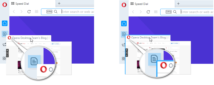
Is it an intended that the draggable tab's thumbnail has not aligned left border and the caption's bottom corners are still rounded while the browser's tabs have square bottom corners now (like it was in version prior to reborn3), on all channels.
O58 vs 68/69

-
I know that the drag and drop feature for workspaces is disabled yet by default, just a suggestion:
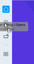
When dragging a tab the workspace's icon should also react on thumbnail's left upper corner, not only on the cursor. Thumbnail's left and upper borders can be highlighted if 'Workspaces' feature is enabled in Settings (in this case the aligned left border like in O58 will look better too)

Currently when I grab a tab(in the middle) and try to drop it I need to move cursor until I see the '+' sign, thumbnail collapses in this case.

-