• Login
    • Search
    • Categories
    • Recent
    • Tags
    • Users
    • Groups
    • Rules
    • Help

    Do more on the web, with a fast and secure browser!

    Download Opera browser with:

    • built-in ad blocker
    • battery saver
    • free VPN
    Download Opera

    improving dark skin

    Opera for Windows
    5
    17
    5194
    Loading More Posts
    • Oldest to Newest
    • Newest to Oldest
    • Most Votes
    Reply
    • Reply as topic
    Log in to reply
    This topic has been deleted. Only users with topic management privileges can see it.
    • mrpantz
      mrpantz last edited by

      Agreed, not enough contrast, so it's a clear usability issue.

      It's more noticeable on some monitors, because not all of us have their monitor brightness and contrast maxed out.

      Solution: Increasing the contrast on active tabs will help prevent accidentally clicking or closing the wrong tab - this happens a lot due to the poor contrast.

      Reply Quote 0
        1 Reply Last reply
      • leocg
        leocg Moderator Volunteer @seriousgigi last edited by

        @seriousgigi It looks clear to me.

        Reply Quote 0
          mrpantz 1 Reply Last reply
        • mrpantz
          mrpantz @leocg last edited by

          @leocg Happy to hear it looks clear to you. Perhaps your eye sight is perfect, but not everyone's is (mine isn't). And not everyone will have the same contrast/brightness setting on their computer - this is a variable that can drastically affect the contrast between active/non-active tabs.

          While I don't believe that developers can account for every variable, I do believe there can be additional contrast added for active tabs so that usability is not an issue. Right now it clearly is a usability issue, otherwise users would not be reporting it.

          Reply Quote 2
            leocg 1 Reply Last reply
          • leocg
            leocg Moderator Volunteer @mrpantz last edited by

            @mrpantz They could use private window theme/color in main window.

            Reply Quote 0
              andrew84 1 Reply Last reply
            • andrew84
              andrew84 @leocg last edited by andrew84

              @leocg pink/purple?
              It'd be a disaster.

              Reply Quote 1
                leocg 1 Reply Last reply
              • leocg
                leocg Moderator Volunteer @andrew84 last edited by leocg

                @andrew84 Why? It works in private window.

                Reply Quote 0
                  andrew84 1 Reply Last reply
                • andrew84
                  andrew84 @leocg last edited by

                  @leocg it works yes, but looks awful.

                  Reply Quote 0
                    leocg 1 Reply Last reply
                  • leocg
                    leocg Moderator Volunteer @andrew84 last edited by

                    @andrew84 It should have been an affirmation, not a question in my previous comment. I fixed it now.

                    For me the color in private window is great and could be used in the main one.

                    Reply Quote 0
                      andrew84 1 Reply Last reply
                    • andrew84
                      andrew84 @leocg last edited by

                      @leocg Everyone has his own taste.
                      I can see that software companies usually use color gradations for the dark themes to keep uniformity and more pleasant/calm look to eyes, and I share their vision. Check YouTube's, Adobe's, Windows's and other's dark themes. Mainly there are dark gray color and its gradations + some contrasting elements (buttons/toggles/switches).
                      Opera private window's theme looks like one of the accessibility options is enabled in settings (high contrast for example),
                      Purple/pink + dark navy inactive tabs (light navy on hover) + dark gray bookmarks bar dropdowns + white selected items.... sorry, but I can see no serious work was made here regarding the how do the other UI's elements look/interact with the pink toolbar.
                      They just painted the toolbar pink and think that it looks modern because nobody else uses such kind of indication, For some reason they don't think that other companies don't use because it doesn't look serious. When I open that pink private mode I don't have feeling of privacy or safety and of working feature.
                      *If you see some security guards in pink suits/shoes or pink sunglasses, you must probably think that these guys are just clowns.

                      Reply Quote 0
                        leocg 1 Reply Last reply
                      • leocg
                        leocg Moderator Volunteer @andrew84 last edited by

                        @andrew84 I don't really think that the color of something determines if it is something serious or not.

                        Reply Quote 0
                          mrpantz 1 Reply Last reply
                        • mrpantz
                          mrpantz @leocg last edited by

                          @leocg whether it is serious or not is totally beside the point. Using a private window is not a solution to fixing the usability issue that exists in the dark theme. And using a private window is not a replacement the dark theme. AT best it's a temporary workaround.

                          The existing issue is confusion and difficulty identifying the active tab for many users.

                          When it comes to UI design, whether it looks cool is not a factor that should override usability. Ask someone with a visual impairment to try and identify the difference between two closely related shades of grey.

                          Lightening the active tab, while keeping the dark mode will help solve this basic usability flaw.

                          Reply Quote 1
                            andrew84 leocg 2 Replies Last reply
                          • andrew84
                            andrew84 @mrpantz last edited by

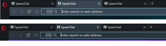
                            @mrpantz Check the latest Developer build, it offers a bit more lighter navy color for the toolbar and active tab. I don't know if it's an intended change.

                            Dev vs Stable
                            2020-03-24_194957.png

                            Reply Quote 0
                              mrpantz 1 Reply Last reply
                            • mrpantz
                              mrpantz @andrew84 last edited by

                              @andrew84 Thanks. Hopefully that makes it into the stable build. It's MUCH better.

                              Reply Quote 0
                                1 Reply Last reply
                              • andrew84
                                andrew84 last edited by

                                I think that they should adjust color for the inactive tab hover effect too. Now it looks identical to the active tab (in Dev. version)
                                2020-03-24_203017.png

                                Reply Quote 0
                                  1 Reply Last reply
                                • leocg
                                  leocg Moderator Volunteer @mrpantz last edited by

                                  @mrpantz I never said that private window should be the solution but that its colors scheme could be a possible one for those who want a different color for the active tab.

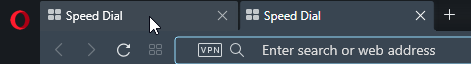
                                  And my eye sight is far from being good, even so I can tell which tab is the active one, at least most of the times. Maybe it's my monitor, don't know.

                                  Anotação 2020-03-24 163418.png

                                  This is what I see and it seems pretty easy to say which one is the active tab.

                                  Reply Quote 0
                                    1 Reply Last reply
                                  • First post
                                    Last post

                                  Computer browsers

                                  • Opera for Windows
                                  • Opera for Mac
                                  • Opera for Linux
                                  • Opera beta version
                                  • Opera USB

                                  Mobile browsers

                                  • Opera for Android
                                  • Opera Mini
                                  • Opera Touch
                                  • Opera for basic phones

                                  • Add-ons
                                  • Opera account
                                  • Wallpapers
                                  • Opera Ads

                                  • Help & support
                                  • Opera blogs
                                  • Opera forums
                                  • Dev.Opera

                                  • Security
                                  • Privacy
                                  • Cookies Policy
                                  • EULA
                                  • Terms of Service

                                  • About Opera
                                  • Press info
                                  • Jobs
                                  • Investors
                                  • Become a partner
                                  • Contact us

                                  Follow Opera

                                  • Opera - Facebook
                                  • Opera - Twitter
                                  • Opera - YouTube
                                  • Opera - LinkedIn
                                  • Opera - Instagram

                                  © Opera Software 1995-2025