Opera developer 60
-
jojo0587 last edited by
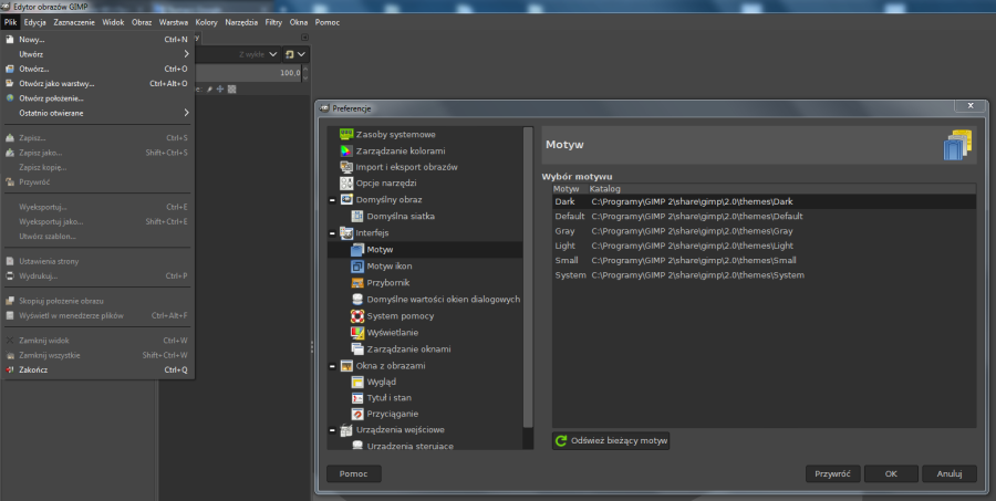
@leocg I think I would have an idea. For example, the dark theme in the GIMP program. The menu has the same color as the rest of the program, it has no white border on all four sides, but everything is legible. And the menu separators are not white. I know that the theme in Opera will be darker, so as in GIMP, give up the menu border and the separators instead of white ones give a gray one?

My proposals for changes in Opera (Google Document).
- There are not enough signs to put all the links here. -
lowlife9 last edited by
I've w-a-i-t-e-d years for dark mode finally all dark, eureka!
Also background Personal News Jumping Jehosophats, it works.
Still News index on left takes up too much of screen ......
Can the index possibly swing in or out?
Also my Downloads [More] button reveals a blank page?
Great work Team Opera I've now got 3 portable dev versions,
for differant subjects. -
jojo0587 last edited by
@leocg no, the new dark color of the Opera is OK. I just wanted to write on the example of GIMP that the white border around the menu may be unnecessary, and the separators that separate some options do not have to be white, for example, they may be gray.
My proposals for changes in Opera (Google Document).
- There are not enough signs to put all the links here. -
A Former User last edited by
please support these futures:
https://forums.opera.com/topic/24406/support-ctrl-and-shift-buttons-for-select-multiple-pages -
smsmith last edited by
This may be difficult for me to describe...
On two separate computers using different graphics cards, I have found a visual bug when using the minimize button in the titlebar using Windows 10.
If I minimize the window using the minimize button in the titlebar, when I restore the window from the taskbar, the minimize button appears to be hovered, even though it is not. If I mouse over the button, it goes back to how it should look. This happens in both the light and dark themes.
If anyone else can confirm, and also let me know where to file a bug, I would be happy to file the bug.
Thanks!
-
A Former User last edited by
@lowlife9 said in Opera developer 60:
I've w-a-i-t-e-d years for dark mode finally all dark, eureka! https://tgw.onl/hostgator/ https://tgw.onl/dreamhost/ https://tgw.onl/bluehost/
Also background Personal News Jumping Jehosophats, it works.
Still News index on left takes up too much of screen ......
Can the index possibly swing in or out?
Also my Downloads [More] button reveals a blank page?
Great work Team Opera I've now got 3 portable dev versions,
for differant subjects.And how do you think it should look? For me, it's perfect.
-
A Former User last edited by A Former User
New update - Opera developer 60.0.3242.0
;-)
The change log, and the announcement.
"This Opera 60 developer update contains more fixes for Reborn 3 UI issues, such as:
- Unpinning sidebar is reflected to the change on the Easy Setup panel.
- Some dark-themed pop-ups are more readable now.
- Clicking on ‘Extension options’ works again.Snap packages are not available for this version."
Other important fixes and changes:
- DNA-71064 Crash at ToolbarActionsModel::AddItem(ToolbarActionsModel::ToolbarItem).
- DNA-75717 Renderer crash at base::Value::InternalCleanup().
- DNA-75779 Move page actions buttons from addressbar to toolbar.


-
lucasnorthmi51959 last edited by
Using a color scheme similar to IObit Uninstaller would be a treat but I guess everyone would have
their own choice of theme if they could, look at 'Vivaldi' the choices are there at least. -
jojo0587 last edited by
@lucasnorthmi51959 I am not going to give up the Opera by a few functions that are important to me. But just Vivaldi in terms of color settings raises Opera. I would like the functionality of the Opera to be similar. Everyone could then make their motif 100% tailored to each other.
My proposals for changes in Opera (Google Document).
- There are not enough signs to put all the links here. -
A Former User last edited by
New update - Opera developer 60.0.3248.0
;-)
The change log, and the announcement."It contains many improvements in dark mode, and some platform-specific fixes."
The Chromium has been updated to version 73.0.3683.46.


-
karcyon last edited by
Latest changes have made me switch to Opera from Firefox. Firefox gets slower with each release... keep up the good work!
-
A Former User last edited by A Former User
New update - Opera developer 60.0.3254.0
;-)
The change log, and the announcement.
"With this build, we’re providing more Reborn 3 visual improvements."
Also, you can select (again) maximum number of columns on the Speed Dial: go toopera:settings/startPage, disable "Automatically adjust the maximum number of columns", and below you should see "Maximum number of columns" option.
Important changes and fixes:
- DNA-75127 [Mac] Context menus in dark mode.
- DNA-75442 Sidebar menu dialogs in dark theme.
- DNA-75507 [Dark] ‘New extension’ popup is unreadable.
- DNA-75546 Lack of devices in Tabs list after sync.
- DNA-75886 Add possibility to manually control the SD max column count.
- DNA-75922 CryptoWallet on Desktop: Enable / Disable from Settings and EasySetup.
- Bookmarks bar folder pop-up looks nicer in dark mode.


-
A Former User last edited by
Have they fixed the bug which makes Opera 57 & 58 crash when Preferences are opened?
-
A Former User last edited by
Hi @concretable, about which case scenario do you speak? if you mean, when the #new-md-settings is disabled, then I think not, because old Settings layout seems to be abandoned, and the flag is removed in the current Beta and Developer.