@amyd32193 It looks like 23 days ago you posted this and no response from Opera?? I guess they don't care about their users.
Best posts made by scubadogs1742
-
RE: General Opera One Appearance Feedback TopicAppearance
-
RE: General Opera One Appearance Feedback TopicAppearance
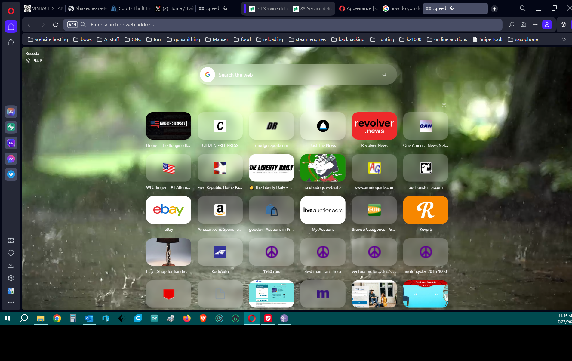
@gustavomolina I agree. Worked in IT for over 40 years. Ran many roll outs of new products and services. This one is far the worst. I use my speed dial page a lot. My tiles were all solid and large so I could see them. Upgraded and now I have to go into each one to correct their upgrade just to get back what I had before the upgrade. I have used Opera since 1997 as my main browser. No support or even one word about this from the company. They lost me as a user.! Who would think leaving your user with a speed dial page like this is the proper thing to do? speed dial.png
-
speed dialAppearance
 Here is what I was left with after my upgrade to Opera One. My speed dial page is all messed up. I have to go into each icon and manually change these to something I can see. Why would a company roll out an upgrade that hurts their users and destroys what they were using......One that does not care about their users, like Opera One. Not a word is heard from the company to all the users who are complaining and reporting this issue. Since 1997 I have used only Opera. Now I am switching to FireFox or Brave. You pissed me off Opera, you don't care about me now I don't care about you... see you later!
 -
RE: Opera Speed Dial bring back the old style?Appearance
Just read a lot of these and I did not see anywhere that Opera has responded. I have been using Opera for many many years. This upgrade to One sucks. Their features are now our problems. maybe a change is needed......Brave?
Latest posts made by scubadogs1742
-
Spell checkOpera for Windows
Can you upload a new dictionary to Opera? the Opera spell check is very bad, no suggestions, simple things like ei or ie are not found when checking.
-
RE: General Opera One Appearance Feedback TopicAppearance
@koko1111 The one thing that was a old complaint was to be able to change the font color on the Speed dial page. This was not addressed. Your correct we don't like to be forced to upgrade to this. Bye Opera...Hello Firefox for now
-
RE: General Opera One Appearance Feedback TopicAppearance
@gustavomolina I agree. Worked in IT for over 40 years. Ran many roll outs of new products and services. This one is far the worst. I use my speed dial page a lot. My tiles were all solid and large so I could see them. Upgraded and now I have to go into each one to correct their upgrade just to get back what I had before the upgrade. I have used Opera since 1997 as my main browser. No support or even one word about this from the company. They lost me as a user.! Who would think leaving your user with a speed dial page like this is the proper thing to do? speed dial.png
-
speed dialAppearance
 Here is what I was left with after my upgrade to Opera One. My speed dial page is all messed up. I have to go into each icon and manually change these to something I can see. Why would a company roll out an upgrade that hurts their users and destroys what they were using......One that does not care about their users, like Opera One. Not a word is heard from the company to all the users who are complaining and reporting this issue. Since 1997 I have used only Opera. Now I am switching to FireFox or Brave. You pissed me off Opera, you don't care about me now I don't care about you... see you later!
 -
RE: General Opera One Appearance Feedback TopicAppearance
@amyd32193 It looks like 23 days ago you posted this and no response from Opera?? I guess they don't care about their users.
-
RE: Opera Speed Dial bring back the old style?Appearance
Just read a lot of these and I did not see anywhere that Opera has responded. I have been using Opera for many many years. This upgrade to One sucks. Their features are now our problems. maybe a change is needed......Brave?