Difficult in creating a new account
-
whisperer last edited by
@andrew84 said in Difficult in creating a new account:
@whisperer said in Difficult in creating a new account:
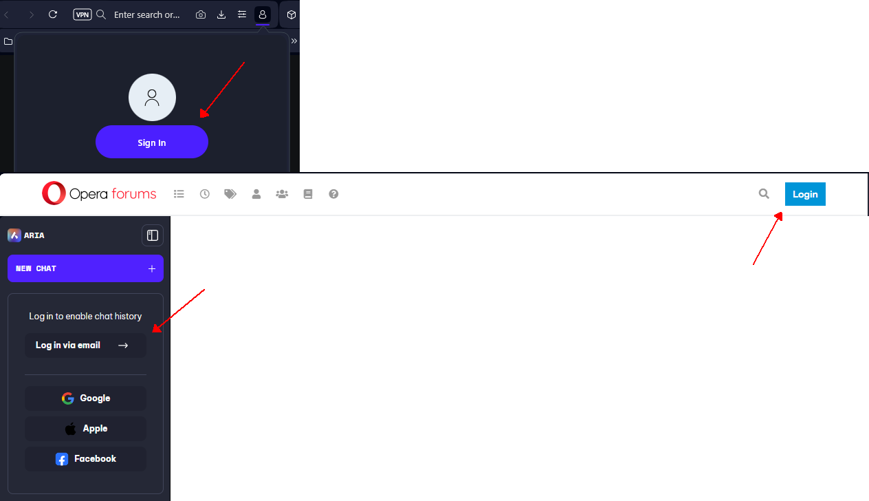
There is no button or link for creating an account, but you have to use the Login button for that.
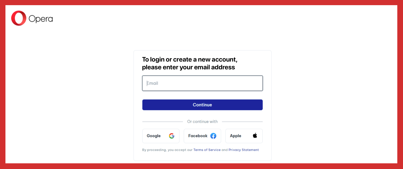
There's 'continue' button by default and depending on whether email exists or not on next step the button will be transformed to 'sign in' or 'create account.
But I agree that it'd be more clear if there were two separate forms.
I meant in order to get to this dialog you have to click a Login button, there is no button or link for creating an account.
-
Formingus 0 last edited by
@whisperer Friend, yes i do click on login and get what I said before. Anyway as we said, it will be more clear to exist small Sing UP button and avoid confusion. Dude, thanks very much for help. All best regards
-
andrew84 last edited by
@whisperer said in Difficult in creating a new account:
you have to click a Login button,
You mean the opera account popup on the address bar?
If yes, I agree. There should be a direct way to login using the popup instead of redirecting to web page. It should redirect only if someone wishes to create new account. -
leocg Moderator Volunteer last edited by
@whisperer The page says "Let's start with your email address", so I guess it's clear that you should provide an email address.
-
leocg Moderator Volunteer last edited by
@Formingus-0 Maybe another account is using the same email address.
-
whisperer last edited by
@andrew84 said in Difficult in creating a new account:
@whisperer said in Difficult in creating a new account:
you have to click a Login button,
You mean the opera account popup on the address bar?
If yes, I agree. There should be a direct way to login using the popup instead of redirecting to web page. It should redirect only if someone wishes to create new account.I mean things like these:

If the user wants to create an account, he has to click Login and then there is no hint for creating an account.
-
Formingus 0 last edited by
@leocg No, in my case, it was some extensions and AdBlocker that caused the issue. In both cases, there needs to be a single "Sign In" button to make it clear.
-
andrew84 last edited by andrew84
Ok, I see now. Indeed a bit confusing.
I may be wrong but it's a relatively new form.
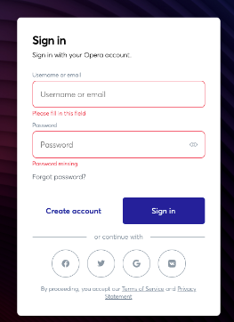
It was different previously, I've found some pictures.

*The new form really a bit confusing but didn't bother me much. What bothered me is that the same account is used for Opera forum and Opera itself. So when I log in on forum I automatically will be signed in Opera and I need to sign out. I'd prefer two separate accounts
-
Formingus 0 last edited by Formingus 0
@leocg If you don’t see the reason, it doesn’t mean it doesn’t exist! They may not be concerned, but this is why four of us migrated to Chroma. Many people have suffered because of their stubbornness. Imagine how many Opera users are lost simply because they don’t see the typical 'Register' or 'Sign Up' button, and you’re saying you don’t see the reason! Do you think everyone in the world has your level of PC skills and they know for this future? Anyway, it’s your project or anyone else’s; you can decide how to run it. As for mine, it’s take it or leave it.
-
unretarded-carla last edited by
Is there a good reason why the screen for logging in or opening a new account could not have a different statement stating what someone should do, making the dual purpose of the form explicit?

I believe I know the answer to that question. I am curious to see other answers advocated by various people.
In the last three months or so, I have come to have a newfound happiness and purpose in life. The way newcomers vs. experienced Opera Forum users respond to the comments regarding the signup process being confusing shows the magnitude of the work in front of the human race is daunting. At least now, we have a chance to save ourselves.
There is a way the Opera browser could contribute even more than it has already. The good news is, no open mind required.