General Opera One Feedback Topic
-
leocg Moderator Volunteer last edited by
@forestworker90 Sorry, I still can't read minds. So I will need a context.
-
Renato-C last edited by
I am a long-time user on windows desktop and have always used opera as my main browser because of the minimalist style and tools. Opera One for me is going in the opposite direction. Module structure might be okay but nothing really useful compared to what could be done before, with the problem of "gaps" between icons and sections reducing visibility. Of course you just have to get used to it and it all goes away, but besides that, in the short time I have had to try the browser I have also found some things work worse, the main one being the ads filter that no longer works on some sites such as youtube. Unfortunately I went back to 99 after 10 minutes....
-
Lamsoonia last edited by
Hey guys, never mind, I found a way to turn off the auto-updates and go back to the Opera I love.
Mods, don't hate me, I know you aren't even being paid. It's just kinda sucky (super sucky actually) what direction this browser is going towards. -
TheDonsWay last edited by
Quite simply, How do I go back to the previous version, and turn off auto updates? Every time any company releases a new version of something, they stuff it up for the rest of us that use it. Stop changing things that work well, please!
-
mna91028 last edited by
@Lamsoonia can you give a brief explanation? Did you download an offline installer of a previous version from somewhere?
I want to go back because of this bevel. You can no longer just push the cursor to the right edge of the screen to hit the scrollbar, you actually have to nudge it by three pixels and place it precisely. I refuse to believe anyone actually usability tested this, they just looked at static mockups and thought it looked pretty.

-
opt Banned last edited by
Opening a link to a youtube channel's videos page takes long time to load in opera one. I tested with previous version and it loaded the same link instantly. Same results with other channels.
Missing start page button.
Obnoxious splash screen with sound on startup.Rolling back and if things don't get fixed I'm going to switch to something else.
-
LitKng last edited by
I'm a GX user since its inception. I was always a Firefox user before that, but when GX got released I just fell in love with its many settings and how optimized it was, but there was always one thing I never really loved about it: the design. It's cool I guess, but I much prefer the simplicity and modern aspects of other browsers, but, in the end, functionality sold me over and I stuck with GX. I only really found out about Opera One yesterday and immediately fell in love with it, from the screenshots it looked like exactly what I wanted: GX minus the Cyberpunk 2077-inspired design. So I downloaded it and immediately got disappointed:
- Migration between Opera browsers is way harder than it should be
I'm not sure how it is from One to GX, but from GX to One is a big pain in the butt. I have no clue why it is that, by default, in the %appdata% they both use different "Opera Stable" folders. I don't think anyone would really use both GX and One in the same machine given how similar they are to one another and besides I would imagine this could be easily mitigated by giving the option to do so in the installer for the odd few people that might. There was also no option to import data from GX to One, meaning I had to manually go there, copy all the folders and paste it. It's the same exact folder structure, same everything. This is only something that I found out after doing some research on how to migrate from one to the other, as Opera Sync isn't really that useful there or at least I couldn't find a easy way to make it work.
But anyways, after half an hour or so of research and then setting things up I finally got it working and had all my accounts, history, extensions and whatnot on One and could finally enjoy my experience with it. So I booted the thing up and got absolutely blasted by one very loud start-up sound. Why is this a thing and why is it so loud?! GX does have one, sure, and it's dumb there too, but at least it isn't as loud as One's. Please, for the love of god, let me disable the sound in the splash thing-y - speaking of which, for both GX and One, please get rid of the splash thingy, it's so unnecessary and annoying. When I open a browser, I do so with an intention or a website I need to go to and so on, I don't want to have to sit around for ~5 seconds to wait for a cute animation with a loud annoying sound to end to finally be able to browse. Locking updates almost feels like a necessity because of this unnecessary "feature". What's the point of even having a splash screen? I already know what software I'm opening and if your browser needs to load stuff up like it's Photoshop or a much more feature-heavy software, there's something very wrong with it. Also the fact that there is an animation/jingle means it probably waits for that to finish even if the browser has already finished loading up. It's just unnecessary and super annoying.
So after this half an hour screwing around to import my data from GX and the extra few seconds watching a cute animation that blasted my ears with a loud sound I instantly got disappointed by the exact reasons that got me into the browser in the first place: design. - What's with the borders?!
It's not pretty. it's more annoying than functional given how it disables the scrolling if your mouse is there and overall it's just taking screen space for seemingly no reason. Sure it's just a few pixels, but then again, it's completely unnecessary. I guess it's to frame the window, but it's just a weird decision when nothing in the computer does that. Not even the GX browser that's unlike everything else and could maybe pull off a border (this isn't a suggestion). I could somewhat excuse it if it was only for the windowed/normal state which is already stupid but it's whatever, but why is it there when maximized? Also why is it not consistent? The top and right borders are both 3px tall/wide respectively, the left and bottom are 4px. - the "liquid gradient" aesthetic is cute, but pointless if you're not going to make it move somehow.
This is more of a pet-peeve than really an issue here, but you could just have a live wallpaper, or a muted blurred background in the top bar or something. The whole point of the liquid gradient design is to make it move (as it is meant to be a liquid)... at least a palette shift or a blurred low resolution video or something, I mean come on, it's not that hard. If you're going to do it, go all the way. If you're worried people might find it distracting or annoying just give them the option to turn it off. GX also has a similar issue of things being a bit too static even if it's meant to be a "gamer browser", but at least it's customizable enough that it's not that annoying. Speaking of pet-peeves... - I really wish I could customize the colors. Blurple is fine enough, I suppose, but we live in a time where most browsers allow you to customize the colors or add themes. Especially coming from GX which is a super customizable experience.
- I really enjoy Aria, but... it's extremely dumb and dated.

I appreciate Opera One having it's own AI solution. I think it's very well integrated with the software and I love having a shortcut for it. I don't love how every time I do a Ctrl+/, even when I'm on the exact same page, it starts a new chat. If I'm reading a page and looking for words to translate for example, I'll end up with 10 or so new chats as opposed to just the one for my translation needs. It would be very appreciated if it could group-up similar themes (given how one of the biggest selling points of the browser is grouping things up) or use the same chat for the same page. Or, at the very least, add an option to use the last open chat, like, say, use Ctrl+Enter to send the prompt.
Speaking of which, Shift+Enter does not break the line, which makes it difficult to send complex tasks through the usage of the Ctrl+/ command. Pasting a prompt with a linebreak adds a weird looking symbol where the linebreak will go. I guess I can open the sidebar and use it through there if I need something more complex done, but then again, I could also just use a better AI solution just as easily. I feel like if you're going to give us an option to use an "in-browser" AI, it should be as flexible and useful as it can. If it takes me the same amount of steps as to just open GPT, it suddenly makes Aria pointless to have. I'd also appreciate if the prompt bar would resize and break the line as the prompt gets larger. Flexibility is never a bad thing.
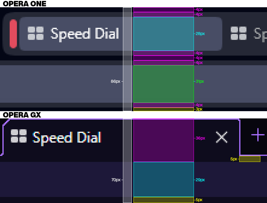
Also (I know this is a very tall suggestion) if you're going to make a browser with a built-in AI, if would be very nice to have it able to read/perform tasks on current open tabs or other browser functionalities. Something like "Hey Aria, change my theme to light", "Find and highlight all instances of the word "Opera" on the current page", "replace all instances of the word "opera" with the word 'ball'", "group all tabs starting with 'Y' on an island", and so on. Even if it's just to perform simple tasks that you could do with a simple few shortcuts like Ctrl+F or changing the HTML in the developer console. It's silly, pointless, etc. but it's the one thing I can see AI being used for in a browser other than just being a side assistant for questions you may have. - Both GX and One could benefit from features from one another, as it is, it's dumb having two different products with this much similarity between them, but it's even more dumb not having all the features one has on the other, as it leaves both experiences feeling incomplete. I love the tab grouping feature and the ability to auto-hide the sidebar. I really do and these are my absolute favorite things about One. I love how all my ugly looking extension icons can be conveniently hidden and get expanded whenever I need to use one. I love the more sober design One has and so on and so forth... but I also really like the typing sounds from GX (it's one of those things I thought I'd hate, but after a while I really grew to liking it), I really like the optimization features that allowed me to kill tabs, limit CPU/RAM usage, etc. and all the many customization options GX has. Plus a few smaller pet-peeves such as the widgets on the starting page being located on the right, or how GX's top bar is slightly shorter than One's since One seems to follow that weird Windows 11 trend of adding spaces between items (as a whole, One has a big problem of just adding spaces everywhere):

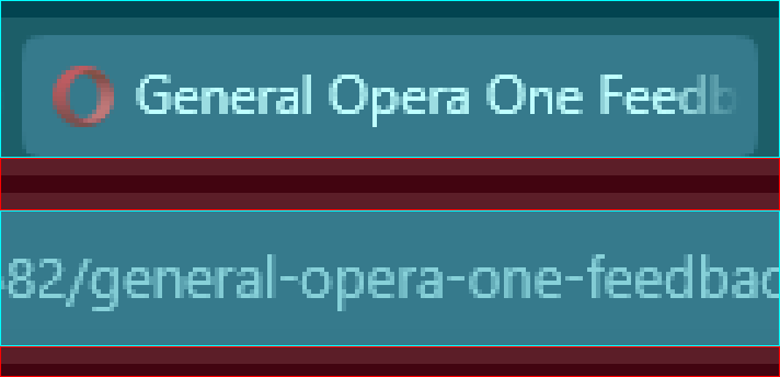
I don't mind the larger top bar as a whole, I think it's probably okay considering One caters to the average user more (not that it couldn't just be fixed by having an option to enlarger its elements) than GX, but the excessive usage of padding just feels very unnecessary. Especially because if you're not using tab islands there's a massive 8px gap on top and bottom of each tab (which when added up with the extra 3px from the top border (the padding under the address bar) and the 4px from the bottom border, adding to a total of 23px (~2% of a 1080p display) of lost screen space for absolutely nothing). Oh, and one thing that just annoys me a lot about the top bar: you can use your mouse on the superior part of it to navigate between tabs, but not in the inferior portion. You also have to be very precise with the address bar even if when it's not selected it just looks like it's far larger than it actually is (this is a problem GX also has, but on One is more noticeable because of how massive the gaps are).

(blue is clickable space, red is useless)
As it is, there's nothing to justify both browsers existing separately. They could both be different themes/presets under one single "Opera" browser, especially because they're both the same app, except with a different layout and some features cut from the other for seemingly no reason other than to make you have to choose between two incomplete browsers and which set of features would you like to have.
And last but not least, the O menu icon is different from the software's icon, this one is admittedly silly, but the O menu uses this flat nice looking icon whereas the software uses the old Opera logo and I think consistency wouldn't hurt.
Functionality-wise I already dig Opera so many of my complaints have more to do with the design than anything else since that's what made me want to give One a go. But as it is, I'm much happier in GX, even if I really love a lot of One's features. I hope these things get patched out or at least added to GX in the near future. One is not unusable by any means, but its weird design decisions leave a lot to be desired.
Anyways, sorry for the long post and lots of pet-peeves but these are the things that actually bother me the most and why I'm not willing to come to Opera One just yet. I'm sure the other problems reported here on this topic are far more important however. - Migration between Opera browsers is way harder than it should be
-
migellito last edited by migellito
Also, the new highlight color is obnoxious. This is coming from a former gui designer. A much better solution would be offering a choice of highlight colors.
-
compression67 last edited by
Problem, I don't use anything in the sidebar menu, I don't use the sidebar.
Now that the Speed Dial button has been kicked of the address bar and into the sidebar, I must turn on that intrusive pos of which I use nothing from. So this leaves the Speed Dial button at the very bottom of the damn screen. You couldn't get it further away from the address bar.... Moronic!
All these feature pimps at the Opera House can stick up there arses. Browser needs to browse, stick and move. This version just sits here like the Turd that it is.
-
GrinningJest3r last edited by
Does anybody else get 2-4 seconds of input lag almost constantly? It feels like at least once or twice per minute just some action taken doesn't immediately respond. The screen doesn't white out, there's no error, it's just an input delay. It's weird I've never had this issue before.
-
Horkol last edited by
For the first look I was not impressed but I gave a chance to Opera ONE. Sadly it sucks for second, third or even fourth look. I use Opera since... I don't even know since when... since forever and for the first time I feel like I try other browsers to see if they can offer something cool. Oper One hurts my eyes.
-
compression67 last edited by
@migellito its in the sidebar menu now, it sucks that its not up top anymore. you have to go into settings to turn it on
-
jito463 last edited by
This is a terrible forced update. The UI is utterly atrocious. I just want to know if I can revert the look back, because this will finally force me to move to Firefox fully. I've been holding onto Opera solely because of the mouse Rocker function, but I will absolutely give that up in a heartbeat to get away from this new design.
-
t-bone tone last edited by
Unbelievably dreadful update. I have lost all my workspaces with many gyazo images. The Tabs is now a disaster, and the perfectly fine address bar arrows to go back and forth through tabs has gone, and we have this totally unintuitive mess for tabs which I couldn't watch past the first 15 seconds.
Thanks a bunch, Opera! Words fail me at how something this stupid -and there is no other word for it - could even get the green light?! Have all the previous Devs gone, and some fresh graduates been taken on or what??? What a mess.
-
t-bone tone last edited by
@t-bone-tone Oh, and I've just lost all my tabs. Magnificent job, Opera. Someone needs firing.
-
t-bone tone last edited by
@t-bone-tone As for 'recovery' lol...BOTH options remove your pinned tabs! Facepalm.
Someone, please tell me this a horrible joke and I'm going to wake up with a working Opera browser instead of this nightmare of unintuitive bilge.