Web page content's border and new modular design.
-
flaviu2 last edited by
@generosus
Very good observation! They tried to make the browser prettier, and the outcome is that suddenly, it's hard to use it, especially for business purpose.So, if you want to use Opera browser to watch cartoon, yes, could be fine, but for daily work, it is distracting and annoying.
-
flaviu2 last edited by flaviu2
@maximilianth
Yes, the design is matter of choice, I agree, but to see if this new design is better or not, please check the functionality and you will see. There are more drawbacks for this new design, and I will mention just one of it:The working view is not stretched from left to right side of the display, and because of that if you have the mouse pointer in that dead and useless (and ugly) space, you will scroll in vain.
So, it is better design ? Take the conclusion for yourself.
P.S. Do you thing that much space between tabs and address bar is looking good ? It looks like they are different windows ... ugly !
-
rahidt last edited by
Missing the old solid design. They should have focused more on the performance rather than silly designs. They removed start page. I dont understand the reason behind such design. Opera should allow customizable design. Otherwise more users will leave opera
-
martin-s last edited by
one simple rule: do something new, do it and the ability to turn it off! I hate the white frame. the cursor gets on it and the scrolling does not work and it looks cheap and out of place
-
flaviu2 last edited by
@rahidt said in Web page content's border and new modular design.:
Missing the old solid design. They should have focused more on the performance rather than silly designs.
Yes, I agree, better to have a performant browser than a fancy one and inefficient !
-
tnt8897 last edited by
I am really not liking the new border. It is quite distracting and provides no value. Really feels like a step backwards.
If the devs really like it and want to keep that that's fine, just give us a way to turn it off.
-
-
-
A Former User last edited by A Former User
@jcmlny said:
@leocg Can I ask you which design do you like more?
Whatever the latest version is.
He likes this one now, and if it reverts back to being all squared, he will think that is the very best.
He has no opinions of his own.
-
-
-
-
Koko1111 last edited by
There are other issues, but just removing this border around the main content would make me way happier with this browser. It looks so damn bad specially in darker pages.
-
-
-
andrew84 last edited by andrew84
I noticed here that in the latest developer build the left and right border is thinner if the sidebar is hidden but 'autohide' mode is active in EasySetup.
Bottom's border is still bold.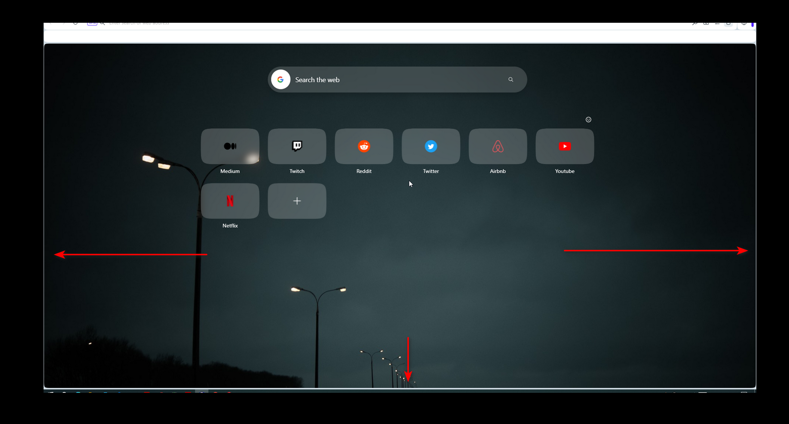
If I turn the sidebar off completely, then only the right's border is thinner.
Conclusion: if the border can be thin and almost invisible, it should be simply removed.
-
A Former User last edited by
The borders around the website content got thinner in the latest developer build.
These thin lines look very distracting when viewing websites with a dark background.
Please give us the option to turn the borders off completely. I'm fine with the rest of the new design.
-- Opera fan since 2005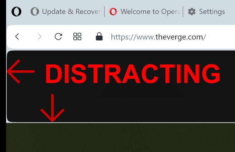
-
flaviu2 last edited by leocg
@lemonlemur
I don't think they listen to us, and we are naive if we think they will change the overall design for us.Read this from their page: Opera offers a complete web experience you can’t get from system defaults such as Chrome, Safari and Edge.
Yes, I agree, those lateral lines are useless and ugly, but they will stay there because they stick for this design.
Do a simple test:
-
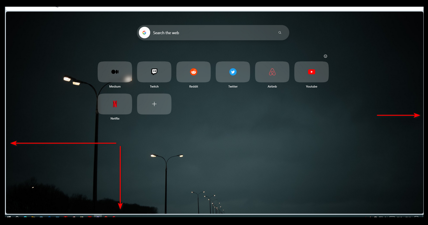
Load a long web page in Edge.
-
Go with mouse maximum left, and scroll. -> The scroll is working.
-
Load a long web page in Opera One.
-
Go with mouse maximum left, and scroll. -> The scroll is not working !! And this design is better ?!
-
-
jerrykist last edited by
The border should be removed or made as thin as possible for a more modern look (Edge removed it).
-
