Opera for Android 52
-
miyukiwork Opera last edited by
Thanks for your input. It's hard to find the perfect color for everyone. Would it make sense to add more color choices in Opera? Currently the only way to avoid the light blue in the tab gallery is to choose the dark theme.
Regarding the title space, we are trying to minor improve this part in next versions. -
polo-naref last edited by
It doesn't matter if I open a new private tab or a regular one, vpn setting never appear.
The problem was there on previous versions too. -
zalex108 last edited by
I've seen Ads using Data Savings, don't know on older versions.
"You cannot know the meaning of your life until you are connected to the power that created you". · Shri Mataji Nirmala Devi
-
A Former User last edited by A Former User
@miyukiwork this is not a question of taste, this is not matching other points of interface and of Android.
For my part, I stay at version 51 for 2 reasons: the rounded quick start icons are ugly and the page refresh each time I move it. It seems that left or right + down refresh so it's unusable.I also don't understand why each time an Opera version is closed to perfection you broke some working things.
-
miyukiwork Opera last edited by
@daxorp
Thanks for your input and nice feedback about Opera version 51. Opera 51 was a version that we've spend fixing bugs and improved usability issues, so we are happy to hear that you mention "close to perfection"
However, we always want to improve our product to support the latest standard, security and technology. Design trend also changes over time, so we've decided to give our browser a minor design refresh in this version.
User input always makes our product better, so please feel free to comment about our products.
-
gt1919 last edited by
It's good to hear that You always want to improve Opera.
However, do not make the mistake of thinking that, just because something looks trendy and nice it is automatically more usable, than the less trendy version was.
Especially, You must not sacrifice any usability for the sake of nice looks or trendy design.
An app is not a piece of art, that I just want to look at and enjoy how nice it looks.
Primarily I want to use an app.
I only care about trends as long as they do not have a bad influence on usability.
Regards,

-
polo-naref last edited by
An other bug after re-install Opera :

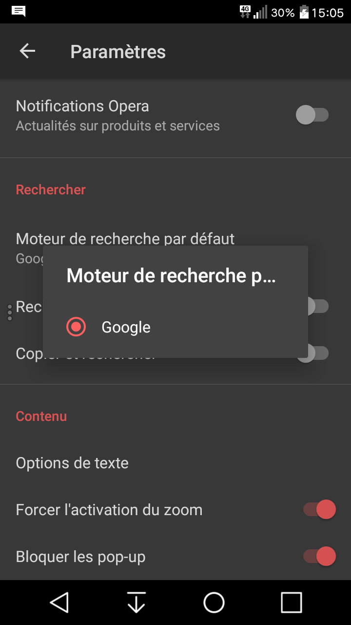
No more search engines, only Google. I really don't understand what's happening !
-
A Former User last edited by
Had to go back to Opera 51 because I have issues with find in page, and I honestly would still prefer the tab gallery UI before v52.
-
miyukiwork Opera last edited by
Did you clean install Opera 52 or was it an update from older versions? If it was a new install, you probably had a bad network connection during start up.
-
miyukiwork Opera last edited by
@Code027
Can you tell us what exactly about the issues with find in page? Is it about scroll animation?
-
A Former User last edited by
@miyukiwork Normally there would be an indicator (ex. 1/33) with how many repetition of words are found in the page, but it doesn't show up and thus can't navigate through them. The found words however are still highlighted.
-
miyukiwork Opera last edited by
@Code027
Just checked and it works fine on our test phones. Does it happen in any page? If you don't mind sharing your device information (phone model and android version), that'd help us reproduce the problem.
-
polo-naref last edited by
I did both : update from older version and fresh new install, and my internet connection is very good.
Something is going wrong with my it, obviously. And vpn is still a hidden feature to me. -
miyukiwork Opera last edited by
If you don't mind sharing your device info (phone model and android version), we can investigate some more.
-
Monycat last edited by
New red button "Add new tab" is associated with function like "close tab/all tabs" or other buttons with "Х" mark because it's big and red.
-
polo-naref last edited by
Sure. I have a LG SPIRIT H440 with rooted stock android 6.0.
I have updated Opera from an older version I've had saved and search engines are back again. But no luck with vpn. -
A Former User last edited by
@miyukiwork The Google Chrome browser has a hidden game that can be easily launched when you do not have Internet access. Why would Opera be worse? Maybe it is worth adding such attraction to the browser and increasing its attractiveness.
-
miyukiwork Opera last edited by
Thanks for your input! If we are getting more user input about the same problem, we'll review the design (color) to make it less confusing.