New Opera developer 59
-
A Former User last edited by
New update - Opera developer 59.0.3209.0
;-)
The change log, and the announcement.
"We are happy to announce, that we’ve fixed Widevine for Linux.If it still doesn’t work for you, please make sure the Widevine library is available in one of these locations:
- /opt/google/chrome/libwidevinecdm.so
- /opt/google/chrome-beta/libwidevinecdm.so
- /opt/google/chrome-unstable/libwidevinecdm.so."
Highlights:
- DNA-72523 [Linux] It is not possible to use Widevine on Linux.
- DNA-73461 [Bookmarks Bar] Favicons doesn’t load if no internet connection.
- DNA-74983 Crash at content::WebUIMessageHandler::FireWebUIListener(std::basic_string const&, base::DictionaryValue const&).


-
shintoplasm01 last edited by
@l33t4opera Yeah, about that, I've never quite figured out whether you were a dev or not because you consistently post updates about changelogs and new/deprecated flags...

-
A Former User last edited by A Former User
@shintoplasm01 Yes, I like to help Opera, and also bringing some useful tips for the users
;-) -
A Former User last edited by A Former User
New update - Opera developer 59.0.3211.0
;-)
The change log, and the announcement.
"Today’s developer update contains some UI fixes.Known issue: DNA-75140: [Mac] Video entering/exiting full-screen mode takes a long time."
The Chromium has been updated to version 72.0.3626.71.


-
shintoplasm01 last edited by
General question: considering that Chrome Stable v72, which came out today (30th January), fixes some serious security issues - will Opera backport some or all of these into the Stable O58 (on Chromium 71) or will we have to wait for O59 for these?
-
A Former User last edited by A Former User
Hi @shintoplasm01, most probably some of them will be backported, but if you want to have more detailed reply, you should ask one the Opera's employees, e.g. @tnowak, or @mgeffro.
-
A Former User last edited by
New update - Opera developer 59.0.3218.0
;-)
The change log, and the announcement.
Important fixes:
- DNA-73421 Speed Dial background flickering, while changing themes.
- DNA-75096 JS and invalid cert dialogs are not visible after tab switch.
- DNA-75140 [Mac] Video entering/exiting full-screen mode takes a long time.
- DNA-75185 Zoom pop-up is shown, when the page is not displayed in the default zoom level, and when choosing “Print”.


-
A Former User last edited by
The first R3 update - Opera developer 59.0.3228.0 comes with new design
;-)
The change log, and the announcement.
"Today we are releasing the developer version of the new Opera browser (v.59), codenamed R3 (Reborn 3). In each of our Reborn releases, we seek to redefine the modern browser, both in terms of look and functionality.We are extremely excited, that R3 will be the world’s first Web 3-ready desktop browser. Today however, we would like to discuss the upgrades to the design of the browser interface, that enhance the user’s browsing experience.
The browser is your frame to the WebThe main function of a frame of a picture or painting, is to enhance the viewer’s experience of the work it houses, not to distract from it. We believe a browser should provide such a frame for the Web.

With R3, we put Web content at center stage. We’ve removed dividing lines between sections, so you can browse without borders and unhindered by unnecessary distractions. Also, just as no one frame is effective for every picture or in every lighting, we’ve given the browser two distinct themes - light and dark.
Light and dark theme inspired by photography
The design of each of these themes was inspired by high-key and low-key lighting photography, where the goals are to maximize or minimize the amount of light in a photo, while still retaining contrast. Depending on your mood, your setting, or the content you are viewing, you are in control of how you frame it.
With the light theme, your entire browser, including the sidebar and tab area, is bright and clean. To us, this evokes a feeling of openness and optimism. We designed it to spark productivity and lift your mood.
The dark theme signifies to us a certain elegance and focus. It turns the browser dark and subdued, almost mysterious. But on a practical note, it’s also soothing for the eyes.

It comes down to what works best for you – we’re giving you a choice to frame your web browsing in a way, that works for you.
Minimalist design in a powerful browserWe believe, that minimalism is more than a look - it serves a specific purpose. It’s easy to achieve a minimalist design by stripping down features, resulting in a cleaner looking, but less functional browser. This was not our goal with R3.
There is no other browser, that comes close to Opera in terms of features and functionality, and we didn’t intend to make any compromises. What we’ve done with R3, is to refine our features and place them in a way, that they are fully accessible without getting in your way. Our vision of minimalism, is such that your browser is more functional for your daily use, not less.
R3’s design changesWe’ve achieved this in very specific ways. We’ve given the browser a fresh new look, and moved some of its key functionalities, so that there is nothing to distract you from your content.
The new tabs have been designed to elicit a visceral response - whichever tab you have open, it feels physically open, and stays on top of other tabs.

After thorough testing, we have also decided to move EasySetup and Snapshot to the access bar, where they are better placed for convenient access.
The Snapshot tool, which lets you take screenshots of a website, has been placed next to other web browsing functionalities, such as “Send to My Flow” and bookmarks. This means, that now all the key interactions you can have with a website, such as adding it to bookmarks, sending it to your “Flow”, or taking a screenshot are in one place.

The EasySetup panel has been moved from the browser’s start page to the toolbar area, to keep the browser’s basic settings at hand. This makes it easier for you to adjust the theme, wallpaper, and switch on some of Opera’s crucial features, while you browse.
Integrated Crypto Wallet
Our brand new browser also features integrated Crypto Wallet, which lets you browse Web 3, while signing crypto-transactions with your phone. To use it, you have to pair the crypto wallet in Opera for computers with your Opera for Android browser.
Test Opera R3 nowWe hope you enjoy the design changes in our new browser. We will let you know more about how R3 defines the new standard of browsing through features in the blog post on our browser’s launch day in March.
To get the latest updates from our team, make sure to visit our Reborn 3 page and sign up there."
There's also small change to the sidebar: from now on, if your sidebar is unpinned, it won’t be visible on the browser’s internal pages including Speed Dial. You can change it’s visibility in Easy setup.


-
A Former User last edited by A Former User
There are few UI inconsistences in R3. Like mixing rounded and squared styles. Tab layout, address bar are rounded now. Separated search box window in address bar is squared. Personally, I hate rounded controls
 especially on Win10, where UI is basically squared.
I like UI on current stable Opera, squared tabs layout, address bar.
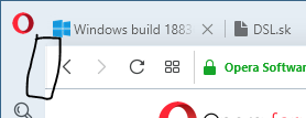
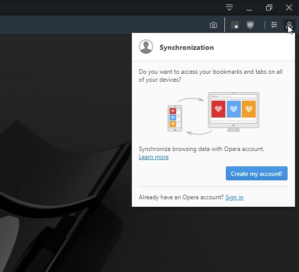
On light theme there is some vertical line before Left navigation button. On dark theme it looks good:

I hope that there will be option to switch between rounded and squared layout .
.Edit: I just found that on blog screenshot there is shadow around active tab and on the left between web page content and side bar. I don't have that shadow.
-
A Former User last edited by
Hello,
With the new version of Opera developer I can't seem to divide the Speed Dial into files of 5 websites.
Previously I did that with Zoom, but now the zoom changes between 250% (4 websites) to 300 (6 websites).
I would like an 275% (5 websites?), How I can do that? Can you fix it please?
Thanks a lot!
-
donq last edited by
@sencor90 said in New Opera developer 59:
I hope that there will be option to switch between rounded and squared layout
 .
.Same here - I really hope for squared tabs. This rounding looks ugly to me, sorry.
Another thing - when address bar is in focus, it is surrounded by really distracting bright blue rounded border. Either make it light gray or dark unsaturated blue (and square!) or allow change its color and appearance or simply grab its appearance from windows defaults - I hate blue themes, I hate rounded themes and now both are present in my beloved browser

And more - how to hide unused buttons (start page, submit feedback, snapshot, easy settings etc)?
-
A Former User last edited by leocg
Hi @sencor90, @donq, @temkem, this is the first build, that includes a new redesign. Some parts of the UI, and other things are not implemented completely, e.g. white background of the pop-up window in the dark mode. It should be in one of the further versions.
Hi @devoncito, it's known issue, it should be improved in one of the next builds.
-
A Former User last edited by
Hi @karcyon, as you can read here, this is reported as DNA-75884, so most probably it should speed things up in this regard.

