Opera 106.0.4985.0 developer update
-
Mehrzad last edited by
Some of the remaining bugs:
- Extension icons aren't shown when the extension bar is folded and then expanded after a restart.
- Moving the cursor to the top right corner does not trigger the close button (same for maximize/restore and minimize buttons).
- The text cursor isn't shown on the search bar.
- Incorrect color of the up and down buttons on the Opera-style scrollbar in dark mode.
-
andrew84 last edited by
So many significant bug are fixed in this one release. Looks like more advanced developers were hired or similar.
-
ralf-brinkmann last edited by
Big problem here!
After updating I was logged out of all my pages which needed a login (forums and so on), but a login was not possible anymore. My old cookies for these pages were either not recognized or deleted. And some of these pages didn't show any content anymore. They were completely empty. I could not reload the content. Maybe some extensions didn't work anymore, I didn't check this.
After copying the backup folder of the previous version back (stand alone installation) everything worked like before.
W11x64, Operax64 (standalone installation) -
andrew84 last edited by
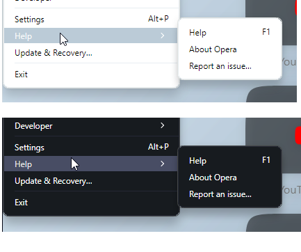
The highlighting is pale for submenu.
But it looks really nice for the both light/dark themes comparing to the bright blue (purple). In light theme text just should be black.
My suggestion is that all menu items should have this highlighting boxes.
-
A Former User last edited by
Forcing dark theme on pages is not working automatically. You need to activate it on each page.
-
A Former User last edited by
"Active Tab Color in Dark Mode: " For me, the active tab distinction is still not clear enough. It would be interesting to put a dot on the active tab, or perhaps the color of the island. As we are, we still have to look for the active tab for some fraction of a second. If there were a distinctive color, as we have in Vivaldi, identification would be more intuitive.
-
koimark last edited by leocg
cencored Crash loop after trying to close Opera caused loss of all my open tabs and loop continued so that I don't have backup files to restor. F***ck. (macOS Sonoma)
Those are my principles, and if you don't like them... well, I have others. ...
-
MichaIng last edited by
@ralf-brinkmann: Same issue here. The underlying issue is that access to session and local storage is denied, at least this is what the browser console throws in a bunch of errors.
-
3fsf23fgs last edited by
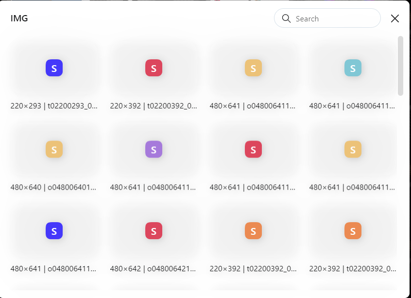
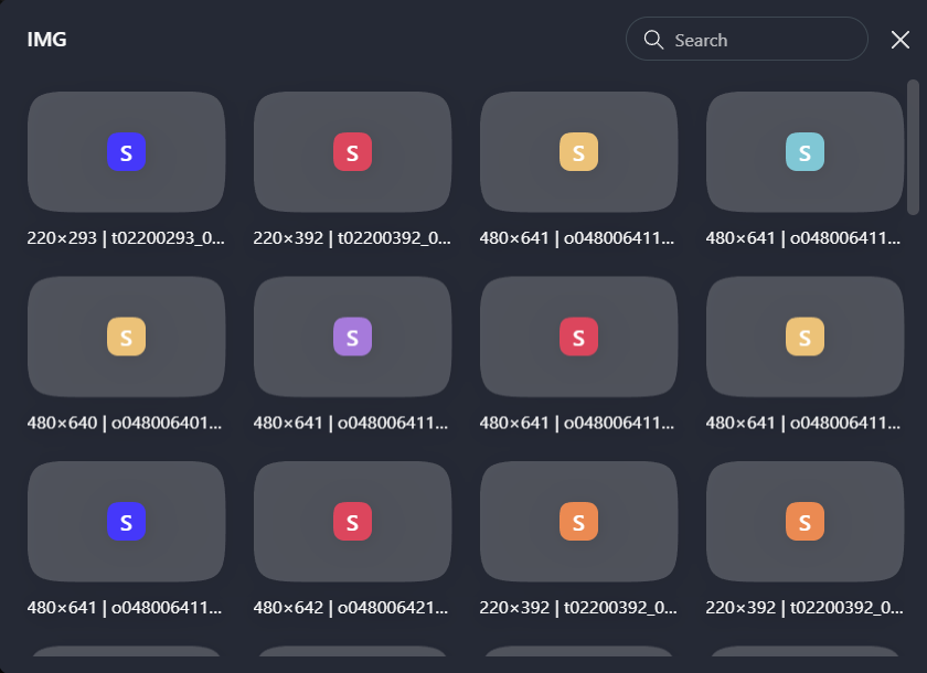
Tiles background in speed dial folders is really bad visible when light theme is enabled. With dark theme tiles background looking good.
Light:

Dark:

-
burnout426 Volunteer last edited by
@vladbabinets I didn't have any cookies issues myself after updating to this build for what it's worth. But, I would close Opera and delete the Cookies file. It's in the "Network" folder in the profile folder on Windows and I think the root of the profile folder on Mac. The path to the profile folder is at the URL
opera://about.With a fresh Cookies file, things might work fine. Something to try.
-
andrew84 last edited by andrew84
Dark/Light theme switching doesn't look smooth while on speed dial page.
Every time theme switches the background flickers (flashbangs), I first see quickly appearing solid white background, then solid black and only then wallpaper itself. -
burnout426 Volunteer last edited by
@vladbabinets Do cookies work fine in a test standalone installation of 106.0.4985.0?
-
vladbabinets last edited by
@burnout426: No. They don’t work either in the regular version or in the portable version
-
andrew84 last edited by andrew84
Make the new tab button look square (round cornered) again.
And the button should react on very top also (like tabs do).
-
andrew84 last edited by andrew84
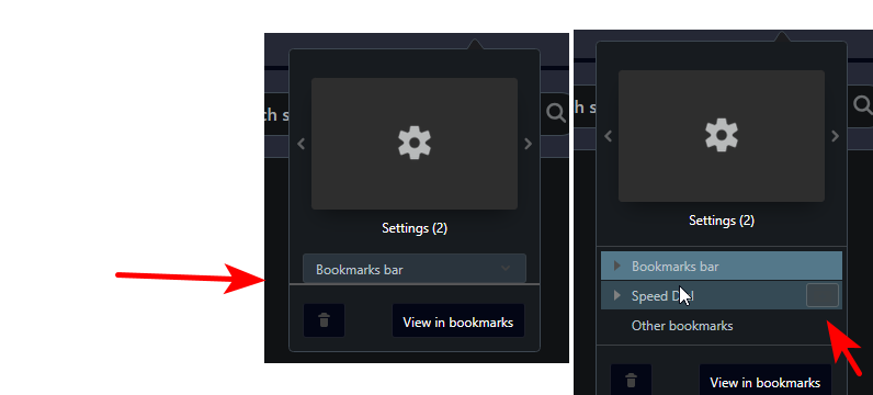
In dark mode the heart menu looks incorrectly.
Some horizontal line at the bottom and thus the dropdown is a bit cut.
Folder icon is not visible and looks like some solid button.
The same is in Stable as it seems.

Window buttons block still has the old dark greeny-navy highlighting boxes.

Also, the 'search tabs' background has the old color.*In overall, I don't like the color selected for dark mode. It's like dark grey but too 'purplish' or 'grayish blue' and suits more for GX version. I'd prefer more simple dark grey (or the shade like in pre One version but a bit darker).