Background change during internet address typing
-
A Former User last edited by
Is there a way to stop changing the background colour of the current tab when typing a new web address in the address bar? The strong change in background colour is very obtrusive
-
A Former User last edited by
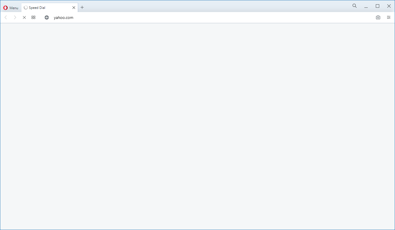
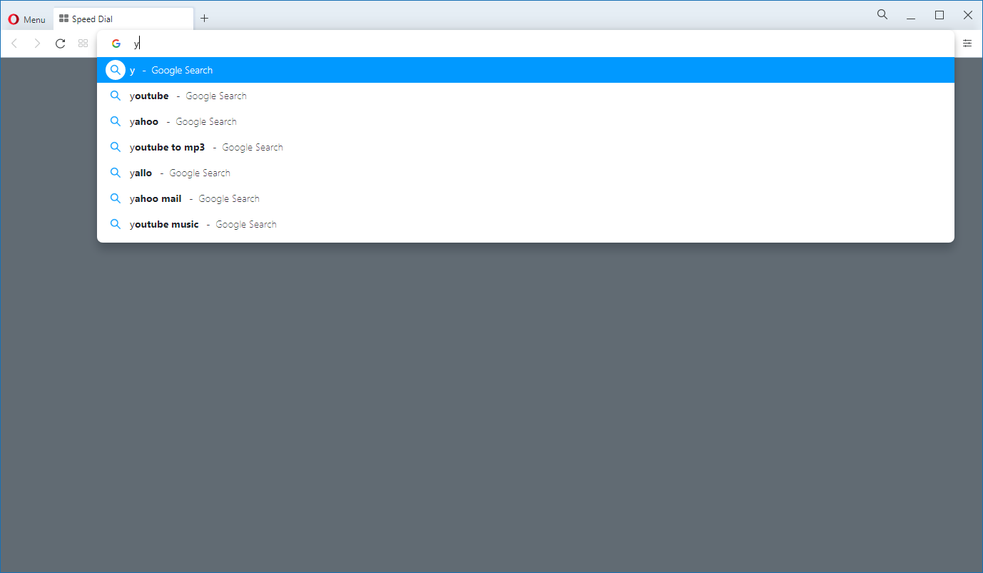
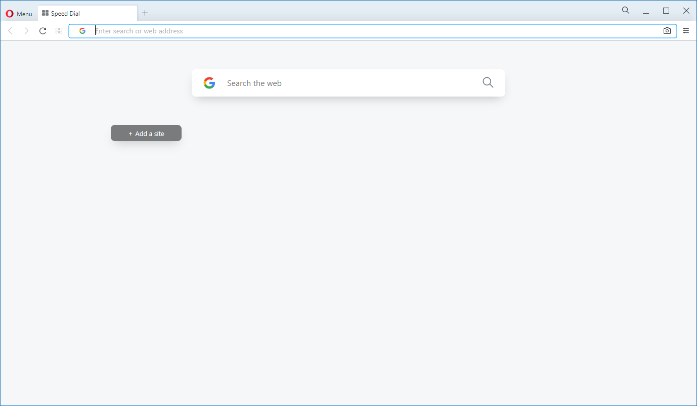
@leocg Thank you for the reply! I just uploaded three screenshots and if you play them in sequence you can see what I mean. When the address bar is active (typing in) the browser background gets darker and when you press enter the background changes back to the previous colour. If you type fast enough you can get these sudden changes in background colour which can be distracting especially in low light environments.


-
freelanceartist last edited by freelanceartist
this falls under
https://forums.opera.com/topic/44775/search-bar-won-t-let-me-enter-grays-out-text-randomly -
A Former User last edited by
@freelanceartist Actually I noticed that as well, and it was a great tip to turn the predictive search bar off, i'm not using that too much also. However, with regards the point I was mentioning, I don't think this is a bug really but more of an intended functionality. I imagine the point is to darken the background when you start typing in the address bar so that the focus is set on the address bar and the pop window underneath it. I was just wondering whether there was a way (a setting maybe) to disable that change in background colour or perhaps to be able to set that colour (or transparency to a user defined value) so that you don't get these colour swings anymore whenever you start typing in the address bar.
-
freelanceartist last edited by
@aquinas9000 Ah, I'm sorry you're referring to the highlight/filter
I mentioned this in the past (https://forums.opera.com/topic/37997/enable-disable-filter/10?_=1604842969481) and found out it is intended, in my honest opinion a hideous design choice, and that it doesn't have a toggle option is just infuriating.
-
A Former User last edited by
@freelanceartist Oh yeap, that's exactly it. Sad to read there's no way to turn that off. In my opinion any changes to the user interface (especially new features) should come with a on/off toggle switch. I used to use Opera a lot in the past and just gave it another try a few days ago and was surprised about this.
There seems to have been some focus on the address bar recently, both firefox and chrome are now "growing" their address bar when it receives input, I guess Opera took it a step further and is changing the background colour also. I'm not saying it's necessarily bad but I fully agree with you, an option to disable it would be great.
-
freelanceartist last edited by
@aquinas9000 I agree with you very much so. I've been using Opera for a very long time, although it does execute a lot of aspects very well, it's known to also butcher some, the video player for example used to be superb, but in a recent update they removed a lot of beneficial features. When people started to complain they added a portion of them back, however a lot of them are still left out (https://forums.opera.com/topic/38673/suggestions-for-the-new-pip-or-video-pop-out?_=1604848273324)
Sadly they won't listen unless it causes a lot of commotion. -
Locked by
 leocg
leocg