Pink? Private tab color scheme | Opera 60
-
A Former User last edited by A Former User
I was shocked (really) when I opened a private tab after update to Opera 60.
The new color scheme for the address bar looks weirdly.
With black theme it looks not so bad, but with light not so cool, imho.


What you think about it?
I would prefer more classic disign.
-
jojo0587 last edited by
@anonan I too don't like new color in private window. Just keep in mind that it should be different from the normal window in the light/dark theme. But yes, I personally am for his change.
My proposals for changes in Opera (Google Document).
- There are not enough signs to put all the links here. -
ephergie last edited by
@anonan Yep - I actually joined this forum just to complain about the"Pink" Private Window colour scheme... it's hideous!
-
operafanuk last edited by operafanuk
@anonan
I agree the colour is vile. Seems to me that Opera should allow users the choice to change colour. This awful colour is 'imposed' upon Opera users. -
A Former User last edited by A Former User
Just compare this with Brave's private tab design:

It looks well. -
valentin-1234 last edited by
Why private browsing in the new version 60.0.3255.84 window color turned pink?
Used to sit on 59(do not write), and there is the color of private Windows was white, and then..

Is there a solution, or wait for fix? Or maybe it's a new feature of the Opera?
-
valentin-1234 last edited by
Yes is very weirdly, pink color looks so bad for private tab(( I'm very shocked after update Opera 60
-
valentin-1234 last edited by
@leocg All right... Especially since they just did a super dark theme, with a blue sheen and it looks very cool as for me)))
Perhaps in future updates will add the ability to select the color of the tabs at the discretion, as it is faceted in the Android version. But you can get used to everything) -
A Former User last edited by
I simply can't look at the awfull color, I hope it can be changed, because this makes me want to go back to Chrome!
-
A Former User last edited by
I'm also here to complain about the purple colour. How many times does Opera have to change it's colour theme? How hard is it to simply add an option to customize the colours? You can always go back to this "designer approved" theme. This design is too radical, stop pls.
-
nunya last edited by
I am ALWAYS in private mode. So having this pink (I consider it purple) blob at the top disgusts me.
I don't need a color to distinguish private mode because I have the hat and sunglasses.BUT, more importantly, the dark color hides the spinning circle that lets me know when a web page is "connecting".
I find not knowing where I am at (in terms of a data stream) to be more of a problem than the god awful purple. -
A Former User last edited by
Oh, i've just got updated already, and i'm frustrated how its looks like now. I was not asked to change the color scheme, Opera do not care about my opinion
-
A Former User last edited by
Well, I think Opera does never going to improve that creepy design of private tabs.
-
A Former User last edited by
@anonan
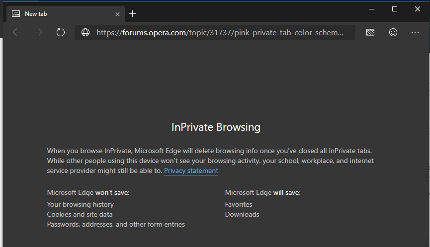
It looks way better in Microsofts new Edge that are under development. New Edge is Chromium based as well and has a more pleasing color scheme overall. I like Opera but dislike the blue-ish-dark color on tabs instead of the darker color you see in the attached image.
https://www.microsoftedgeinsider.com/en-us/
