Active Tab should be different color from inactive tabs.
-
TmSpeede last edited by leocg
I'm constantly confused and clicking the wrong tabs to get back to a particular site, or I accidentally delete the wrong tab due to no differentiation between active and inactive tabs.
Pretty basic thing that is overlooked.
-
sgunhouse Moderator Volunteer last edited by
@tmspeede Actually, the active tab is a different color - but (if you're using dark mode) not very different. Many systems are set up so that very dark gray looks black on your display, and you'd have to fiddle with the display settings to be able to tell the difference.
-
GnuLegax last edited by
@sgunhouse I'm using the dark mode too, and its a nightmare to find the active tab where I'm... terrible UX design for that little but annoying feature.
-
mmichel last edited by
Hello,
Since there is a consensus that dark theme's active tab is not highlighted enough, is there any plans to fix this ?
It should itch the UX team in Opera ! -
Referenced by M mmichel
-
 nkgrzegorzewicz Opera last edited by
@PaddyP Hi! Visibility of active tab was recently improved. Could you please check if this still occurs on newest version of Opera?
-
PaddyP last edited by
@nkgrzegorzewicz it is, though as there are several light grey tabs as well (what do they mean/can I disable them?), then it's still a bit fussy up there, so could still be much clearer tbh. Just being able to give it a soft pastel colour (it doesn't need to be gaudy), would make it instantly stand out from all the other tabs without having to scan them.

-
PaddyP last edited by PaddyP
@PaddyP said in Active Tab should be different color from inactive tabs.:
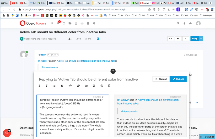
The screenshot makes the active tab look far clearer than it does on my Mac's screen in reality...maybe it's when you include other parts of the screen that are also in white that it confuses things a bit more? The whole screen looks mainly white, so it's still a white thing in a white landscape to me.
")
 ...it's an unfortunate oversight, which could easily be fixed, to make the active tab more visible.