[Compilation]Discussions On How To Go Back To Old (99) UI
-
AaronLlerena last edited by
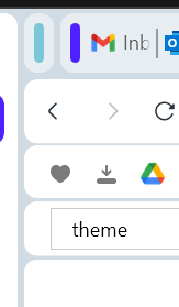
This new theme is really absurd, There is too much space wasted in the bars, they are exaggeratedly large, the usable navigation space is so restricted that it stresses people out
As I see that they will not solve this, unfortunately I will go to another browser and delete my information from Opera. I've been with Opera for years,
and this is the end.
And so, many of us will leave. -
None-now last edited by
@aaronllerena I feel your pain. I am hoping that maybe they will listen and at least give those that want to return to the old look and feel the option to do so. Of course they would need to give their customers a portal to upload suggests like that.
It would be wonderful if some of these companies would implement changes their customers had suggested instead of tearing down the house and put up something that removes what made the existing product wonderful to begin with.
I have looked for a place to make suggestions on their site, but found none. The only option I see for this would be to submit this as bugs. I just hope someone in charge is listening to us in this blog. Until an option to return to the prior state I will no longer recommend Opera unfortunately.
-
leocg Moderator Volunteer last edited by leocg
@none-now You can submit suggestions for Opera Desktop here in the forum: https://forums.opera.com/category/15/suggestions-and-feature-requests and/or in https://opera.atlassian.net/servicedesk/customer/portal/9
-
makoruu last edited by
I have a habit of putting my cursor to the side when scrolling through websites like Youtube and Facebook.
And now there's stupid god awful border around the entire page that is a complete and total dead zone. The scroll doesn't work if the mouse is touching it.
You can't retrain twenty five years of muscle memory to fix something like that. I've started using Chrome against my will, and I'll stay on Chrome until they change back the theme.
I've been a loyal Opera user for almost thirty years. This is horrible.
-
ghost-walrus last edited by
@makoruu I believe you, but I can't recreate it. Where does the mouse have to be to be in a scroll-less zone?
-
None-now last edited by leocg
@leocg Thank you very much. It took me a moment to get to the forums as your link contained the 'or' in it and it kept coming up as not found. Here is the link corrected...
https://forums.opera.com/category/15/suggestions-and-feature-requests/
-
ghost-walrus last edited by
@makoruu I wonder if I can't recreate it because the right side just goes onto my 2nd monitor and the left side automatically opens my sidebar. That sounds annoying though, hope they fix it for you!
-
kingfish84 last edited by
@makoruu Yes I have the same thing, essentially moving the cursor to the extreme right of the screen means you click on an entirely unnecessary border (that is only there to preserve the modular design) rather than the scroll bar. I have checked and no other software that I use with a vertical scroll bar does this. What a terrible change.
-
makoruu last edited by
@kingfish84 Yeah, it's horrible. I can't stand it.
I use a lot of scrolling websites that use the mouse wheel. Facebook, Twitter, Imgur, et cetera.
This is one of the worst theme designs I've ever seen for a browser as far as functionality goes.
-
A Former User last edited by leocg
I hate this modern curvy violet bloated lgbt themes. Do you, Opera designers, know that the users are supposed to use this software? This funky pinky teletubbies theme adds nothing positive to the user experience. Do you develop the software for using it or just for the delight of some noisy group of weirdy people?
-
kvrga last edited by
@makoruu I managed to do it on Win. First, I downloaded opera 99 offline istall. Then I had to disable internet, install the Opera browser, then disable auto update feature by deleting some parts from the program folder. Very cumbersome process. There should be an option to disable auto-update. Very bad UX, and even worse UI on Opera One. I really don't like it.

 ... maybe in the future Vivaldi will be my main browser , I hope