Same with the new tab button. You have to work hard to click it. Just like at the beginning I thought it was a nice refresh of the interface, so now I'm skeptical about it.
Best posts made by mcedro
-
RE: [Duplicated]Non-clickable gap above tabsAppearance
-
RE: [Duplicated]Non-clickable gap above tabsAppearance
@jiri70800 I agree with it. Additionally, turning this option on and off in Opera One turns it off for me in regular Opera.
-
RE: General Opera One Feedback TopicGeneral
I have been using Opera for as long as I can remember (I remember Opera with a banner ad). Unfortunately, recent changes in this browser forced me to change browsers (hopefully temporarily). I'm not mentioning all the fantastic functionalities that I often used. Releasing a product in a stable version that causes major problems for many people is terrible and frivolous.
My objective problems with the new interface:
- The icons in the sidebar look terrible, the background on the dark theme is discouraging
- Close button, minimize button, etc. they are rounded and therefore inactive in the very corner of the screen. I have to aim to close the browser
- For a long time (stable version!!) the scroll button on tabs did not work
- For a long period (stable version!!) the space above the tab was inactive. The option in the menu did not work. Actually, it probably still doesn't work, the advantage is that you don't have to aim at the tabs.
- Rounding everything and the spacing associated with it.
- Moving tabs between screens is a pain! Every other browser does it smoothly and quickly. Here you have to wait and it won't go where you want. Additionally, it opens new windows...
- The new tab button is too small - you have to aim.
- Splashscreen? I think he disappeared?
Therefore:
- Will it be possible to change any interface element?
- Is there a roadmap for the upcoming functionalities in Opera?
- The icons in the sidebar look terrible, the background on the dark theme is discouraging
-
RE: [Solved]Address/Search bar doesn't work, won't let me enter, grays out text, etcOpera for Windows
I have the same problem.
Opera 73.0.3856.31 Beta -
RE: Opera 110Blogs
Moving tabs between windows can still reset the browser. In general, moving tabs is slow, imprecise and the worst method of browsers I know. You still have to hit the X to close the program, you have to hit the plus to add a new tab. In the latest stable version, YouTube started buffering again when another website loads a lot of data. Opera has some unique things that make it hard to give up, but sometimes there are bugs in the stable version that make you not want to use it.
-
Aiming for the close buttonGeneral
Why can't Opera close button activity be extended to corners. With Opera GX, I can hover over a corner of the screen and the button continues to be active. In the case of Opera One, I have to aim at it.
-
RE: Opera 110.0.5130.64 Stable updateBlogs
New things are being added (immediately in the stable version), but the address bar still doesn't work. Moving tabs is still terrible.
What is the purpose of maintaining beta/dev versions?
Latest posts made by mcedro
-
Aiming for the close buttonGeneral
Why can't Opera close button activity be extended to corners. With Opera GX, I can hover over a corner of the screen and the button continues to be active. In the case of Opera One, I have to aim at it.
-
Favicons not loadingGeneral
Loading icons (favicon) in bookmarks, favorites or custom sites (flag option) does not work. The problem sometimes occurs, sometimes not, but it is annoying. For example, on youtube.com it sometimes takes up to 30 seconds for the favicon to load.
-
Moving tabs between Opera windowsGeneral
I operate on multiple monitors, moving tabs between Opera windows takes far too long. I noticed that in Opera GX it started to work much better (it seems to me that not so long ago it worked similarly here and here). Is it possible to achieve the same effect in Opera One (maybe you need to uncheck some options?).
-
A few notes on Opera OneGeneral
Hi,
I've been with the Opera browser for many years, the last redesign on One made the first few or a dozen versions unused in my opinion.It's not bad at the moment, but a few things bother me:
- It works on multiple monitors, moving tabs between Opera windows takes way too long. I've noticed that in Opera GX it started working much better (it seems to me that it worked similarly here and here not so long ago). Is it possible to achieve the same effect in Opera One (maybe I need to uncheck some options?).
If it weren't for the fact that I can't get used to the gaming look of GX, it currently works better in this respect. In addition, it has most of the add-ons from regular Opera.
-
The browser close button. I'll refer again to GX, where I don't have to aim at X, I can just reach the corner of the screen.
-
Loading icons (favicon) on bookmarks, favorites or custom sites (flag option). The problem is sometimes there, sometimes not, but it is annoying.
Can someone comment on my comments? Thanks in advance.
-
RE: Storing conversationsFeedback
@leocg I have installed stable, developer and Air versions. When I log into my account, no chats are synchronized, is that how it should be?
-
RE: Opera 110.0.5130.64 Stable updateBlogs
New things are being added (immediately in the stable version), but the address bar still doesn't work. Moving tabs is still terrible.
What is the purpose of maintaining beta/dev versions? -
RE: Opera 110Blogs
Moving tabs between windows can still reset the browser. In general, moving tabs is slow, imprecise and the worst method of browsers I know. You still have to hit the X to close the program, you have to hit the plus to add a new tab. In the latest stable version, YouTube started buffering again when another website loads a lot of data. Opera has some unique things that make it hard to give up, but sometimes there are bugs in the stable version that make you not want to use it.
-
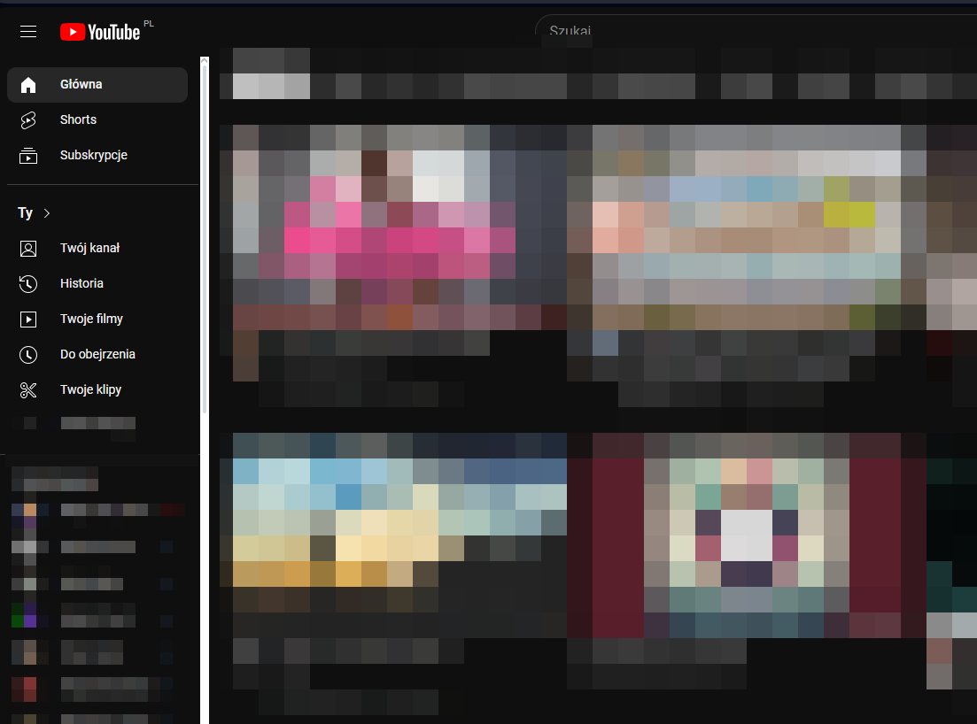
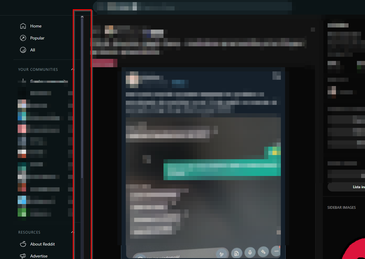
RE: Youtube/Reddit scrollbars looking badOpera for Windows
@leocg Reddit much better. On YT the scrollbar has disappeared (it is black). It only appears when I hover my mouse over it. It's definitely better, thanks.
-
Youtube/Reddit scrollbars looking badOpera for Windows
Youtube/Reddit scrollbars looking bad
How to fix it ?


It looks better on other browsers.
- Appearance