General Opera One Tabs, Tab Islands and Workspaces Feedback Topic
-
A Former User last edited by
some feedback - visually, it gets very confusing to tell which tab is active at a quick glance when there are some tabs in islands, some tabs not in islands, and an active tab. The tabs not in islands are more visually distinct by not having a background border, while the active tab looks very similar to a tab inside an island with the background bubble/border. Perhaps making it a different color or something would help

-
IvanRosLiwe last edited by
@komi-the-cat Yes! Or they could even put the inactive islands in grayscale
-
abstractalgo last edited by
This has hindered my experience when having tabs with a video call + other tab that I'm working on or screen-sharing. The current workaround with creating a new window, closing the current tab, and opening it in that new window is a no-go.
Dragging tabs across windows can come later, but please provide a context menu option to move a tab between windows, at least; and as soon as possible.
-
JoannaCzajka Opera last edited by
@komi-the-cat thanks for the feedback. We're still working on such details, especially contrasts. Some updates coming soon.
-
mushin last edited by
I'm more than disappointed: All my workspaces were cleaned out! I now have to find it out from my history... one after the other. If this persists, I'll be done with Opera!!!
-
Meeker-Morgan last edited by
@leocg
Tab islands. A very poor implementation of something many others have done correctly for a while. I mean tab groups. I have it turned off, but I might use tab groups if implemented correctly. Not a big issue to me.A big issue to me:
That awful awful animation when switching workspaces. I know enough about programming to know a lot of work went into that, but who asked for it? What problem was it supposed to fix? Did someone think it just looked cool?
And it wouldn't be a big fix to make it a configurable option to turn off in settings.
-
MarqM last edited by
@leocg tab islands would be a nice feature but I will not use it as long as those islands collapse to a featureless bar without any indication of its content. This will become a nightmare regarding lack of clarity when you have many of them in your task bar. In the current state not practicable for efficient browsing, maybe a great feature for users who like to play memory or for hide and seek enthusiasts.
-
techdabes last edited by techdabes
I like the Tab Islands feature because it can organize the tabs, I can open a link from a tab and a Tab Island. It organizes the tabs so well!
I rate this 10/10. So awesome. -
Athenais last edited by
When I want to move a tab to another workspace, why there are no workspace names on the list as before, just icons? Now I have to remember what icon I assigned to each workspace (and since the choice wasn't great, sometimes it was really random).
-
hanna-d last edited by
Good feature, would be useful, however, to be able to move all tabs in an island into a new window together.
So far, seems like it's only possible to move individual tabs and then group them again, which is a hassle.I see a way to move them into a new workspace, but not a window. Worspaces don't cut it when working with multiple monitors.
-
Vybo last edited by
I'd welcome the ability to change the workspace switching animation. Either to the option to turn it off completely or to specify the timing, because right now it seems like 300+ms, which is quite a big of a delay in comparison to 0, which it was previously.
-
Hexenschuss last edited by
The tabs are rendered in a completely illegible manner, with transparency and overlap, and without any cropping of favicons.
It completely ruined any remaining accessibility - please compare current version from Opera One vs. Opera GX. I admit I have a lot of tabs open, but they were distinguishable from each other previously, while right now it's a mess.


Why don't you test your soft on edge cases, instead you choose to go the safe path with only 3 tabs opened, with a full-screen window, and claim success afterwards?
Hope this cancer from O.O doesn't reach O.GX. If so, I honestly admit I will have to switch to Edge.
-
cirenjules last edited by
@mushin Yes the same happened to me! What a pain :-(. I just added them back in as/when/if I needed the Tab previously associated with a specific Workspace
-
cirenjules last edited by
@marqm I agree. Whoever did the Useability specification for Tab Islands? Whilst hovering over the Island shows the Tabs within it - and with a bit of luck you can select one without opening the Island itself - it's really not a great experience. What's essential is the ability to simply Name an Island. Come on Opera Devs let's make it happen asap!
-
rocendroll last edited by rocendroll
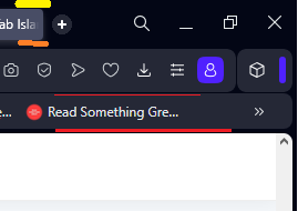
I feel that there could be "compact" theme where these gaps would be deleted, and bars tighten by couple of px?
Also, why there is shrinking option only for addons icon not the whole icon bar? Or to give user the ability to pin whichever icon he choose that he doesn't want to be hidden at a click on this blue separator

This is how much space is being freed

-
MarqM last edited by
@cirenjules In my opinion, naming the island only makes sense when the name stays visible when the island is collapsed. There is a reason when I establish a tab in the tab bar. I have searched for a content and I want to keep it to be able to look it up whenever I need it without having to search for it again. How reasonable is it to hide away the searched content completely in such a featureless dash so that you finally have to search for it again in your tab bar, when there are only lots of those meaningless dashes there. This is outright absurd.
-
cirenjules last edited by
@marqm I agree - the name needs to remain visible - even if it's vertical inside the Island. My current workaround is to just hover the mouse pointer over an Island; which then opens up a Tab List for that Island (from which you can select a specific Tab). It kinda works but a user defined, permanently display Name would be best imo.
-
MarqM last edited by
@cirenjules I would not call that a workaround. It is just one of the two possible methods to work with tab islands in the current state. The first one is to hover over all collapsed islands to see its content, the second method would be to expand the islands before starting to work with them. Both methods could be quite time consuming when the tab bar is clustered with those colorful dashes, not at all convenient when I want to find content quickly.
My "workaround" is not to use tab islands as long as they can not be configured that way, that they do not play hide and seek with me for my content.
This is just like having a library at home and then deliberately wiping out the labeling at the back of the books - how reasonable is that?