General Opera One Appearance Feedback Topic
-
lethewaters last edited by
@zauberfritz I ended up reviewing what I could and closed most of them as they were old tabs that reopened. Unfortunately there is not a way to fix the size of the tabs from what I have seen (as of yet). You can turn on the scrolling to help as well as turn off the "island" tabs. Unfortunately, trying to move the tabs around is an issue
-
A Former User last edited by
The border around the web content is horrid, it makes you feel like you zoomed or locked into the site, not to mention it defeats the purpose of the dark mode feature on youtube, twitch, etc.
The tab bar/list with its misalligned spacing is a mess, like a bad css turned into "design".
I really tried to get used to the new apperance but after 2 days I simply went back to version 99 on both in my home and office pcs. I will use it until its secure or One's UI/UX issues have been fixed.
ps.: I've replying to your post because a simply topic Reply throws "Error" and wont Submit my post.
-
jito463 last edited by leocg
@himmelsheriff I've been registered on the forums for a while, and have used Opera since it required payment to remove the ads (which I paid for multiple versions of), and I absolutely hate this new design. You have some condescending opinion of my post? Some conspiratorial description of why I'm posting about it?
Accept it, this UI change is bad, and the Opera team should feel bad for forcing it on us.
-
A Former User last edited by
@jito463 I‘ve written about posts from people, who have registered only the other day not someone like you, who‘s been here forever.
-
A Former User last edited by
Holy crap, I‘ve just seen, I was being downvoted for a post, in which I simply said, that I liked the new design.
In the Vivaldi forums you are being downvoted for writing anything negative about its browser. Here you are downvoted for writing something positive.
Anyway, both are only tools to use. Some have forgotten, as it seems.
To be sure, that‘s my last post in this thread. Some will be delighted, I suppose. -
kingfish84 last edited by
@flaviu2 Agreed, this is truly an awful change. It also means that those with disabilities are less able to manipulate the browser. Opera why would you make your product less accessible simply for the purpose of a stupid "modular" design that no one asked for?
-
tiborzsitva last edited by

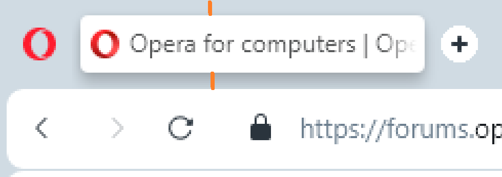
I highlighted the unwanted space in the header of the program in orange. Can that be reduced?
-
leocg Moderator Volunteer last edited by
@tiborzsitva It's part of the new UI, there's no way to reduce it.
-
tiborzsitva last edited by tiborzsitva
@leocg is it possible to change it from your side? I appreciate the look, it's nice, but from usage point of view it's worse
 I lose useful area of my screen just because of that header...
 -
A Former User last edited by
@tiborzsitva It seems to me there is no point asking for any change. The design is set in stone and the developers wont listen to us.
The sooner you switch back to version 99 or part ways and fine another browser the better. -
tiborzsitva last edited by leocg
ok, thx
Maybe I should have put this somewhere else, but I noticed a bug... I have a 3 buttons touchpad and I use the middle button to close tabs. I move my mouse cursor completely to the top, I position it horizontally and click. But sometimes it doesn't close the tab. Sometimes yes.
Edit: I already know the reason. It doesn't work, when I open a link in the tab in new window. Then a vertical bar will appear before the title of the tab and in that case the middle button of the touchpad will only work if I move the cursor inside of the tab's rectangle. I think I should be able to close the tab when my cursor is just above that rectangle.
-
cheerd last edited by
@jessbaltrusch I just returned to version 99. But history got broken after it (maybe should to clear all history to get it work again).
-
A Former User last edited by
I've been using Opera since around 1998...I was a Netscape user prior but at that time I had an older PC (in college so I could only get the basics), I found a suggestion to use Opera as Netscape was getting a little 'thirsty' on the resources and Opera was fast and efficient.
The other day I was updated (I closed the browser but didn't notice the update looming)...the next day when I went online for work, I got this new splash screen animation, and a horrible new look and layout. I had had it all tweaked the way that I liked it for my needs...all sorts of settings that had tailored it to my personal use (another reason that I had originally switched). I had noticed many updates ago Opera was getting 'thirsty' with more features (that I've never needed anyway) and it had slowed some, but my PC has always had enough grunt to deal with it so it didn't bother me.
.....however, the new look is.....well I don't know what they are going for as the colours are all over the place as is all the stuff that I had customized (muscle memory)...some of these new features make the browser more of a pig (the stupid splash screen really serves no purpose and slows the whole lot down).
The new One looks a little childish in style, colours and as I said before stuff just seems to be all over the place. Such a drastic change should have an option (maybe it's there and I missed it, but I was looking)-like other porgrams that make a big leap-the option for a 'classic' mode. This would maintain the familiar look and feel and mix in new features/function, but not at the expense of the experience.
It feels like the group over at Opera thought it all looked cool, but (as most companies do anymore) didn't check with the user say by offering a limited time preview, or something along those lines. I would have given it a shot, but I would have had the option to click a button to revert it all back.
I welcome change to most things, but this just seems like a 'shoot first and ask questions later' sort of thing.
I still have it installed in the event they re-work it (I mean it's a browser, not an OS...it doesn't need as much as it has), however I have mograted everything over to Edge (feels more like Opera used to.
I will keep checking back, as I have been with it a long time...so I'll give them a chance.
-
canadagoose4everreturns last edited by
@habsfan In spite of my being a Leafs fan, I'll still give you an upvote since I share your view of Opera One. You've been with Opera two years longer than I (I began in 2000) and came from Netscape as well (I could no longer stand Netscape 6, if memory serves). Unlike you, however, I've removed Opera One since I received the information that there would be no reverting to the older UI and that updates to the older version would only continue temporarily. Not sure what else to tell you since I'm in the same quandary although unlike you, I've reverted to Firefox rather than Edge.
-
Vasevase last edited by
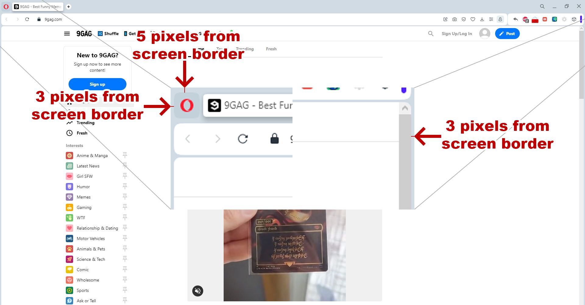
Hello. Tell me why you added a border between the scrollbar and the edge of the screen. It became impossible to sharply move the mouse cursor to the right edge of the screen to click on the scroll bar. Also, by quickly moving the mouse cursor to the upper left corner, it is impossible to click on the Menu. Is there any rational explanation for this innovation?

-
A Former User last edited by A Former User
For me, Opera has always felt like a small startup from my hometown Oslo.
Since the times with Jon Tetzchner, I’ve given them some slack compared to the large operators such as Google and Microsoft.
But for the company to make such user-unfriendly design choices in 2023 is inexcusable.
Are they a fashion- and marketing company or a producer of software?
Opera has 600 employees. What do they all do?