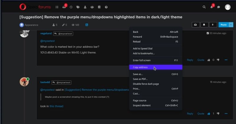
[Suggestion] Remove the purple menu/dropdowns highlighted items in dark/light theme
-
myswtest last edited by
I might be confused ... I don't see any purple on my systems.
Maybe post a screenshot showing this, to put it into context (?)
-
A Former User last edited by A Former User
What color is marked text in your address bar?
101.0.4843.43 Stable on Win10. Light theme.
-
tastodd last edited by
@myswtest said in [Suggestion] Remove the purple menu/dropdowns highlighted items in dark/light theme:
Maybe post a screenshot showing this, to put it into context (?)
look in this thread
-
myswtest last edited by leocg
Okay, I think I mis-understood ... I thought the complaints were about the "white background" of the pop-up, when in a Dark theme.
Notice my pop-up is black background, with Blue (Ultramarine blue) for the highlighted text. But I understand now the complaint.
But yea, to answer the question, "and what do you call that color:?" ... to me, it's Ultramarine Blue

-
andrew84 last edited by andrew84
In case of tabs island, I discovered that similarly to the sidebar's Bookmarks/History panels, highlighted items in island's dropdown look different and nice in dark/light themes (but colors a bit different than in sidebar panels). So we have 3 or 4 different color schemes for the same UI.

-
A Former User last edited by A Former User
Not exactly Apple quality control on design and UI.
I guarantee you; Opera has neither thought these color choices through, nor are they aware of the variation and discrepancy.
Some might think it's all minor details, I call it a big mess.
-
andrew84 last edited by
@vegelund Yes. Now we have:
- still the old one light blue in Settings and EasySetup
- the new one purplish blue or bluish purple in menus/context menus and bookmarks bar's dropdowns
- normal tones (dark navy accents or similar) in sidebar panels
- normal tones (dark a bit purplish gray accents, which is most probably is inherited form GX) in island popup.
-
LinasT last edited by
@andrew84 said in [Suggestion] Remove the purple menu/dropdowns highlighted items in dark/light theme:
It means different gray accents for dark and light themes instead of the bright purple.
I like purple color here in menu and dropdown... Option if there will be changes - to do it customizable.
-
andrew84 last edited by
@linast said in [Suggestion] Remove the purple menu/dropdowns highlighted items in dark/light theme:
Option if there will be changes - to do it customizable.
No complaints here then from my side if it'd optional.
As was stated earlier, there's already GX version with such bright elements which remind gaming interface. Now they transfer GX's features to the regular version.
Another example is annoying splash screen. Even the process name (opera_gx_splash.exe) tells that it's just copy-paste from GX -
myswtest last edited by
@andrew84 said in [Suggestion] Remove the purple menu/dropdowns highlighted items in dark/light theme:
Another example is annoying splash screen. Even the process name (opera_gx_splash.exe) tells that it's just copy-paste from GX
Aha!!
I keep reading folks complaining about the splash screen, which I have NEVER seen on my Linux machines ... and I suspected it was OS specific, which you just confirmed (you state it's an .exe program doing it). And that's fine, don't want a splash screen.
But to stay on-topic, the light blue selection highlight is okay by me - it's not really intrusive.
-
Locked by
leocg
