[Suggestion]Possibility of Naming of Tab Islands?
-
andrew84 last edited by
@emmanuelyee said in [Suggestion]Possibility of Naming of Tab Islands?:
Tab islands are just pill-shaped objects.
The comparison reminded me about Dr. Mario game

-
MarqM last edited by
@emmanuelyee I would prefer when the islands would not collapse completely to just a vertical bar. You always have to hover over it to see whats inside, this is not very convenient i.m.h.o. How about collapsing the tabs of an island just behind the top tab? So an island would appear all the same as the other tabs, icon and title of the top tab always visible (or at least the icon), the only difference would be the vertical bar at the left hand side - maybe with this indication of layered tabs at the right hand side as well.
-
andrew84 last edited by
@marqm I suggested the same here https://forums.opera.com/post/314915
I suggested users to decide how they like to see the islands (just vertical tab or top tab). Also I suggested what should happen when I click on the island (on a top tab), should the island auto expand or it should stay collapsed. It means 2 additional options for the tab islands in the browser Settings. -
MarqM last edited by
@andrew84 all this would be a step in the right direction, I agree.
Although I really wonder what is the point in collapsing the island to just a vertical bar? In no time you will have lots of those bars in your task bar and very soon it will be more efficient just to open a fresh tab rather than playing memory with all these featureless bars in your task bar to find what you are looking for. In my opinion only top tab display for tab islands makes sense in the long term. -
thatoneunoriginal last edited by
+1 Would be nice to give tab islands a name, maybe they could appear when the tab island is minimized. Along with this maybe the ability to choose the colour of the tab island pill thingy instead of just sticking with the one Opera picks automatically.
-
MarqM last edited by
Just to specify my last entry more precisely: I think the tab islands are a good idea in principle. But there has to be some indication of its content when it is collapsed i.m.o., this could be:
- Just the icon
- Top tab title with or without icon
- Custom name
Would be nice also to let the user customize the appearance of the collapsed islands:
- custom name
- custom color of the bar
- custom behavior when clicking on it
- ...
All ideas appearing in this thread would be nice to have.
But just renaming an otherwise anonymous vertical bar will not enhance clarity a lot, especially when the task bar will be populated with lots of them.
-
Deano-2007 last edited by
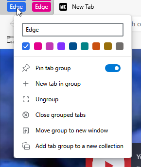
@emmanuelyee when you don't name a group on chrome it is also just a pill shaped object. so what your telling me is that they are exactly the same except you can't name tab islands?
-
Deano-2007 last edited by
@emmanuelyee Alright so what your saying is tab islands are just chrome groups but worse. no names, not even the ability to choose the color.
-
Referenced by
Rouxken
-
RJF-Campbell last edited by
@emmanuelyee Yes, that would be fantastic. I love Opera, but am seeing more user friendly tools on other browsers. For example, on Vivaldi, you can stack your tabs and then name the stack whatever you want it to be (e.g. 'Travel' on lots of tabs you have open while planning a trip). Please do this Opera. I can't be that hard. Thanks for considering.
-
RJF-Campbell last edited by leocg
I love Opera, but am seeing more user friendly tools on other browsers. For example, on Vivaldi, you can stack your tabs and then name the stack whatever you want it to be (e.g. 'Travel' on lots of tabs you have open while planning a trip). Please do this Opera. I can't be that hard.
With Tab Islands in Opera you just get a coloured bar, but cannot see what is in the individual Tab Islands.
Thanks for considering.
-
Tolomaj last edited by
+1 to this.
It would be amazing. It's the last thing that opera is missing that holds me back from transition.
In almost all ways Opera looks like better Chrome alternative, but Chrome has excelent tab grouping, and see what is inside by custom name is GameChanger.
-
sean95e last edited by
@emmanuelyee +1 totally agree.
This is the one thing holding me back from a full browser move from Chrome - even if it's an option to ADD a name, so people who like the minimalism aren't left out.
-
Atomiz last edited by leocg
Named groups > Pills and no. hovering over the islands is not a solution. either make it the default to have names or make a setting to adjust per user. this is complete nonsense
-
andrew84 last edited by
@atomiz said in [Suggestion]Possibility of Naming of Tab Islands?:
complete nonsense
Another nonsense is that the islands can't be pinned.
*Islands should work like in Edge and have the options popup each time island is created

-
pilotbilal last edited by
Any update on this thread? It's been a year, please add this functionality as it is quite basic.