General Opera GX Feedback Topic V2
-
tonySU last edited by
I loved at first when I downloaded the opera gx, the customizable features were so cool. But from the last few month, the shaders stopped working glitching, browser became so slow, often crashing, like in my online meeting which was extremely horrible experience!. And I found out the opera GX browser is bad ad keeping customer privacy through many youtube videos. And passbolt is not working i guess for some reason to privacy issues.
-
AgentCPU0 last edited by
I'm going to start out saying this: I am giving up on Opera GX completely
Now that I have the attention of the devs, first of all, yes, I am serious. I will be switching to Brave as soon as I make this post. I have been using GX for about a year, and when I first started, is was great. But the longer I used it, the slower it became. This browser is advertised to be fast, and great for gamers. I have never felt more lied to in my entire life. And I'm sure someone is going to respond by saying "disable these settings, turn off your extensions, clear your cache and data". Listen, I have tried ALL of that, and none of that has helped in the slightest. And I have a pretty powerful PC as well, so I know hardware isn't the issue. If the devs truly cared about this browser and wanted to make it the best it can possibly be, then this shouldn't be an issue in the first place, and yet it is. I am done, I am frustrated, and I am not dealing with it anymore. I wouldn't even recommend this browser to my worst enemy, it is pure torture how painfully slow it is
-
kyny last edited by leocg
I loved opera gx before now it turned into a garbage browser. To start, whats with the reaktinator suddenly ruining your experience and zero tutorials on how to remove it. The only tutorial or instruction I received is through reddit. What a hell feature. On that note, search function in settings is garbage. Its only matching what you search with word match and does'nt only showing you the setting what you search for but you have to scroll down for it. Even worse, its not suggesting a setting if the word doesn't match one by one even if the setting you searched worked the same. Where is the UX designers on this. Also, where is the tab grouping feature? I remember using it way back before on OPera GX but suddenly I cant tab group anymore. I dont mean the workspaces because its garbage it does not compensate to tab grouping. Workspaces is not the solution just bring back the tab grouping where you can just drag a tab to another tab to group. Whats happening opera.
-
SanadTheGamezzFan2011 last edited by leocg

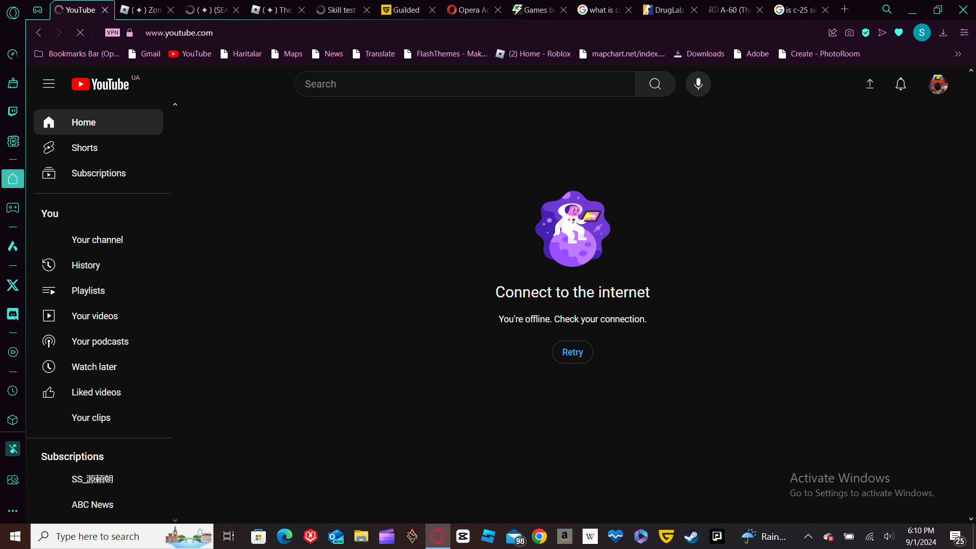
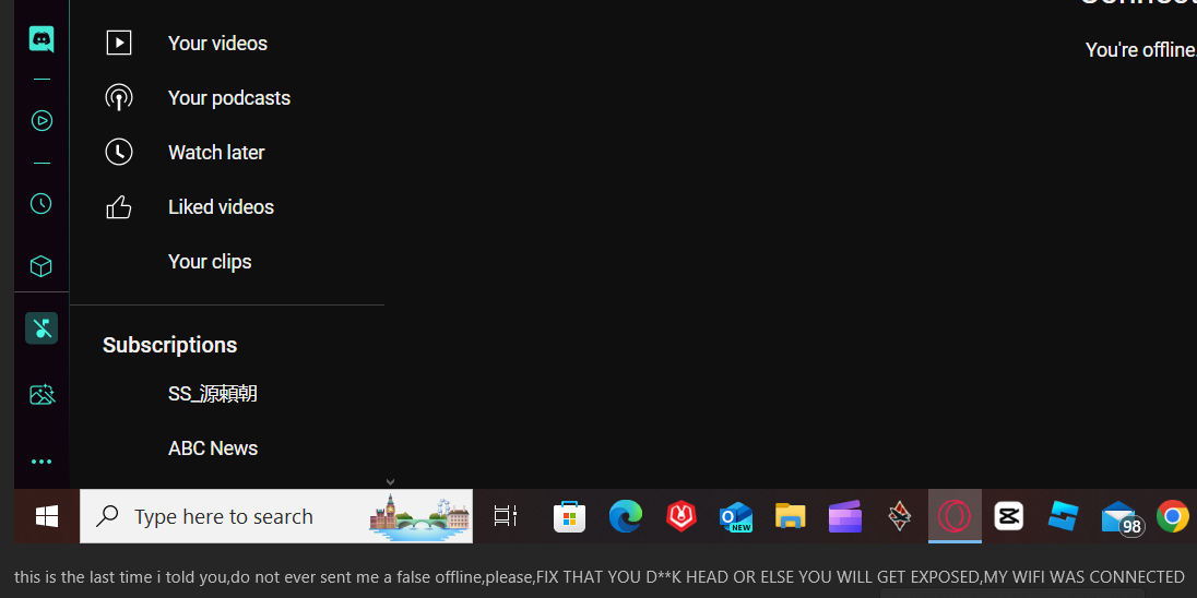
this is the last time i told you,do not ever sent me a false offline
-
KommanderWar last edited by
@SanadTheGamezzFan2011 u piece of s*** be more polite I can see how rotten you are by your filthy desktop.

-
SanadTheGamezzFan2011 last edited by

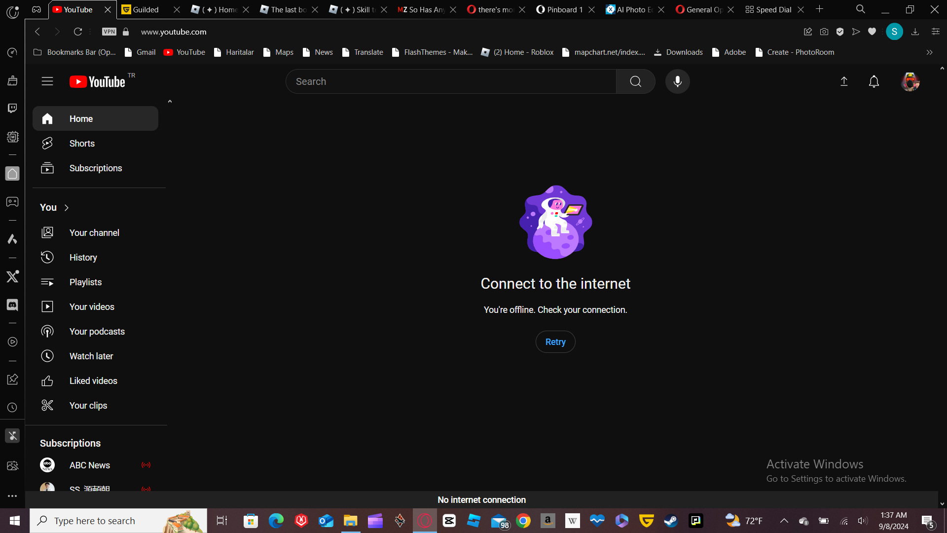
this should be hope the last time,if it again,i'll do it by response to you,so,there have been reports by me were i found a fake offline on youtube platform in opera gx forums,this could lead causing my wifi being disconnected itself before being reconnected or connected,the wifi was shown to be as connected,and as for youtube,it showns with a fake version of offl;ine disconnected,so,u should fix that one and fix it right Now!
-
SanadTheGamezzFan2011 last edited by
@KommanderWar ok,chill chill,i wont ever do it again,but let me tell you,the offline itself was fake for doing this on my youtube career platform while my internet was connected itself,this was a stupidiest reason that opera for doing this by doing that
-
darkwyrd last edited by
I'm trading over to exclusively using Opera GX from a regular combination of Chrome and Edge use. The biggest thing that has stopped me from doing this sooner is the annoying function of the Work Space system. Because of my work I am prone to having dozens and dozens of tabs open at once with various pages that I need to touch on for research or projects.
Chrome and Edge allow me to collect tabs into similar groups based on topic, and these groups can vary from window to window. I can also name each window so I can find what I need fast. Opera does not have this capacity and the Workspace systems staple the same groups into every single window. That might work for someone who only has one window open at a time, but I work with between 5 and 10 windows open at once. I've looked into extensions to make up for this shortcoming, but they fail to meet what I need.
Recommendations:
- Enable tab grouping and collection collapse in each workspace to minimize clutter and maintain organization.
- Allow for different Work Spaces per window.
- Window labeling for easy searching.
TLDR: Opera GX page organization method sucks for someone who has dozens of tabs open across several windows on the daily. Better features and methods are needed.
-
blackwolf115579 last edited by
Hi everyone
I wanted to say that opera gx is a rly good browser. It has some great features etc. And while i am typing this i am listen to my theme music. It can be calm or hardrock. I think opera gx is the best browser of them al so good luck and i wish u alot of happines and pleasure aswel with opera gx
bye
regards oliver -
H0P3 last edited by
Why can't you just update the installation, without screwing up the actual installation on Windows? I had the newest opera gx and some older version installed in installed apps. Obviously when you try to uninstall both of them one of them just fails and stays there.
I mean how the hell can you code like this? "Well we should ask the user to first uninstall because we cannot just update the files, we need to reinstall the new version". "Forget it, they won't uninstall lets just install a separate installer over the old one".
Last straw, after the insanely terrible computer and device management, where you cannot clear the same machine but older instances from the favorites and the recent files and i see hundreds of the same devices with logs and files and crap.
It's trash coding. I'm done with you, worse browser ever, would be the best, if you could code properly.
-
asrarulhaquejamara106 last edited by
Opera is a very good app.I think its a good idea to rate it 5 stars simply because there is a secure vpn and a forum feature a wallet feature and you can even limit ram and choose a backround with minigames if there is no internet and if you dont want to choose a backround make one by uploading the file.
-
lukamax09 last edited by
hello operaGX i have a suggestion
soo.. basically u know were you can mod as we like to have opera like the background song and more so can u add so u can save the style like
u creat a style that u like last of us song one pice backrgound
and u can like save that style and create a new one and u can switch between them and u can idk upload them and other people can see them and download so they can enjoy it to
pls -
Pelmen-Gamer last edited by
Hello and shx for the Opera Gx the best app i ever use in my life.Easy to understand dont make your pc be like air craft/
-
Cyberio last edited by
In new UI tabs are not highlighted when hovered at the very top of browser in full-screen, making it not allow to change tab. This gap is very small, because miniscule movement of cursor downwards highlights the tab making it possible to change into it. Buttons like "Search tabs", "Minimize" and "Close" can be clicked with cursor being at the very top of the full-screened browser. Hope this issue will be fixed.
Monitor is 1920x1080 -
1Ashura1 last edited by
25/11/24 - I just got the new opera GX update and usually I like GX but this update is just not it. Everything feels like a micropixel or just HTML vibes and the tabs have a white cross when I hover over them? Like a light cross button on a dark tab.. Oh and there is a weird 3D glow or outline around the browser even when it's maximised. It's kinda annoying cause it looks like the browser isn't in full view kinda thing.
I like the hidden icons at the right of search bar, I don't have a problem with it. Also if I'm not wrong, the font has changed. It's much more bigger? and pixel vibes.
The icons on the bar in the side are smaller and smushed together even with plenty space on the bar.
Overall, I'm not a huge fan of this update