• Login
    • Search
    • Categories
    • Recent
    • Tags
    • Users
    • Groups
    • Rules
    • Help

    Do more on the web, with a fast and secure browser!

    Download Opera browser with:

    • built-in ad blocker
    • battery saver
    • free VPN
    Download Opera

    Workspace - count indicator

    Suggestions and feature requests
    4
    7
    2621
    Loading More Posts
    • Oldest to Newest
    • Newest to Oldest
    • Most Votes
    Reply
    • Reply as topic
    Log in to reply
    This topic has been deleted. Only users with topic management privileges can see it.
    • Cayde
      Cayde last edited by

      Honestly, workspaces are unusable for me without some sort of indicator that there are some tabs open inside workspace.
      A little dot just like the built in messenger and whats-app already have.
      I guess if you work with them on daily basis you don't really need that but if you work with them occasionally - that's completely different story. I would forget I put something to another workspace a hour later 😕

      I already wrote it here:
      https://forums.opera.com/topic/38956/workspaces-improvements/5?_=1604386908259
      but I feel like this deserves a topic of its own.

      Reply Quote 0
        1 Reply Last reply
      • andrew84
        andrew84 last edited by andrew84

        Instead of dot I'd better prefer workspace's blue icon if there are opened tabs in the workspace and when hovering by the cursor there should be a tooltip 'Workspace name + number of tabs opened'.
        If there are no tabs in workspaces, then icon will be the regular black/white in light/dark themes respectively.
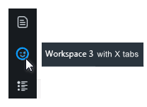
        2020-11-03_132812.png

        Reply Quote 1
          Cayde A Former User 2 Replies Last reply
        • Cayde
          Cayde @andrew84 last edited by leocg

          @andrew84 Yes, Anything would be great. Your idea sounds good too 🙂

          Reply Quote 0
            1 Reply Last reply
          • A Former User
            A Former User @andrew84 last edited by

            @andrew84 I'm all for the feature, but I like aesthetic solutions. The less words, the more informative. We all know Workspaces keep tabs and nothing more. 🙂 So "with X tabs" is redundant. Simply alone X should suffice. But..

            Let it be for example:
            Workspace 3 - 5
            Workspace 3 / 5
            Workspace 3 | 5
            Workspace 3 (5)
            Workspace 3 [5]
            etc

            I always changed names of all my workspaces to be more informative so I was shifting the numbers to the first places. The best solution to the count number yet it'd be to use # for tabs number. Selection of separation mark(s) should be left to the user. Thus you might define your tooltips more freely.

            Example:
            Workspace 3 | #

            However If you moved workspace number to the first place you'd have more aesthetic options.

            3 Workspace - #
            4 Workspace / #
            5 Workspace | #
            6 Covid (#)
            7 Weather [#]
            etc

            The hash will be changed to the real number by Opera itself.

            Reply Quote 1
              1 Reply Last reply
            • dw1405
              dw1405 last edited by

              Sometimes I forget that there are some tabs under workspace 1 or 2. If there's some indication next to it, I think it'll be useful.

              Reply Quote 0
                1 Reply Last reply
              • andrew84
                andrew84 last edited by andrew84

                Yes, it was already suggested https://forums.opera.com/topic/44739/workspace-count-indicator

                But in my opinion the sidebar with counters next to each workspace will look messy. It's enough the workspace (its icon) to be highlighted if there are tabs in this workspace (how many tabs exactly can be shown on the tooltip).

                Reply Quote 0
                  A Former User 1 Reply Last reply
                • A Former User
                  A Former User @andrew84 last edited by

                  @andrew84 I do agree. Narrow Sidebar is better. The less items (or s**ts) the better for any application.

                  Reply Quote 0
                    1 Reply Last reply
                  • Referenced by  andrew84 andrew84 
                  • First post
                    Last post

                  Computer browsers

                  • Opera for Windows
                  • Opera for Mac
                  • Opera for Linux
                  • Opera beta version
                  • Opera USB

                  Mobile browsers

                  • Opera for Android
                  • Opera Mini
                  • Opera Touch
                  • Opera for basic phones

                  • Add-ons
                  • Opera account
                  • Wallpapers
                  • Opera Ads

                  • Help & support
                  • Opera blogs
                  • Opera forums
                  • Dev.Opera

                  • Security
                  • Privacy
                  • Cookies Policy
                  • EULA
                  • Terms of Service

                  • About Opera
                  • Press info
                  • Jobs
                  • Investors
                  • Become a partner
                  • Contact us

                  Follow Opera

                  • Opera - Facebook
                  • Opera - Twitter
                  • Opera - YouTube
                  • Opera - LinkedIn
                  • Opera - Instagram

                  © Opera Software 1995-