Opera 72.0.3814.0 developer update
-
andrew84 last edited by andrew84
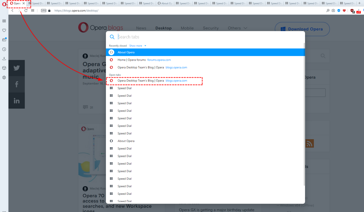
When opening Search tabs popup an active tab should be selected. not simply the first item in the list. I think it's obvious.

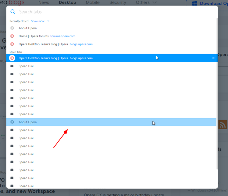
And currently active tab should stay highlighted, for the hovered items another color should be used (like it worked in previous TabMenu)

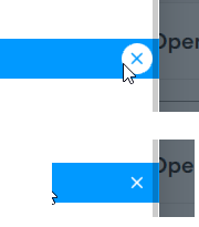
*Also, the highlighting still overlaps the scrollbar (closing cross in the circle too)
