[Compilation]Discussions on the new Opera GX UI/Layout
-
VibrantSpectator last edited by leocg
The new opera gx layout is a bit annoying to get used to especially how everything is smaller. yes that does give more space for the main window but I would prefer it if you could either choose or customize it more. while having this new layout like this is indeed more sorted based on category but I would still like to have the option to have the tools as they were and larger.

a positive change about the new layout is this setting bar. it's much more intuitive than the old way too navigate the main settings and such

-
TealofHatena last edited by
I personally don't enjoy the lack of smooth clean surfaces like in the current version, even though I prefer the sidebar.
Everyone is different, so I really hope we get the ability to choose between the current or new look, or have better customization control in the settings/themes.
Either way I'm grateful for the Early Bird feature and this browser in general!


-
VibrantSpectator last edited by VibrantSpectator
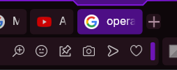
Something to add to this is that this outline grabs a bit too much attention in my opinion and negatively affects my experience using opera gx


It's kind of hard to see the outline in this image but if you click the images you should be able to see it.
And I know this problem can be reduced by having a less obstructive theme but what if you want to or even need to use higher contrast themes to be able to see what the icons and stuff are? -
daneilek last edited by
Can I return to the older version of opera? it doesn't work nor look well.
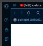
I'm attaching 2 screenshots. The first one is the new look, and the second is the old, better one.

lmk if there's smth i could do
-
Kooeala last edited by
I don't want this new UI to be used... I have alot of tabs and the smaller tabs make it look so much worse, when I open a new tab it just becomes black and I want it to stay as the old version... Please make an option to revert back to the old UI if you make this change permanent...
-
Kooeala last edited by
Please don't make this change permanent... I use alot of tabs and the smaller tabs make the UI look so much worse... It also switches to black whenever I open up a new tab that also looks bad... Please make an option to switch back to the old UI if you do make it permanent... It is also too laggy for me...
-
VibrantSpectator last edited by
@leocg I think they're talking about the extrusion on the selected tab that imo is a little aggressive
-
sgunhouse Moderator Volunteer last edited by sgunhouse
@Freetoplay951 Huh? Mods are a feature of GX, not regular Opera. Is this post about GX or about Opera One?
-
burnout426 Volunteer last edited by burnout426
Opera GX 114.0.5282.218 has the New Look that was in Early Bird on by default and no way to turn it off now.
-
butcha-xxx last edited by
I hate the new look!
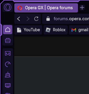
I want my old tabs back, not a dent from the edge of the screen down above the activated tab. Round colored app icons in the sidebar. In general, not everything is so forced to be angular!
Overall, this is an absolutely disgusting betrayal of the GX philosophy and a slap in the face the users and fans of Opera GX because of its customizability to their own taste!
It was adjusted somewhat, absolutely not to my liking, without my consent, or at least the possibility of adjusting it back to my liking. -
leocg Moderator Volunteer last edited by leocg
Try the following ->
Via Settings, Enable Widgets (opera://settings/widgets_settings)
Open the speed dial
Open the widgets menu on the speed dial (its at the top right)
There should be a bar on the top asking feedback about the new UI
Next it it, click on the back button
There will a prompt, optionally give feedback
Click on revert and restart
Let the browser restart with the old UIDon't know for how long that option will be available
-
butcha-xxx last edited by
@leocg
OMG, yeah - that worked - thanks !!!
I have my complete desktop, Opera, Favicons, Windows App Icon, Start menu, Taskbar Buttons, and a lot more customized.

https://addons.opera.com/de/wallpapers/details/big-matrix-code/But an Opera GX update later, and the entire aesthetic achieved through long work is ruined.
Well, thank you very much too!
Opera wanted to feel like MS, or what?
But which genius thought, that the only way to have the chance to get back to the old design language, is hidden in the tiny corner of a hidden feedback to that not optional new design language? And should furthermore be placed, in the corner of a feature, which is optional, on a page, which is optional ?!! That's remarkably dumb, really the last of 2 brain cells.
After the restart, the “What's new?” page with a tile that informs you about the new design language - if you click on show more, you will be taken to the color selection for the new design and only for the new - that is intentional trolling!
If you click on download more above the color configuration, you are dragged to the mod section.
Where you can download and modify anything, including a lot of unnecessary BS, except something to modify the Design language, or a design language!! There's no doubt - insanity shaders can't be disabled.
I have completely deactivated the speed dial, the weather widget is the only activated.
So I was already looking for current versions of Iron and cyberfox and came across dozens of variants of chrome and firefox, and even more based on their chromium and gecko rendering engines, which made me even more frustrated.So thanks again!!!

 "New look"