General Opera One Appearance Feedback Topic
-
 hucker last edited by
@darthgtb said in General Opera One Appearance Feedback Topic:
I assumed the trigger was using a mobile. Or is that more longwinded to detect?
If you had a different size screen, would it still be the same % width? Is it a pixel limit or a proportion of the screen limit?
That's on desktop. The width limit is pixels, so it's fine to use the browser on ultra-wide monitor, but it's terrible on a normal monitor size
What number of pixels is the limit? My main screen is 1920*1080. Just standard HD.
I assume you have a reason to need it narrow. I never use programs non-maximised, unless they're tiny like a calculator.
Multi-tasking. Sometimes I'm working on the left while documentation is on the right
Ugh. I would never squeeze two programs onto one screen. Multitasking requires multi monitors. I had two at work, but I have 5 at home. One has security cameras, it's cool, I can watch outdoors, see who's coming to the door, etc. Even found my neighbour's lost cat once. One is the main one I use. Another is if I'm referring to something. And the other two are to monitor 10 computers running science projects.
I'm on the default of 100%. I was surprised you were suggesting someone might be on 125%. It should only be on that if they've set it that way on purpose, which means they want it that way.
Any new laptop you buy with a 1080p monitor that comes with Windows will come 125% by default. Yours is probably by default on 100% because you are basically on 720p
This is a 1080p monitor. But then I installed windows myself and don't have stupid settings from manufacturers who don't have a clue. 100% is 100 for a reason, it means normal. More than 100% means you want to magnify it (bad eyesight etc).
Indeed. I don't worry about possibilities. No vaccine or seatbelt either. I think the word I'm looking for here is a kind of flower.
Just remember you only live once
") that's your choice and I respect that. I don't recommend, but I respect your choice
that's your choice and I respect that. I don't recommend, but I respect your choicePity the police don't, but I've worked out how to avoid them or talk my way out of things. I got one very irritated when he said "at the end of the day you're only endangering yourself", and I responded with "why are you wasting my time stopping me then?" He then asked "do you want a ticket?" and I said "what do you think?"
-
DarthGTB last edited by
@hucker ok, so you don't care about security in the web, but you care about it in your home? why don't you get rid of your cameras if you are sick of security? Whoever invented keys is an idiot am I right? You can easily pick a door open after all
What number of pixels is the limit? My main screen is 1920*1080. Just standard HD
I don't have it installed anymore, so I can't check that for you anymore. But it was more than half of a standard screen like that one
I would never squeeze two programs onto one screen
ok
100% is 100 for a reason, it means normal. More than 100% means you want to magnify it (bad eyesight etc)
It comes with 125% by default mainly because in 14'' laptops 100% is tiny. The only reason why I changed that back to 100% is because interface takes up too much space. I agree with you though, it should come with 100% by default and give you a tip that you can change that in the settings. Most of my colleagues are clueless about that setting and they struggle to fit content on their screen while working
About the life choices you make, I have no business on that. I wasn't talking about legal punishment either, I was talking about actual safety. I'm not a saint myself
Now, this conversation has gone way too long away from the topic's actual purpose and this will be my last reply to you.
If you want to try it out, check Yandex Browser. You don't care about your privacy, so you will probably like it. The only big functional issue I have with it is that window width problem that started impacting in my daily work cycle. Everything else works very well and it has the same basic functionality as Opera has (sidebar, popup video, speed dial, built-in ad blocker, etc.), but every one of them works better. It also allows for tabs in the bottom like the original Opera used to allow. It may have a few untranslated Russian text on new features from time to time too, which is honestly fine as they fix those fairly quick. It didn't impact me because I speak Russian, but I think it may impact others...
The only thing I'd say though is that I used to use it before Chromium browsers started to add the border and rounded corners, so I can't say for sure if it has that now too. It was also before Opera's rebranding, so I don't know if they also added tab grouping. But since it's a fork from Opera and they try to keep up with Opera's features, there is a chance this feature is there or may be in the making
-
DarthGTB last edited by DarthGTB
@andrew84 something like this could work for tab islands (top is when you have your cursor on the address bar and bottom not)
I still don't like that the active tab is too dim, but with this visual connection, it would make it easier to spot
This connection would also fix the weird under glow on selected non-islanded tabs
-
hucker last edited by
@darthgtb said in General Opera One Appearance Feedback Topic:
@andrew84 something like this could work for tab islands (top is when you have your cursor on the address bar and bottom not)
I still don't like that the active tab is too dim, but with this visual connection, it would make it easier to spot
This connection would also fix the weird under glow on selected non-islanded tabs
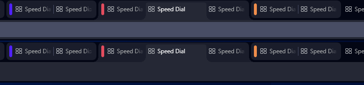
What on earth is that? You've got the word speed dial in a kaleidoscope. Why would I want one thing repeated 8 times?
-
DarthGTB last edited by
@andrew84 ah yes... that would be the case in case their understanding of a module is different than mine (which so far it has been).
If modularization means having actual modules, that would make it possible to move these modules around the UI, like it used to be in the original one, pre-chromium times
If modularization means "boxes", then yes. This design would go against their current goal
-
-
andrew84 last edited by
@darthgtb said in General Opera One Appearance Feedback Topic:
If modularization means "boxes"
That's exactly what I see now.
I see no advantages having the simply visually separated modules.
All the elements (buttons blocks, icons, panels and etc. ) are still not movable.
When I first heard 'modular' design, I indeed though it will be possible to 'assemble' the browser's UI how user wishes. But I see simply 'bordered' elements on practice instead. And what's even worse is that the browser's habitual functionality is partially broken. -
DarthGTB last edited by
@andrew84 agreed. My thoughts exactly. I even remember getting confused because when this was delivered, I couldn't find the setting. Sure a change like this would have been easier to find. It was then that I came to the forums more frequently and even pinned the bug report page because this has become quite a mess honestly. I still think they should actually make it modular instead of it just being a marketing stunt
-
DarthGTB last edited by DarthGTB
@hucker ah yes, true. I forgot you decided to stick to v99. That explains the confusion. There are no vertical lines here. These divisions is what they call "tab islands"
You see, since version 100, now it's possible to group tabs. What @andrew84 and I were discussing is the fact that on current version, their choice for pseudo-modularization forced them to make the interface have floating buttons instead of actual tabs like the ones you showed in your picture.
This is what the tab grouping looks like right now on version 104:
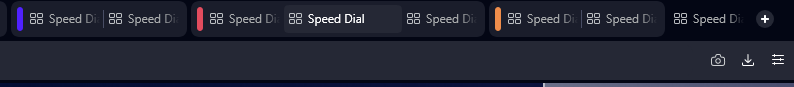
Here are 3 groups, two of them with 2 tabs and one with three. There is also another tab that is alone, without a group. The center one in the group with 3 tabs is the selected tab.
The discussion was about making the connection of the selected tab to the tab's content more visible even if inside a group, so my proposal for fixing that, would be to connect the group with rounded outwards corners and the selected tab, which coincidentally has the same colour as the address bar, then connect to the address bar. This would make it much more visual than what we have now and still maintain the grouping functionality available. Groups that are not selected can stay floating
Since their modularization approach doesn't entail actual modularization, this should work, although I would argue, this could work even if they take modules seriously. If bottom tabs for instance, the connection would happen upwards (even if no address bar down there, but it would visually help anyway)
Edit: just for reference, this is what collapsed groups look like:

The grouping feature is honestly helpful particularly for my work cycle as I would pair a tab with what I need to do with the documentation regarding that, collapse groups with tasks that are waiting for other people to finish their stuff and so on.
The only issue is that it's not well implemented yet
-
hucker last edited by
@darthgtb said in General Opera One Appearance Feedback Topic:
@hucker ah yes, true. I forgot you decided to stick to v99. That explains the confusion. There are no vertical lines here. These divisions is what they call "tab islands"
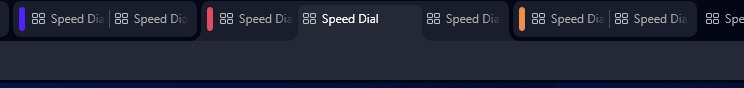
They are vertical lines, I see vertical bars of colour. Those cannot look differrnt on your end, it's a picture attachment, we both see the same.
You see, since version 100, now it's possible to group tabs.
Why on earth would you want to do that? Extra complications.
What @andrew84 and I were discussing is the fact that on current version, their choice for pseudo-modularization forced them to make the interface have floating buttons instead of actual tabs like the ones you showed in your picture.
And what I see on your example has faded out text, why?
This is what the tab grouping looks like right now on version 104:
Here are 3 groups, two of them with 2 tabs and one with three. There is also another tab that is alone, without a group. The center one in the group with 3 tabs is the selected tab.
It just looks like a vague mess. One tab is wider for no reason, the lettering fades out, and I can't see any divider between each one.
The discussion was about making the connection of the selected tab to the tab's content more visible even if inside a group, so my proposal for fixing that, would be to connect the group with rounded outwards corners and the selected tab, which coincidentally has the same colour as the address bar, then connect to the address bar. This would make it much more visual than what we have now and still maintain the grouping functionality available. Groups that are not selected can stay floating
Nothing should float, that's a silly gimmick.
-
DarthGTB last edited by DarthGTB
@hucker why are you mad at me? like... honest question
You reply to me as if I were an Opera designer. I'm not. "why there is faded out text?" I don't have a clue. Ask Opera not me. My reply has literally nothing to do with that. The only thing I talked about you didn't reply about
Dude, maybe you need a Snickers. You are not yourself when you are hungry
-
hucker last edited by
@darthgtb said in General Opera One Appearance Feedback Topic:
@hucker why are you mad at me? like... honest question
You reply to me as if I were an Opera designer. I'm not. "why there is faded out text?" I don't have a clue. Ask Opera not me. My reply has literally nothing to do with that. The only thing I talked about you didn't reply about
Dude, maybe you need a Snickers. You are not yourself when you are hungry
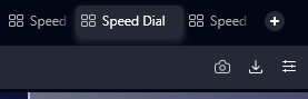
I'm not mad at you, I'm just trying to understand the weird screenshot you posted, which you said was "better". It's unusable. The tabs should look like my screenshot from v99. They should simply label the page and let you click them, a very simple function, it requires no fancy flower arranging round it.
-
DarthGTB last edited by
@hucker yeah, and I explained it in the second time I sent. The first screenshot in that second message isn't edited, so it's pointless to argue over that like you did. The second one is the "better" version. And I don't mean better than v99. I mean better than the first image, which is the current design.
I hope you understood what I meant, even if you disagree with my proposed design. I for one think the groups should stay. You can always turn that feature off if you don't like it.
The connection I proposed would work on single tabs too and it would then look like they used to be on v99 (but rounded. I know you don't like roundness, but at this point, I just accept they won't go back to squared design, so I would rather suggest them with rounded edges to fit their design new pattern). That's what I meant in the first message when I said it would get rid of the unpleasant underglow we have now on the selected tab. I didn't do it before, but here is what ungrouped tabs look like now:
And what they could look like with my proposal:

-
hucker last edited by
@darthgtb said in General Opera One Appearance Feedback Topic:
@hucker yeah, and I explained it in the second time I sent. The first screenshot in that second message isn't edited, so it's pointless to argue over that like you did. The second one is the "better" version. And I don't mean better than v99. I mean better than the first image, which is the current design.
I hope you understood what I meant, even if you disagree with my proposed design. I for one think the groups should stay. You can always turn that feature off if you don't like it.
The connection I proposed would work on single tabs too and it would then look like they used to be on v99 (but rounded. I know you don't like roundness, but at this point, I just accept they won't go back to squared design, so I would rather suggest them with rounded edges to fit their design new pattern). That's what I meant in the first message when I said it would get rid of the unpleasant underglow we have now on the selected tab. I didn't do it before, but here is what ungrouped tabs look like now:
And what they could look like with my proposal:
I can't even see the difference unless I stick my eyes right up to the screen, you've got mega dark blue and black next to each other. Any particular reason you have such dismal colours?
There is no need to group, there is no need to be round. They just need to go back to proper tabs. Why group something which is temporary? Webpages are only opened while you use them, why sort them? Why have rounded corners? We do that on physical objects so you don't hurt your finger, doing it on pixels is absurd.
-
DarthGTB last edited by
Any particular reason you have such dismal colours?
Dude, how many times I have to tell you you shouldn't be asking these questions to me? I agree with you though. It is a poor choice of colour for the selected tab. It used to be better in previous versions of Opera One.
About having to get too close to the screen to see it, that's probably because I'm using Opera's dark mode. A small screenshot like this on a white background like this forum can make it even more difficult to see
There is no need to group
that last message has nothing to do with groups. also you can literally turn that feature off. there is no reason to whine about this that much. it's obnoxious
-
hucker last edited by hucker
@darthgtb said in General Opera One Appearance Feedback Topic:
Any particular reason you have such dismal colours?
Dude, how many times I have to tell you you shouldn't be asking these questions to me? I agree with you though. It is a poor choice of colour for the selected tab. It used to be better in previous versions of Opera One.
I assume they're system colours and you have something set to dark. Opera does not look like that on my other machine I've allowed to update Opera:

Which only really has one thing wrong, the pointless gap between the tabs and the rest of the browser. But it's enough for me to disable updates.
About having to get too close to the screen to see it, that's probably because I'm using Opera's dark mode. A small screenshot like this on a white background like this forum can make it even more difficult to see
Wear sunglasses if you have sensitive eyes. If you insist on "dark mode", Opera ought to have white lines on a black background. Black on black is going to end in problems.
There is no need to group
that last message has nothing to do with groups. also you can literally turn that feature off. there is no reason to whine about this that much. it's obnoxious
I don't think you understand the word "obnoxious".
And you don't need to turn it off, it's just a pointless thing you can use by "create new tab in island".
-
 canadagoose4everreturns last edited by
@hucker I've read through this thread and I feel compelled to add that it is "you" who might not understand the term "obnoxious." Why so animated? Chill out a bit. It's a browser, after all, not a life-altering issue. Relax.
-
hucker last edited by hucker
@canadagoose4everreturns said in General Opera One Appearance Feedback Topic:
@hucker I've read through this thread and I feel compelled to add that it is "you" who might not understand the term "obnoxious." Why so animated? Chill out a bit. It's a browser, after all, not a life-altering issue. Relax.
Why do you confuse disagreement with anger? All I've done is disagree. I've not called anyone any names. Why exaggerate? Stating I think someone is wrong is not obnoxious.
Now if I was to call you a pathetic softy Canadian, that would be obnoxious.
