Please return the old Opera looks
-
astzart last edited by
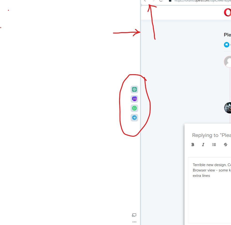
Terrible new design. Centered icons on the sidebar - a powerfully inconvenient tool! Browser view - some kind of lego constructor - it's funny to look at, use - distracts a lot of extra lines

-
PeterG21341 last edited by
@nightmaresoul The dead space over and under each tab (especially under) is what is intriguing to me. What kind of thought went into that?
In a fancy Bjørvika room someone went: "Oh here we have some dead space under each tab so that when you sometimes want to switch tabs... you don't!"
-
Cod19 last edited by
Who got the idea to use this annoying look with borders ? It's clunky, not seamless at all. At least integrate an option to give the ability for users to choose between this style and the original one. Disappointed with this roll out.
-
Karavel last edited by
I agree (moreover, have a problem with the add block extensions. Nothing can stop adds on YouTube since the last update)
-
tastodd last edited by
Agree with the terrible new look.
Very annoying bright highlights in the context menu -
Moved from Opera for Windows by
 leocg
leocg
-
IsAnyNameAvailable last edited by
Re: Please return the old Opera looks
First, if I've posted this in the wrong place it's cos I don't know what I'm doing, ok. Like many people I have hundreds (thousands?) of bookmarks, arranged with folders on the bar then folders-within-folders etc. With the "new look" there is now a huge gap between the icon and the folder or link name, most of which disappears off the right because also the width of the drop-down does not expand to fit. Am working round this for now by having the bookmarks menu permanently open in my l/h tab. A slow but reliable way to find what I want. If you don't fix this I may be driven to use Edge but I'd rather stay with Opera. -
wombatello last edited by
I totally agree. I'm using Opera since early Presto-based versions for its usability, and it is now thrown away. New design looks like a broken CSS layout, is it some kind of a joke?
-
None-now last edited by leocg
It is too bad that someone thought this monster was a great idea. After all of these years of using a wonderful browser it is now an ugly eye sore.
I am on a couple forums discussing this and everyone feels the same. I have faithfully recommended Opera to so many others.
Now I feel like my faith in Opera has been betrayed. I will no longer recommend Opera to others. I will be working on finding a suitable replacement for all those I have suggested Opera to and will recommend something else to anyone in the future.
Maybe someone should create a forum here for suggestions to other browsers for a replacement.
-
saguoran last edited by

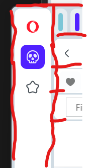
Please remove all the margins in red and reduce the paddings all the side/search/address/bookmarks/tabs bars too.
Reason: they took too much space of my small screen. -
kskwin last edited by
Hi,
- Set back the Old look and feel (No curved boundaries)
- Font brightness is very low. Redesigned to Set it Good Brightness.
- Title bar and address bar height is more compared to old version.
- Remove the Flash startup animation.
- Frequently occurring Browser Memory Issue. Then, needs to restart the web page.
-
askalick 0 last edited by
@none-now There is always Vivaldi! Or Maxthon. Both have a a very nice Speed Dial.
-
None-now last edited by
@askalick-0 I am currently trying Vivaldi out at the moment and it appears to be working for me. I have not tried Maxthon yet. Thanks for the suggestion....I will give it a go.
-
sserin last edited by
+1 to all the complaints about the dead space in the top bars, around the tabs etc. Screen space is valuable, make the search bar a little less TALLL while you're at it pleeease
-
gehtniemandwasan last edited by
I do not like the new "round licked" look at all. I also agree with all the spacing issues discussed above.
What's really annoying since the redesign is the placement of the mute button in the tabs bar.
I have many tabs open and hit in 4/5 times the mute button instead of navigating to the tab.
The placement in the old design was much more intuitive with less precise clicking, especially with a touchpad. Can you have a look at this?PS: I use Opera as my main browser since 2001.
The tab grouping feature is pretty cool, btw. Thumbs up for that. -
Prizrat last edited by
I made an account only and primarily to express that I also really don't like the new look. It broke some functions that opera used to have zero issues. Aesthetically it is not my jam either, it used to feel clean and sleek and now it feels bubbly and almost noisy because of it.
Everything everyone said in this thread is correct. I didn't even update it on purpose because I'd seen how it looked updated and decided I didn't like it, but it updated on its own and it's just a massive disappointment and frustration.
At the very least, I just want the option to return to the old browser layout. I really enjoyed what Opera brought to the table before this update and made it my primary browser because of it. I'm fully prepared to drop it if this is the new normal.
-
redwolftrash last edited by
i made the horrific mistake of closing my computer because i was going to sleep. then i remembered i needed to finish doing something, and opened my computer to see it shut down and restarted itself without me asking it to...and now this monstrosity of a browser is on my computer, when i had something that worked perfectly well and wasn't an eyesore like opera GX is (i'm a gamer, but i can't stand how stupid opera GX looks. it reeks of wannabe hacker...and don't get me started on that annoying typing sound).
to say the homogenous, "sleek" (in the company's attempt to look futuristic they instead look cheap and unoriginal like the countless companies that have tried to rebrand from "design everyone was fine with" to "disgusting clunky mess with boxes and curved corners around everything"), soulless corporatization of all website UI into godawful spacing, unused empty space because "why not", and unnecessary sectioning and boxes around literally everything is a plague on the internet is the understatement of the century.
also, that startup window and noise is so corny. i thought we left that concept behind with windows XP? i never close the browser anyway, so it seems useless to add something a majority of users won't see unless they decide "hey, let me give my poor computer a break".
nobody asked for this UI redesign. in general, there seems to be this misconception at companies that people somehow appreciate having a website or browser or app they have no issues using (and by extension, no issues with the appearance of) being altered with no warning or requests for feedback or alterations beforehand, especially when this change doesn't appear to be reversible for people who -- shocker -- don't like this repulsive design.
if you want to roll out new features, it's infinitely easier to make them experimental and then add them as fully fledged options once they've been finalized (see: all the financial things i disabled because i'd never trust a browser with my financial information and all the crypto things i disabled because it's crypto).
i also love how they finally added tab grouping, but only for tabs that are opened from one another (and of course the browser was too stupid to determine whether i had any tabs that would fit this criteria). i don't use the workspace feature because to be frank i forget it exists 9 times out of 10. the forgettability of this feature once led me to believing i had accidentally wiped out all of my pinned and open tabs in a session, so i started anew, only to find my original workspace later on.
i'm going to hope someone releases some sort of extension on tampermonkey or the extensions market to rectify the multiple awful, desultory looking design choices like people did when tumblr tried to twittify their dashboard.
unfortunately, i don't know if i can ever find another browser that'll satisfy my requirements for one other than opera (i only switched to opera in the first place because its coding is based off of chrome's, so i knew i'd be familiar with it, and chrome was so ridiculously laggy i couldn't even play music and play a video game at the same time with the youtube tab playing music being the only tab open).
-
multitasker-5 last edited by
I'm in complete agreement with None-now & Prizrat & others, posting here and several other places online. They have -- to put it quite simply -- murdered what had for years been my favorite browser. This new look is atrocious, like some psychedelic cotton candy mess that has melted across our screens. Otherwise, Opera One is bloatware -- full of features I never wanted, and would not use. For me, productivity is based upon simplicity and streamlined familiarity. (Plus good options for personalized customization, and without undesired changes that are rammed down your throat !) I don't give a damn about supposedly improved video performance: I have VLC and a bunch of other video tools for that. Bugfixes and security updates are one thing -- and necessary -- but "If it Ain't Broke and Was Working Just Fine, Don't Go and Reinvent It !"
Tomorrow I am going to revert this godawful mess back to version 99, buying time for exploring alternate browsers. I already had Vivaldi demonstrated as being the most functional browser for my phone. And I already had SeaMonkey (old school type suite, a la Netscape) and a couple others on the desktop computers, as backups. But I expect to be sampling Brave and LibreWolf., among possible primary replacements. Such a Crying Shame, What You Went & Did, Opera !
-
jcmlny last edited by
@multitasker-5 I feel your pain, and believe me, you are not alone. I think Vivaldi is a great alternative but still not polished 100%, I am using now Brave, Vivaldi and Firefox
 , I really hate the new Opera theme


-
Prizrat last edited by
@redwolftrash The islands are the only good thing thats come from this update as far as I can tell. I've been trying, in spite of my frustration, to give this a good faith go. Its a week since I updated. Im so so mad that popups are broken for me now.
The islands are nice, though-- the main thing that drew me towards Opera was the variety of options for organization and this one scratches an itch for keeping my tabs tidy. I 100% use the workspace and this helps add to the organization that I valued from Opera.Aside from the islands though....I stand by what I said and what the others are saying. It's an eyesore. I hate the popup sound, I hate the colors, I hate the bubbles. No no no.