• Login
    • Search
    • Categories
    • Recent
    • Tags
    • Users
    • Groups
    • Rules
    • Help

    Do more on the web, with a fast and secure browser!

    Download Opera browser with:

    • built-in ad blocker
    • battery saver
    • free VPN
    Download Opera

    General Opera One Appearance Feedback Topic

    Appearance
    appearance feedback opera one
    71
    279
    140106
    Loading More Posts
    • Oldest to Newest
    • Newest to Oldest
    • Most Votes
    Reply
    • Reply as topic
    Log in to reply
    This topic has been deleted. Only users with topic management privileges can see it.
    • amyd32193
      amyd32193 last edited by leocg

      I'm frustrated virtual worker with ever worsening eyesight. Now that you'd updated the browser I can't make out anything on my speed dial. all of the icon have been reduced by 50% or more in size. How is this a "speed" dial when I have to open everything and zoom in, etc. So much space being used up by semi transparent fluff instead of the usable icons that help me differentiate items in each folder.

      Then I went to connect my Spotify and it told me I didn't have a FB account associated with Spotify yet this is how I log in, from my desktop, from my phone and since it's bundled with my hulu, from Roku. I have no ability to see which of my facebook accounts it's attempting to use. Growing pains sure, but thus far haven't seen any thing about the new Opera One that I like better than the Opera I was using yesterday. Disappointing. What am I missing?

      Reply Quote 16
        scubadogs1742 wcsu1975 2 Replies Last reply
      • flaviu2
        flaviu2 last edited by

        The "minimalist" design is not quite minimalist, as it leaves too much space between address bar and view, and between tabs and address, and so on. Who benefits from this ? No one else than who designed. It is not practical, it's not nice either. Why the view has not the entire space between left display and the right display ? Why address bar is so thick ?

        It is very hard to gain a user for your browser, but it's very easy to lose it.

        Reply Quote 17
          flaviu2 1 Reply Last reply
        • flaviu2
          flaviu2 @flaviu2 last edited by flaviu2

          Let me exemplify you when your design can annoying and force users to leave this brower.

          Suppose you scroll a long page. And accidentally put the mouse in most left side (or right). Suddenly, the scroll, doesn't work. Why ? Because you didn't stretch the view from left to right side of the display. Why ????

          Reply Quote 14
            mazito kingfish84 2 Replies Last reply
          • A Former User
            A Former User last edited by A Former User

            I don't know why I decided to update my Opera today, but it was really terrible decision. This new modular ui just awful and ugly. Looks like design team was inspired by Dribbble trends, not actual user needs.

            Reply Quote 24
              flaviu2 1 Reply Last reply
            • flaviu2
              flaviu2 @Guest last edited by

              @hanteras
              Very true. Users needs a browser easy to use, fast, less consuming resource and reliable browser. With their last update, they fail every point, except maybe the speed. With their new design, they force to migrate a lot of users from Opera to another browsers. Why to have a brick like design and to be puzzled which tab and which address is paired ? Why to have rounded view(s) ? It's not handy at all and ugly as well !

              Pity.

              Reply Quote 14
                1 Reply Last reply
              • marinadze
                marinadze last edited by

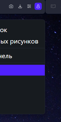
                after the update, the question "do developers have vision problems?" how could you choose such a terrible purple color, it is very irritating to the eyes.

                Reply Quote 6
                  leocg 1 Reply Last reply
                • leocg
                  leocg Moderator Volunteer @marinadze last edited by

                  @marinadze What purple color?

                  Reply Quote 0
                    marinadze 1 Reply Last reply
                  • marinadze
                    marinadze @leocg last edited by leocg

                    @leocg

                    Снимок экрана (37).png

                    this color is very unpleasant for the eyes

                    Reply Quote 5
                      A Former User leocg CUL8R hucker 4 Replies Last reply
                    • A Former User
                      A Former User @marinadze last edited by

                      And the continuous inconsistency. Purple is used as highlighting color in Menu list and Bookmarks bar, while not used in History and Bookmarks.

                      Chrome, Edge, and Firefox use gray as marking color.

                      Reply Quote 1
                        A Former User 1 Reply Last reply
                      • A Former User
                        A Former User @Guest last edited by

                        @cmspencer said

                        I'm getting the impression that the Opera dev team are starting to adopt the same attitude as MS "We know best and users will do as we say".

                        Kinda like Apple. Apple does not care what consumers want on product development.

                        The difference is that Apple has unlimited resources for building, testing, and evaluating products before launch – so they get changes right.

                        People still complain, but soon realize that the Apple product team have done their job and eventually users feel the new version is superior.

                        We also complain, but here the story will not be like Apple’s.

                        Opera needs to listen to feedback, because I believe they are making numerous mistakes in the evolution of their design and features.

                        Hopefully Opera will understand that it was a wrong path and adjust – or perhaps they have market research and user data that diverges from the voices on this forum.

                        I doubt the latter.

                        Reply Quote 7
                          leocg A Former User 2 Replies Last reply
                        • leocg
                          leocg Moderator Volunteer @marinadze last edited by

                          @marinadze I like that.

                          Reply Quote 0
                            A Former User 1 Reply Last reply
                          • A Former User
                            A Former User @leocg last edited by A Former User

                            @leocg said

                            @marinadze I like that.

                            Well, you liked it before when it was grey.

                            If they change it to orange or rainbow colors, you will also like it.

                            It's as if you have no opinion or preference on your own, outside the current Opera build.

                            Reply Quote 4
                              leocg 1 Reply Last reply
                            • leocg
                              leocg Moderator Volunteer @Guest last edited by

                              @vegelund said:

                              Kinda like Apple. Apple does not care what consumers want on product development.

                              Yet lots of people rush to buy new Apple products as soon as they are released. Even if there aren't any significant changes or improvements on it.

                              Opera needs to listen to feedback

                              They do listen. However, they can't base their decisions only on a forum topic.

                              Hopefully Opera will understand that it was a wrong path and adjust

                              I don't think it was. And adjusts will always happen and are welcome.

                              or perhaps they have market research and user data that diverges from the voices on this forum.

                              There are high chances.

                              Reply Quote 0
                                A Former User 1 Reply Last reply
                              • leocg
                                leocg Moderator Volunteer @Guest last edited by

                                @vegelund said:

                                Well, you liked it before when it was grey.

                                Yep, I can like both. Just because i like one doesn't mean that I need to dislike the other.

                                If they change it to orange or rainbow colors, you will also like it.

                                I would need to see before.

                                Reply Quote -1
                                  1 Reply Last reply
                                • A Former User
                                  A Former User @leocg last edited by A Former User

                                  @leocg said

                                  There are high chances.

                                  Do you believe Opera Norway knows something about the browser market and user preferences that Alphabet Inc. does not have full overview over?

                                  You sure are a fanboy. Bonne chance.

                                  Reply Quote 1
                                    leocg 1 Reply Last reply
                                  • leocg
                                    leocg Moderator Volunteer @Guest last edited by

                                    @vegelund I believe that Opera have telemetry data and also do market research to know their public, like any company does.

                                    Also, their designers surely know the current tendencies in (browser/web) design.

                                    Reply Quote -1
                                      flaviu2 2 Replies Last reply
                                    • zauberfritz
                                      zauberfritz last edited by

                                      To many colors, too intense, too frivolous, to crowded, busy etc. Like happened earlier, the tab icons are muddy, crammed; you can't find your tabs anymore. A browser is not a Christmas tree.

                                      Reply Quote 4
                                        1 Reply Last reply
                                      • flaviu2
                                        flaviu2 @leocg last edited by

                                        @leocg

                                        I pretty sure they would not make Opera browser back to the previous design, they worked too much on this one to do that.

                                        I noticed Opera is most likely Mozilla as look and feel. It is a matter of taste, I agree. Personally, I prefer steady design like Edge or Chrome. For business case, 99% users prefer that. Maybe Opera browser doesn't target those users.

                                        In my opinion, even Opera GX looks better than Opera One, because tab area is coupled with address bar. And if Opera One looks like Mozilla does, at least Mozilla stretch the view on the entire screen. Better ! I don't expect Opera team hear us, if Opera has telemetry, maybe they see how many users give up using Opera ...

                                        Reply Quote 4
                                          1 Reply Last reply
                                        • flaviu2
                                          flaviu2 @leocg last edited by

                                          @leocg
                                          Moreover, Opera One doesn't fight for the most efficient browser from the market. Now, Opera One consume RAM/power more and more, for those fancy GUI which is not even util.

                                          Reply Quote 1
                                            1 Reply Last reply
                                          • weirdtuned
                                            weirdtuned last edited by leocg

                                            67f0755f-ed34-4f18-800a-b7a68d944bf4-image.png
                                            The new design of v.100 sucks a lot: too vibrant highlights, tacky and absolutely disgusting layout - the rounded outlines on search panel, bookmarks panel and extension panel make it all feel so unnecessary disjointed along with the weird "bundling" of tabs into separate outlines. All of this is annoying visual clutter. In other words, I don't want the excessive GX's style thrown into a cosy pristine browser that Opera pre-100 was. I hate these eye-popping acid purples thrown into my browser, and if you're going as far might as well give us the option to completely colour-correct our browser with custom colours for everything.
                                            ce53c7de-0cf9-40a9-b971-ca76c16c7360-image.png
                                            One more thing - Opera devs, hello, we aren't on mobile phones, we don't need to have stuff at the bottom of the sidebar when all of our tab interactions are happening upstairs, duh. The person who decided to move the sidebar icons down and not give an option to switch back needs to get their head bonked real hard. Hopefully, this is a bug, because I still have hope that some devs at Opera have figments of sense left inside.

                                            Reply Quote 16
                                              1 Reply Last reply
                                            • First post
                                              Last post

                                            Computer browsers

                                            • Opera for Windows
                                            • Opera for Mac
                                            • Opera for Linux
                                            • Opera beta version
                                            • Opera USB

                                            Mobile browsers

                                            • Opera for Android
                                            • Opera Mini
                                            • Opera Touch
                                            • Opera for basic phones

                                            • Add-ons
                                            • Opera account
                                            • Wallpapers
                                            • Opera Ads

                                            • Help & support
                                            • Opera blogs
                                            • Opera forums
                                            • Dev.Opera

                                            • Security
                                            • Privacy
                                            • Cookies Policy
                                            • EULA
                                            • Terms of Service

                                            • About Opera
                                            • Press info
                                            • Jobs
                                            • Investors
                                            • Become a partner
                                            • Contact us

                                            Follow Opera

                                            • Opera - Facebook
                                            • Opera - Twitter
                                            • Opera - YouTube
                                            • Opera - LinkedIn
                                            • Opera - Instagram

                                            © Opera Software 1995-