Tile's background color bug
-
A Former User last edited by
@andrew84 Which version of Opera are you using? Please share a screenshot of the issue.
Regards
Opera Team -
andrew84 last edited by andrew84
@neetesha there are a lot of screenshots provided above in this topic.
https://forums.opera.com/post/191910
https://forums.opera.com/post/197047 -
A Former User last edited by
@andrew84 Right. But that was issue in older version. Are you on latest version (62.3.3146.57763) of Opera and seeing same issue?
-
A Former User last edited by
@andrew84 Ok. Right, i can see this issue now and it is more visible in Private mode with dark color. Unfortunately this is an issue which is not going to fix at least in recent time. We will see if we prioritize it later.
Regards
Opera Team -
andrew84 last edited by andrew84
@neetesha It's also well noticeable in normal mode with dark theme enabled (blue filter off).
Thanks for reproducing the issue, but regarding the timeline I was said the same a year ago. -
andrew84 last edited by
Unbelievable.
The issue is still not fixed. You managed to upgrade home screen wallpapers but didn't manage fixing the distortion. -
andrew84 last edited by
Still no fix = another one installation and removing.
But, at least you can, count each installation and include it in 'millions' downloads statistics. -
A Former User last edited by A Former User
@andrew84 this can be fixed.
The smaller image is scaled by the Android graphics device interface. As I tested it too, the smaller images are the results of scaling dark shades. If it would have been light shades it would have worked.
Solution, during animation to small nothing to do. Once at small scale a carefully scaled other image identical but scales and dithered and blurred takes over the full scale image. This must be done for every dull scale image having a small scale duplicate that especially takes dark colors in mind.
There are in fact only 256 shades of grey for example usually and of these shades of grey most people see only difference between 32.
It's because the colors are 256 in blue or green or red drom which in dark areas probably it's more like 16 colors of blue or green or red.
And you and I can see this.
This is why different images that have
Color dithering
should replace it in overview.
This is a limitation in all 8 bit color r,g,b.
https://en.wikipedia.org/wiki/DitherThis requires someone to carefully check and dither small scale images at an AMOLED screen.
Dither is an intentionally applied form of noise used to randomize quantization error, preventing large-scale patterns such as color banding in images.
I have seen this in many applications like at a TV or anything as soon as dark shades are involved. Without dithering images shown in small it would never work. Android cannot do this itself. It simply requires another set of images that are only different in size. But the small scale images carefully dithered. Please see Wikipedia link with how with black and white only it is perfectly possible to show every shade of grey to human perceived eyes.
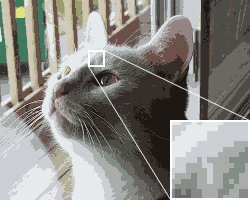
 Figure 5. Depth is reduced to a 16-color optimized palette in this image, with no dithering. Colors appear muted, and color banding is pronounced.
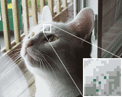
 Figure 6. This image also uses the 16-color optimized palette, but the use of dithering helps to reduce banding.
Both images have 16 colors only, but you should see definitely a huge difference.
-
Locked by
leocg
![Screenshot_20210316-111351_Opera[1].jpg](/assets/uploads/files/1615886134801-screenshot_20210316-111351_opera-1.jpg)
![Screenshot_20210316-111405_Opera[1].jpg](/assets/uploads/files/1615886165964-screenshot_20210316-111405_opera-1.jpg)