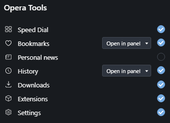
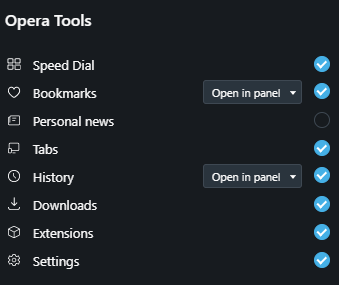
Where is the "Recently closed tabs/Tab menu" button on the top right?
-
zetmencool last edited by
How do I remove "Tab Search" and return "recently closed tabs" in its place ??? After the upgrade it came out no one needs shit, tabs and so open, what do I search for? How to return recently closed?

-
A Former User last edited by leocg
I had to move my computer and now my Opera got updated to the new loadout
I don't know about the average IQ of Opera users but I certainly don't need a function to find specific tab because you can just drag your damn tabs to organize them
While you might find you need a page that you didn't knew you need before you closed it or just closed it accidentally
Also why dafuq is the Search in tabs all fking white even in dark mode
Do your damn engineers even test the damn product before pushing them out -
pauluzz last edited by
I also join the shouting fest here. Anyway, please keep the feature of the 'tabs trashbin'. It is more productive to close stuff and reopen what is needed than to search in too many open tabs.
Or find a way to merge the two for all I care. -
iuliug last edited by
Please restore the last Closed tab menu as it was before. hell yes i a m joining ya all.
And do not remove features like that with out an impact assesment.
-
A Former User last edited by
Where is "recently closed tabs" gone? I don't see any use for this another search button, in any case.
Seems like Opera's "button displacement department" is the most hard-working guys in their development team. -
LazyMan last edited by
After lates update I saw that you replaced a useful "Resently closed" button by "Search". It was one of my favourite function in Opera, because it simple to use in two clicks. But now I should open the lateral panel (1), chose what I closed (2), and close the panel (3). So +1 useless step. And it is so unconfornable to use!
Please, turn my favourite button back (or make it configurable for turning in).
-
slaxer last edited by
Great. The feature I used Opera for (that and mouse gestures) is now gone.
I guess it's time to use other browsers and see if there's an addon that does the same.
-
nsx last edited by
It's pretty clear by this point that this "experiment" is a big fat fail, please let it die.
I'm using Opera on my phone and computer, and have been using it since it was paid/ad supported. Lately it feels like the devs are forcing more and more crap onto the users, with more and more incentive for users to switch platform.
-
maydin95 last edited by
I used to press that button literally every day and after updating my Opera, i had a little shock for a while.
I always close tabs and need to reopen from last closeds literally every day. I have more than 150+ tabs because of my job currently, still I accidentally discovered "Search in Tabs" feature using shortcut (probably was Shift+Tab but it seems removed) but never used.
That button was one of best features of Opera when I start using it in 2009 and I still love it.
I hope developers find another way to implement new features without making old boys sad.
-
A Former User last edited by
@leocg said in Where is the "Recently closed tabs/Tab menu" button on the top right?:
@kkthxbye Type opera://activity in address bar or try the sidebar icon if it shows up.
"If it shows up". What exactly determines if it shows up? I have two installations, both Windows 10 64 bit, both version 68.0.3618.63, with the following result:


I am trying to get accustomed to the loss of this "Tab menu", but this is frustrating. Further, only one machine shows the tabs from the other machine on the "opera://activity" page, but if I set the flag that removes the new "Search in tabs" button, the original "Tab menu" DOES show other machine's tabs.
What is going on? Are these just bugs, or intended functionality? If the latter, please explain.
Update: The machine that did have the Tabs sidebar item has now lost it after a restart (no update to Opera though).
-
A Former User last edited by
@ericartman92
Also missing that feature alot. Needing to first go to the meny, and then scroll down to fin "history" is really akward in comparison to how nice & easy it used to be. -
A Former User last edited by
I just extra created an acoount just to reply here to say that the removal of the "recently closed tabs" button is the worst decision in whole opera history. This button was THE reason why I have always used Opera instead of Firefox or Chrome and I use Opera for more than 10 years. And now you removed it....
The new menu-->history way is very bad: way more clicks and much longer way for the mouse pointer and therefore uncomfortable and time wasting.
Adding the new search option is not wrong overall (although I don't need it) but why replacing another more useful thing with that? Do the Opera developers really think that average Opera user is such an dumb person that one button leads to overstraing while using Opera? The absolute minimum would be giving the user an option to decide which buttons he/she wants to have.Thanks for the guys giving the solution with changing the flag but I am very afraid that the flag will be removedn a future version because of "cleaning up the code"... It will be the point where I have to choose a new browser.
-
slytzel last edited by
@chrisohm I agree with you. For me this feature was also, as small as it might seem, the biggest reason to stay with Opera. Once it will be completely removed, there will be far less holding me back to change to another browser if it ever tempts me.
-
federr7 last edited by
@sgunhouse thanks for let me know, Last update are making the experience worst! Opera is going down seriously. You are removing good features like the classic pop up video. I'm seriously downloading an older version or thinking to move out to Edge.
