opera 66 video popup has a limit in sizing, no controls, etc
-
YouDiYo last edited by
This new topic is basically a complaint to the opera team at how terrible the new "picture-in-picture" mode is.
Things that the new picture-in-picture mode does wrong when compared to the previous iteration of the same feature.
-Almost all the interface within picture-in-picture window has been removed. The only remaining interface is the video time bar, that is, without the time indicated and no media controls to be seen. In other words, pretty much useless.
-The maximum size for the picture-in-picture window has been limited, and for me is limited to a quarter the area of my monitor. I was used to watching picture-in-picture window full screen and this limitation is a horrible decision
-When hovering over the picture-in-picture window it turns grey, and to pause a video a specific icon needs to be clicked, whereas before you just needed to clicked anywhere, to pause and it didn't gay over either.
-Another annoying feature is that the original video is not shown when in picture-in-picture mode, unlike previously where both picture-in-picture and original video was shown.This is a direct comparison between the old system and the new. Which means that going from old to new they removed all functionality from this feature and in comparison is absolutely useless. This screw up from designers of this update needs to be fixed and opera's defining FUNCTIONAL feature needs to be returned. There was absolutely nothing wrong with the previous iteration of this system and it was a poor decision to update this feature.
Saying all this, i am aware that the new system does reflect google/google chromes 'picture-in-picture' mode, and there might be some limitations of the opera team. This complaint is more aimed at whoever, from whatever company designed this new system.
-
A Former User last edited by
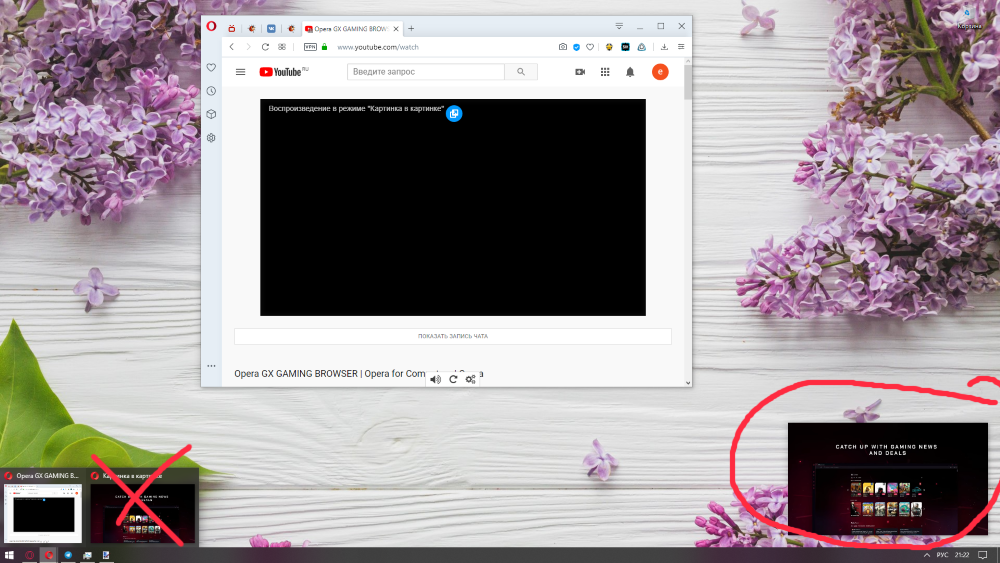
what happened to the pop up video? It doesn’t have control buttons anymore, doesn’t remember the location and size of the window, doesn’t contain a name, creates an extra window in the Windows taskbar that is not needed(there is always access to video popup and it does not need a separate window on the taskbar. Now, in order to return to the opera from other applications, instead of just clicking on the opera icon on the taskbar, you need to do several things - first click on the icon, then select the desired window, and so many times a day that turns the experience of using the browser into a nightmare).
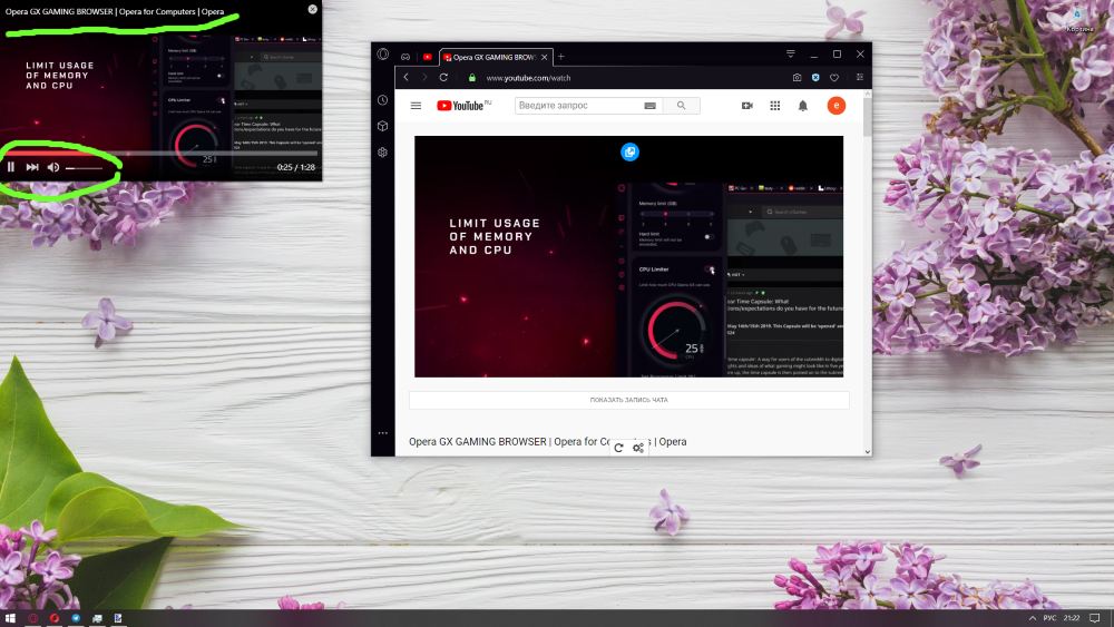
I just want to know will you return the old format or this is the final form of pop up video? I want to note that in Opera gx for gamers there is old video format and I had to install this browser specifically for watching videos, do not break this function at least there. but it would be ideal if you returned this function in opera to its original form. Thanks
this is a new terrible pop-up video window in the opera

this is an old perfect pop-up video window in the opera GX

-
marwerno last edited by
Absolutely agree. I used to be able to maximise (by dragging) to same size as my small laptop screen. This is really important to get back for me. I work on my main monitor and watch something on the pop-out on the laptop/ side screen. Especially since the laptop sreen is small, I need to squint now with this new "feature".
I know I can also drag out a window and then maximise it. But this is just bad if I accidentally close my main opera windows before the "Video" window.... I have lost quite some tabs this way... -
mangojambo last edited by
Hello, let me explain:
-
Before It would pop out a copy of the video, keeping the original web page playing as well. In UX it was better because sometimes I would like to check some small details in the video and I had to just one click on the tab to open it. The bigger video was there; and after checking things like this I would just click in another tab to keep doing what I was doing without the need to pop the video out again. It was there already;
-
Picture in Picture don't memorize the last position and size for other tabs and it it quite annoying. Only for the current video, which is kind of useless since we only open a video once. To have to move and resize it every time for a new video is kind of annoyingly unnecessary;
-
Some videos, like Twitch.tv, the pop up button appears at the begining of the video and just disapear. I have to reload the page to make it apear again and click it before it is gone;
-
Being able to click in any part of the video to pause it was kind of nice. Like youtube, etc. It's an usual experience. To have to click only in the play/pause button is worst than before. Not the worst thing to be fair, but for the UX I feel it was more fluid before, no constraints, you know?
The good thing about this new version:
- The "Back to Tab" button is more then welcome! I missed it so much before. It works perfectly for this new proposal, but if you guys get my words above in consideration would be great if this button doesn't close the pop up as well, since duplicated video is a feature.
I wrote this because pop out video was the feature killer to make stay in opera instead other browsers. There is a lot of other small things as well, be for my daily basis I use it a lot. My hope is to have at least an option to get the way it was. Thank you for your time.
Cheers
-
-
A Former User last edited by A Former User
@mangojambo the only good thing about the popout widow now is the gpu is lots lower while watch 'n vids in dev
miss the old pip style ..
-
thomas-rager last edited by
I just can agree. The old behavior was much better. Opera once was known for letting the user decide. If they really want to optimize the performance for users then this is ok for me. But they should just add a option to choose wich version you want. On my 8 core system with 24 GB I just don't care if it ist more performant the new way. It is just more inconvenient !!!
-
borghy last edited by
Hi
In Opera 67, I've tried to disable the "user surface layers in Video Pop-out" but now the windows is black...
-
A Former User last edited by
@borghy set the "user surface layers in Video Pop-out back to (Default)
and relaunch browser then try Video pop out again..for me default or enable works for me..
Note - it will be the new Video Pop-out w/o the black screen.. *old style gone for now
-
A Former User last edited by
@wfpl hi! can someone help me, i'm new to opera so i'm a bit confused. i tried the steps above but i cant find the opera:flags#video-pop-out-surface-layers andopera:flags#enable-surfaces-for-videos
-
Locked by
 leocg
leocg