New Opera Neon - concept browser
-
A Former User last edited by
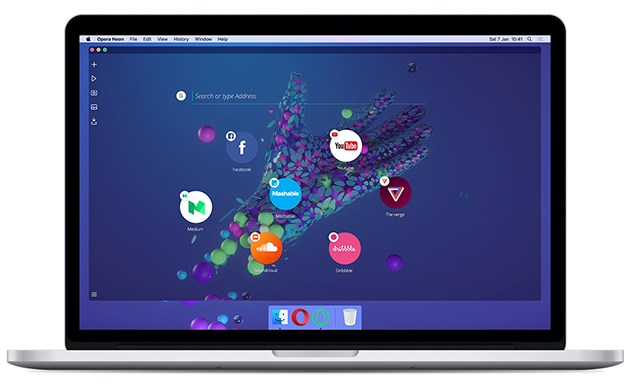
Hi, say hello to Opera Neon, our new concept browser

"A year ago, we set out to explore what web browsers might look like in years to come. Now, you can try Opera Neon – a concept browser, that gives you a glimpse into the future of desktop browsers.

Today’s web browsers are not as fresh as they used to be
At Opera, we have been building web browsers for more than 20 years. We are very aware, that some parts of the web browsers we know today are nothing more than tributes to the last millennium – a time, when the web was mostly made up of documents, and pages. But the web is changing fast, and so are people’s expectations for how apps, and web pages should behave.
Opera Neon is born
To bring our vision to life, we put together a team of talented developers, and designers to work on a unique prototype browser. We created thousands of concepts, drawings, iterations, versions, and interface designs.
Today, we can finally show you Opera Neon. It is a concept browser – an experimental browser, that envisions the future of web browsers similar to the way concept cars predict the future of automobiles. Like the Opera browser, Opera Neon is built on top of the Blink engine, but unlike any other browser, Opera Neon has been built from scratch to bring you cool effects, and animations without slowing down your experience.
What’s fun and fresh in Opera Neon?
Opera Neon is packed with fun ways to interact with web content, including the ability to drag and push things around, and to even pop content out of the web and save it.
Here are some new features you won’t have seen in a browser before:
– A new start page, that uses your desktop wallpaper as its background.
– A sidebar with its own video player, image gallery, and download manager.
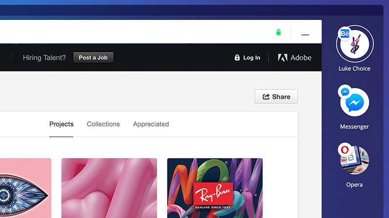
– A vertical, visual tab bar on the right side of the browser window, that makes it easier to distinguish between tabs.

– An intelligent system, that automatically manages your tabs. Like gravity, frequently used tabs will float to the top, while less important tabs will sink to the bottom.
– A completely new omnibox, that supports top search engines and open search.
We’ve also added new ways to enjoy web content:
– Video pop-out, which lets you play videos, while you browse other web pages.

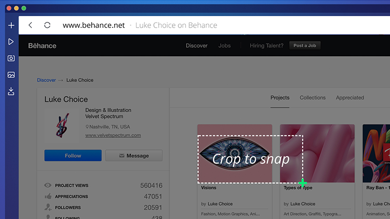
– Snap-to-gallery lets you snapshot and crop any part of a web page, and save it to the gallery for later.

– Split screen mode lets you seamlessly view and interact with two pages at once.

It’s beautiful and it’s smart
Here’s how to manage bubble tabs:
– To open a new tab, click the plus icon on the left sidebar (the open tab will be highlighted).
– To add a favorite site to your tab bar, drag and drop the bubble there.
– To minimize a tab, click on the bubble, or click the plus icon on the left sidebar.
– To close a tab, click on the x icon next to the bubble.
You’ll find several other icons on the left sidebar - one of these is the player icon. This gathers together tabs, that are currently playing music and videos.
The camera icon on the left sidebar lets you to take a snapshot of the page, which then lands in your gallery under the landscape icon. You’ll find all your snaps there.
While Opera Neon has lots of new features – and many of the Opera browser features you know, and love – there are some key features we have not included, such as our native ad-blocker, VPN, and the ability to add extensions. The reason for this is simply that Opera Neon is a concept browser, built for experimentation, and play.
A little something extra
Opera Neon wipes away your desktop clutter by bringing your computer’s wallpaper into the browser. Or, if you want to go full-Neon, we’ve collaborated with top graphic artist Luke Choice to create two free Neon-inspired wallpapers.
The future will be here sooner than you expect
Opera Neon is a concept browser – a vision of what browsers could become. It is not designed to replace the current Opera desktop browser. However, we do plan to incorporate some of its best new features into Opera for computers as early as spring 2017.
Jump in and play, then let us know what you think of Opera Neon!
Download Opera Neon
Opera Neon is now available for Mac and Windows. www.opera.com/neon

 :cheers:
 -
karrier-bag last edited by
I might seem a bit dim but how do you use the split screen option?
Otherwise it is lovely, smooth, different and a credit to those that developed it.Thank you.
-
mulleke05 last edited by
I like this concept! It works very nice and quick.
The only thing at this moment is that there is no adblock at this time.
I hope to see that activated in a next beta! -
A Former User last edited by
I think the Opera Neon browser needs to reorganize the toolbar and the close button and the sides next to it. When we close the tab, the other tab should not open automatically. We'd better narrow down the bar on which the tabs are opened. I believe that the search bar of the page I am opening is a bit thinner and that it will look very nice if it is transparent if possible.
Note: My English is not very good. I translated this post from Google.translate
-
leocg Moderator Volunteer last edited by
I like this concept! It works very nice and quick.
The only thing at this moment is that there is no adblock at this time.
I hope to see that activated in a next beta!Neon is a concept browser, it's something to show new concepts, new ideas on UI and design mainly and see hoe people react to them so those ideas may be implemented in Opera in the future.
It's unlikely that Neon will get any of the Opera's features.
-
A Former User last edited by
This concept is good as standalone app. Dont even think about to ruin desktop Opera by this wired ideas. Desktop Opera is very good browser (it'still missing some stuff though) so dont try to ruin Opera's features like you did with old->new Opera.
Everyone please better dont say anything or say you dont like it at all because Opera's developers are starting to have something broken in their mind again like they had with presto core. So if you dont want to have your favorite browser broken for years again better say: concept is all bad.
So as standalone app yes but as crosbreading with standard desktop Opera... HELL NO!
-
gpbenem last edited by
I have installed and really like this at first time, but i don't like the top bar, why it is light mode, while in the video is the dark mode?
-
musubde last edited by
Great concept, great ideas. I miss some details as mouse gestures, extensions,....but I really encourage you to continue with this project, It is the best idea for tablets.
Thank you
-
jammer2001 last edited by
i like neon but i think that it needs more for example extensions and bookmarks
-
gagi-3 last edited by
Just checked the concept - and I FREAKIN' LOVE IT! It's really unique, and I like how it solves some of the usual browser issues - like the 'player' you added, or having two tabs on the same screen without having them as separate windows (chatting on Messenger and browsing the web side by side, for example), screenshots etc. It's basically a lot of separate apps I use in one - Franz for chatting, SnagIt for screenshots, Opera Beta of course for browsing... It looks visually very pleasing as well!
Implementing those features into Opera is cool, however I don't see why Neon couldn't become a full-on browser on its own. If so, here are a few things that could make it a 'proper' browser:
- The 'tab' buttons could be smaller, the whole tab bar could be slimmer too - just like the bar on the left.
- Opera's full synchronization service.
- Extensions, the most crucial thing. I won't log in or surf much of the web without Disconnect, AdGuard etc.
- Bookmarks.
In the end, this is very much enjoyed. I am glad I stuck with Opera for so many years. You seem to be the leaders in innovation. Can't wait to see these features implemented into Opera, however long that process will be.
-
iamthepete last edited by
Tried downloading the OperaNeon.dmg file and tried to open it on my Early 2014 MacBook Air running Sierra and the dmg, itself, won't open. Tried downloading three times from both the Opera and Opera Developer browsers. Other dmg files open/mount just fine. Any idea what's going on here? Am dying to try out Neon! Thanks!
-
leocg Moderator Volunteer last edited by
The 'tab' buttons could be smaller, the whole tab bar could be slimmer too - just like the bar on the left.
I think it's too small, sometimes it's hard to see what's on the image.
Opera's full synchronization service.
Extensions, the most crucial thing. I won't log in or surf much of the web without Disconnect, AdGuard etc.
Bookmarks.It's a concept browser, nothing will be added to it.
-
mairoldi last edited by
Hi I'm checking out Neon and I find it really interesting!
I would like to give you some feedback after using it on my 2-in-1 Windows 10 tablet with a touch screen interface:
- Can't drag elements with a touch screen.
- Can't get to the tab close button, since I can't hover.
- It would be nice to have the possibility to make the side menus horizontal when rotating the screen, since vertical side menus take a lot of the screen space from the main browser window in portrait mode.
Otherwise the browser seems really solid for a beta/concept, and the only things I'm really missing are favourites (the start page with bubbles is cool but simply not enough - maybe a way to create groups of bubbles ?) and of course ad blocked and add-ons.
Keep up the good work!

