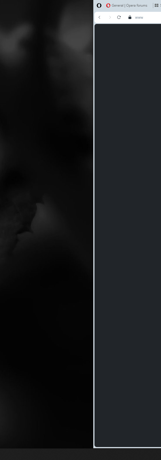
My "normal" opear was just updated to one. Why the heck did you add this bold border around browser? Im on ultra-wide monitor and using opera 2/3 of the screen space on a dark background and white opera design. Having dark background and dark website, this white border is just a nonsense and waste of space.

Best posts made by san4o88
-
RE: General Opera One Feedback TopicGeneral
-
RE: General Opera One Feedback TopicGeneral
@bladerunner2023 glad to hear Im not the only one having those issues... Forced me to switch to dark opera design, but still, the "empty space" between website content and windows start bar is annoying... Hope they add option to disable it or remove this ugly bold border
-
Download Button, please do something to it...Suggestions and feature requests
It's just annoying after each download (and I save/download a lot each day) this button appears at the top right. Every time I have to clean & close it. Could you add an on/off slider in the menu, to show it or not? Like with the search at the top for example. Anyway I always use hotkey if I need go back to "download section".
Latest posts made by san4o88
-
RE: YouTube Downloader 2.0Opera add-ons
dont see audio file links... Only video/jpg and most of the videos are without sound
-
RE: General Opera One Feedback TopicGeneral
@bladerunner2023 glad to hear Im not the only one having those issues... Forced me to switch to dark opera design, but still, the "empty space" between website content and windows start bar is annoying... Hope they add option to disable it or remove this ugly bold border
-
RE: General Opera One Feedback TopicGeneral
My "normal" opear was just updated to one. Why the heck did you add this bold border around browser? Im on ultra-wide monitor and using opera 2/3 of the screen space on a dark background and white opera design. Having dark background and dark website, this white border is just a nonsense and waste of space.

-
Bottom shadow breaks full height frameOpera for Windows
Im Ultrawide Monitor user and using Opea always 2/3 of the screen width, but full height. Now Opera behaves exactly like Chrome, the bottom shadow breaks the "docking" state (to top and bottom) and adds empty space at the bottom. Whatever I try, docking state or oversize and move manually, it always reset after I reopen browser.
Before it worked well:

and now, every time empty space at the bottom after reopening. Please fix it

-
RE: [Solved]Opera Logo on the Homescreen?Opera for computers
@zalex108 Thanks, that works. But what if i need that search field?

-
RE: [Solved]Opera Logo on the Homescreen?Opera for computers
@zalex108 do you know the difference between logo and search box? Why do I need the logo at the top? I don't need it, its wasting too much space and is useless...
-
RE: [Solved]Opera Logo on the Homescreen?Opera for computers
@leocg dunno, too many topics here
 thought its general feedback (forum)...
 -
RE: [Solved]Opera Logo on the Homescreen?Opera for computers
@leocg Im not talking about forum, im talking about the Browser itself...
-
[Solved]Opera Logo on the Homescreen?Opera for computers
With the new update you added opera logo on that screen, really? Do we really need to see this logo? It's taking like 150px (at the top, where usually goes the most important content, like search) and is just useless (wasting of space). Now I have to scroll to get my last bookmarks... Also did you test it on a dark background? I mean the font on some default dark background, it looks weird...
Please remove it, its just bad UX/UI...
-
Download Button, please do something to it...Suggestions and feature requests
It's just annoying after each download (and I save/download a lot each day) this button appears at the top right. Every time I have to clean & close it. Could you add an on/off slider in the menu, to show it or not? Like with the search at the top for example. Anyway I always use hotkey if I need go back to "download section".