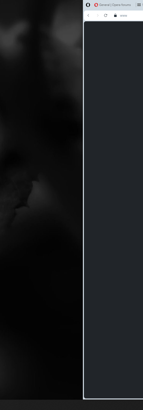
My "normal" opear was just updated to one. Why the heck did you add this bold border around browser? Im on ultra-wide monitor and using opera 2/3 of the screen space on a dark background and white opera design. Having dark background and dark website, this white border is just a nonsense and waste of space.

S
Best posts made by san4o88
-
RE: General Opera One Feedback TopicGeneral
-
RE: General Opera One Feedback TopicGeneral
@bladerunner2023 glad to hear Im not the only one having those issues... Forced me to switch to dark opera design, but still, the "empty space" between website content and windows start bar is annoying... Hope they add option to disable it or remove this ugly bold border
-
Download Button, please do something to it...Suggestions and feature requests
It's just annoying after each download (and I save/download a lot each day) this button appears at the top right. Every time I have to clean & close it. Could you add an on/off slider in the menu, to show it or not? Like with the search at the top for example. Anyway I always use hotkey if I need go back to "download section".