@leocg Opera One. I haven't changed anything, the only thing that's changed is the last update.
Posts made by duncanm
-
RE: Loading DelayGeneral
-
Loading DelayGeneral
I guess this started with the last update. Opera now takes about 15 seconds to load on opening. Before it was virtually instantaneous. Once it's initially loaded it's fine, it's just become very slow to open. I'm wondering if others have been experiencing this or have any ideas on what could be done. It seems to be a bug.
-
RE: General Opera GX Feedback Topic V2Opera GX
I've been using Opera and Opera GX for years. I recently switched back to Opera from GX after an update changed the UI to New Look, which turns out to be buggy. I later discovered that you can turn New Look off but, as has happened before, Opera just presents you with an unexpected change and doesn't tell you how to revert it if you don't want it.
I'm offering my feedback because returning to original Opera after an absence has really clarified some of the concerns I've had about GX. I was originally attracted it to it as a gamer and because of it's customization features, but over the years I feel that it's suffered from serious feature creep, stuffing more and more unwanted, unnecessary features into it which just clutter it up for no good reason, while basic browser functions and elements remain relatively undeveloped and appear increasingly outdated.
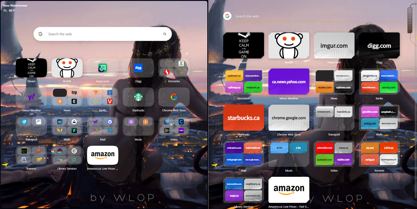
Here's an example

Regular Opera, on the left, has a more compact layout with virtually every tile showing a recognizable logo. Opera GX has larger tiles, but they're just blank tiles with the URL on them. It looks messy and overcluttered, extremely outdated next to regular Opera So I really would have preferred that the GX devs had spent more time improving basic features and functions rather than just stuffing in more bloat like mods and shaders, etc.
-
RE: Speed Dials no longer shows thumbnails after updateOpera GX
I just discovered that you can turn off New Look by going to opera://settings/early_bird and turning it off. Everything goes back to normal. That really could have been mentioned somewhere.
-
RE: Speed Dials no longer shows thumbnails after updateOpera GX
I see this same issue was reported five days ago by another user and no response. So that's it for Opera GX. I downloaded regular Opera, transferred my profile and everything is working fine there.
-
Speed Dials no longer shows thumbnails after updateOpera GX
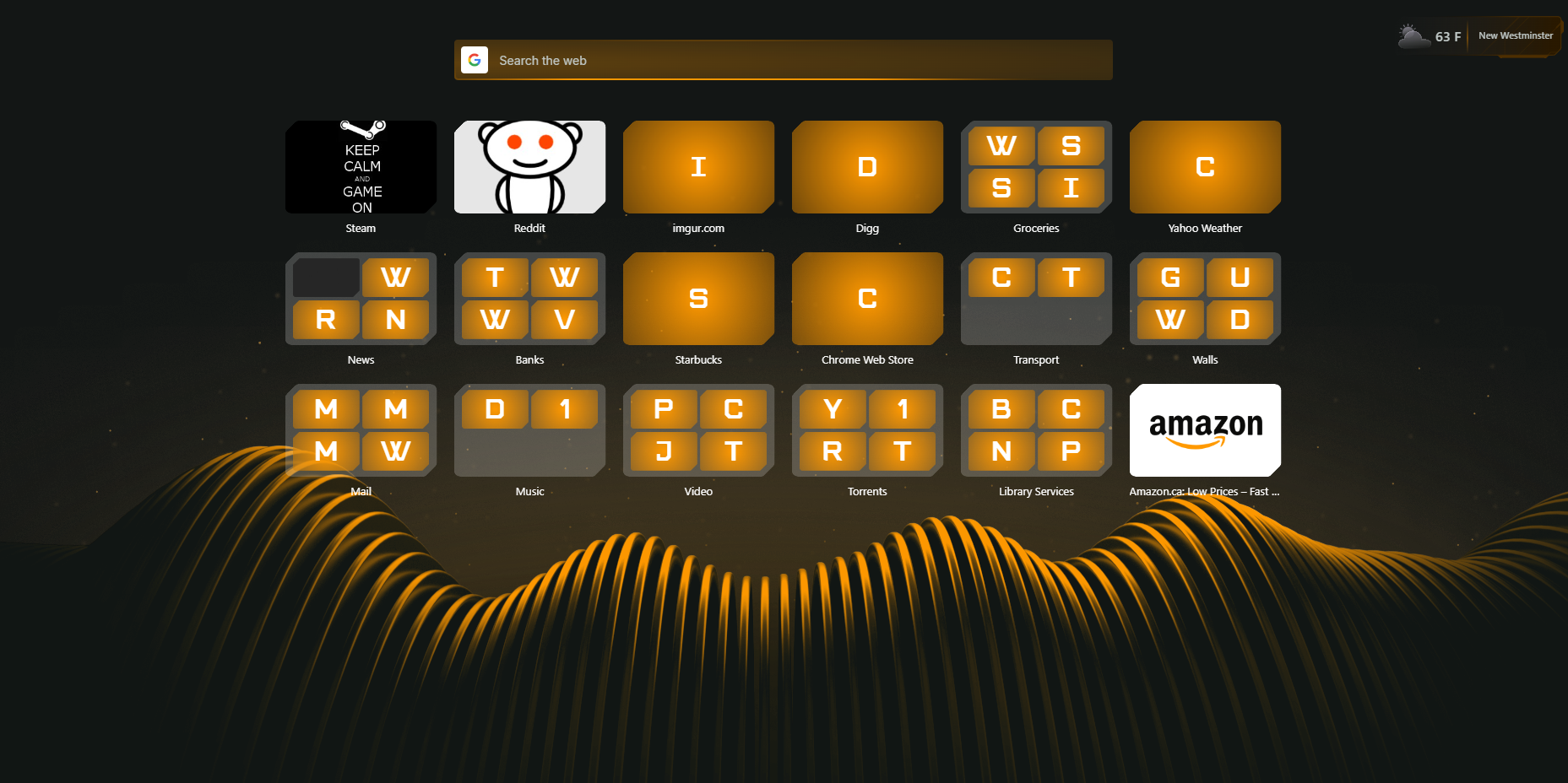
I just updated and everything has changed, and my speed dial has turned into this....

Anybody know what's going on here ?
-
RE: Closing Last Tab Closes BrowserOpera GX
@leocg OK now this is weird. After looking at another thread I decided to just restart the comp. And now it's working the way it's supposed to. Before, the speed dial home page had an X in it's tab to close it, which closed the browser, that's gone now. And that's a new one, been using Opera for years and years. Could be something to do with Win 11. But I'm happy the problem is solved. Thanks leocg.
-
RE: Closing Last Tab Closes BrowserOpera GX
@leocg I don't think it's an extension, I haven't added or removed anything, it seems to have started with the last update, probably a bug. I thought it might be a new feature because Firefox has always done that. I'm wondering if there's a way to roll back to an earlier update, see if the problem is associated with the latest update.
-
Closing Last Tab Closes BrowserOpera GX
This just started, previously when I closed the last open tab the browser would go to the speed dial home page. Now it closes the browser, just like in Firefox. It's that a new feature ? The old behavior was preferred, can this be changed ? Thanks in advance.
-
RE: [Compilation] Discussions on the Opera GX start/splash screenOpera GX
@davoda1 I tried that, didn't work, had to delete the .exe.

-
RE: [Compilation] Discussions on the Opera GX start/splash screenOpera GX
It's back to the normal splash screen but it still can't be disabled in settings, I have it set to not show the splash screen and it's still doing it every time. So it's either delete the .exe repeatedly or move on, maybe to regular Opera.
-
RE: GX lights not working as intendedOpera GX
I have Aura Sync and I've noticed the same thing, all it does is make the RGB a solid color to match the color scheme you've chosen for the browser, so if you choose the white color scheme the RGB shows solid white. The presets don't do anything.
-
RE: [Compilation] Discussions on the Opera GX start/splash screenOpera GX
This is enraging. Who thought this was a good idea ? Some weird guy screaming every time I open this thing ?Now I have to use another browser, export my bookmarks. Thanks Opera for ruining a good product.
-
RE: Turn On Early Bird Doesn't WorkOpera GX
@leocg I tried to upload an Opera snapshot but got a parsing error. In the main settings page, where you enable Early Bird, when I switch it on it remains grayed out, nothing happens. In the quick setup menu it says Early Bird needs to be enabled. But there's no way to enable it. I thought that it might be a region specific feature.
-
Turn On Early Bird Doesn't WorkOpera GX
I heard about AI Prompts and wanted to check it out but apparently I have to turn on Early Bird, which doesn't work. Anyone know what's wrong here ? Thanks in advance.
-
Launch time increasingOpera GX
This isn't a critical problem but I've been noticing over the last few updates that GX has been taking longer to launch, sometimes as much as 10 seconds to load my opening speed dial page. This wan't a problem in the past, it started a few updates ago and seems to be getting a little worse over time. I'd be curious to know if anybody else has noticed this and if there's anything that can be done to improve launch time. Thanks.
-
RE: Option to show Twitch on sidebar doesn't existOpera GX
@leocg That worked, so I guess the problem has to do with the profile I imported from Opera Stable. It's just unfortunate that to use that feature I'd have to re-do all my speed dials, add my extensions and so on, start with a completely new profile except for bookmarks. Maybe I'll do that when I have a little more free time. But thanks for pointing me in the right direction.
-
RE: Option to show Twitch on sidebar doesn't existOpera GX
@leocg Thanks, I tried that and it turns on but there's nothing in sidebar and when I go back to settings page it's disabled again. I copied my Opera Stable profile over to GX so that may have something to do with it, but I did try disabling all extensions and resetting to defaults and that didn't work. It's not hugely important, I was just curious. It would be a useful feature but if it's going to take a long time to trouboleshoot I'll just try and sort it out when I have more time.
-
Option to show Twitch on sidebar doesn't existOpera GX
Just trying out GX for the first time, I couldn't find any info on enabling Twtch in the sidebar. There's a Twitch setting in settings but it doesn't do anything. It turns on but then turns off as soon as settings is closed. I googled this but couldn't find any clear info, is there a particular extension I need to add to get this feature working ?
-
RE: Opera and WindowBlindsOpera for Windows
I'm the OP, I had forgotten about this and was surprised to see it come up again. That 2019 WindowBlinds update was the most recent, it hasn't been updated since. I just rolled back to the earlier version and left it at that. The new update really didn't add anything to the program which was fairly typical. I've found a number of times that third party programs like WB can cause problems with browser settings, but without a good understanding of how both programs work it can be difficult to troubleshoot. So it's just one of those random things that comes up from time to time and not a serious problem. I didn't get an answer to my post and just forgot the whole thing. But I really do wish that Opera had better customization options, like Firefox. I love Opera and I've been using it for years and years but this is one aspect where I always thought it was a little lacking. Light or Dark is pretty limited and it's unfortunate that third party customization programs don't seem to work well with Opera or Firefox.