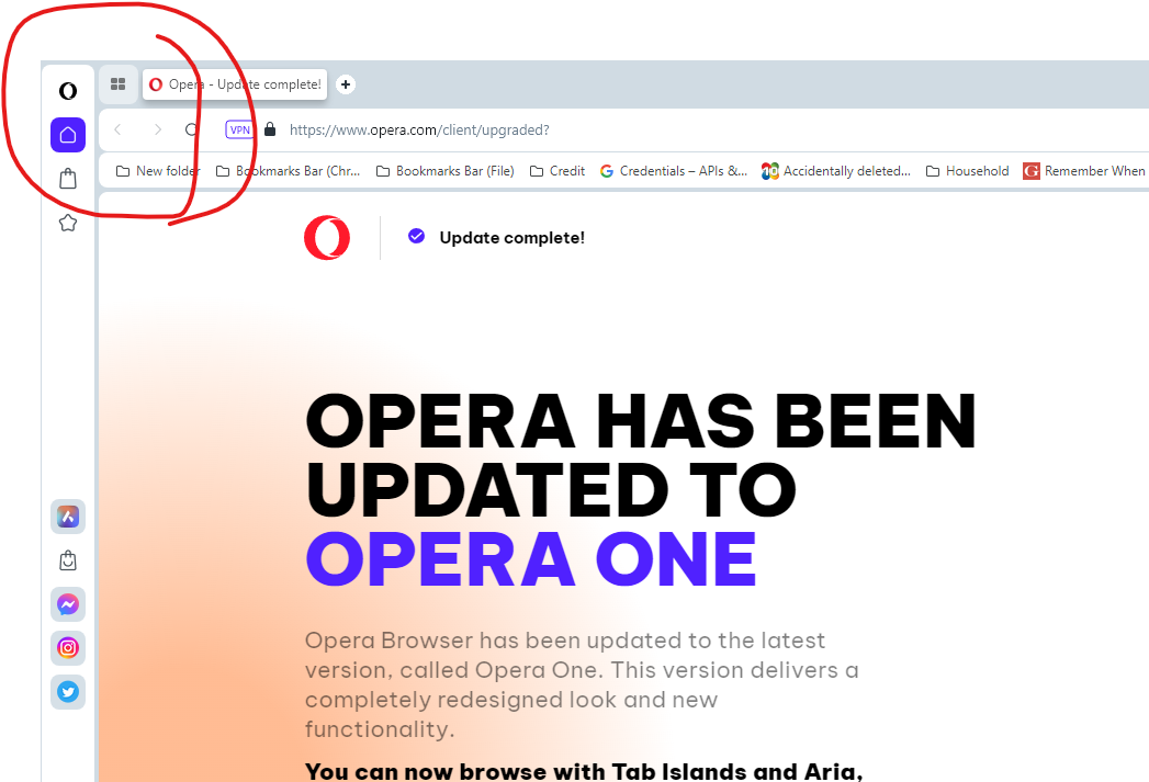
[Compilation]Discussions About Missing Speed Dial/Home Page Button In Opera One
-
cpking last edited by cpking
I posted (here, I think) about a solution that completely evaded me. If you pin the start page tab, it shrinks to a start page/speed dial button. For my version of Opera, at least, this is a highly workable solution.
[EDIT: It was (correctly) pointed out to me that this method pins whatever URL you choose in speed dial. Damn, thought I had it...]

-
cpking last edited by
I did see where you can add speed dial to the side bar. Not at all intuitive, but at least there's that...
-
A Former User last edited by A Former User
I'm pretty sure the icon will return as a toggle in settings.
Considering all the other options Opera keeps alive, such as a separate Search field in address bar.
What does that do? It's performs identically to a search inside the URL field. But they still make room for it in settings.
-
leocg Moderator Volunteer last edited by
@kevdotkrizzle I was just trying to explain what I meant in my post that you've replied to.
-
kevdotkrizzle last edited by
@leocg oh - pardon me...I'm a "homeless" browser user and it suck LOL - I'm sorry bro. btw there's a chrome extension for a home button that works https://chrome.google.com/webstore/detail/home-button-at-top-right/bfejcgpdahgpmgadhgdadfiekmhgnifm
-
jay7son last edited by
Why remove something that has been a way of life for most of us for 20 + years ? I do not understand
-
cmspencer last edited by
I'm getting the impression that the Opera dev team are starting to adopt the same attitude as MS "We know best and users will do as we say".
This change is just creating extra work as now I have to close old tabs and open a new one to get speed dial, before I just hit the button in a tab that was no longer relevant. -
cmspencer last edited by
@ladyshine Okay, while that sort of helps a fraction thanks, there are two issues 1) it's at the lower left corner, the furthest place from where the mouse tends to be most. Moving the Bookmarks and History to the bottom of the sidebar is another asinine change in v100. 2) The Speed dial button on the sidebar opens a new tab, I want to reuse current tabs that are no longer relevant and go to my speed dial page.
-
modemjunkie last edited by
@cmspencer See the post by @kevdotkrizzle a couple of hours ago with a link to a chrome extension that works.
-
modemjunkie last edited by
@modemjunkie Here's the link. https://chrome.google.com/webstore/detail/home-button-at-top-right/bfejcgpdahgpmgadhgdadfiekmhgnifm
-
leocg Moderator Volunteer last edited by
@cmspencer said:
now I have to close old tabs and open a new one to get speed dial
For me, it has always been the regular behavior. I rarely reuse a tab.
By the way, you can use Alt Home to go to Speed Dial.
-
cmspencer last edited by
@modemjunkie I tried that earlier, I just get an error.
An error has occurred
Could not install package: 'UTILITY_PROCESS_CRASHED_WHILE_TRYING_TO_INSTALL'. Could not install package because a utility process crashed. Try restarting Chrome and trying again. -
leocg Moderator Volunteer last edited by
@cmspencer said:
I'm getting the impression that the Opera dev team are starting to adopt the same attitude as MS "We know best and users will do as we say".
Or, maybe, they just feel that browsers need some changes in its design and are trying to provide them.
Of course not all changes will praise everyone and there may be complaints, but it has been that way since I started using Opera in version 3.5. -
A Former User last edited by
@leocg said
Or, maybe, they just feel that browsers need some changes in its design and are trying to provide them.
Usually, design changes are accompanied with new or improved benefits.
What benefits do you feel with the rounded edges and unused borders?
-
cmspencer last edited by
@leocg I've noticed a general trend amongst website, and to a lesser extent app, designers, that puts esthetics above functionality and the practicalities of actually using the site/app. While the desire to make it look pretty has always been there, that has always been tempered by limits of the hardware and the fact that people kept their PCs for several years, now with so much being mobile and a push to replace your device annually and laptops < 3 years, then not only aren't the hardware limits an issue, actually creating websites that perform poorly on older equipment is desirable to some, e.g. Apple slowing performance on older iPads to "extend battery life".
The only thing that stays constant is change, but change for change's sake just fuels discontent. -
kevdotkrizzle last edited by
@leocg I think they just copy/pasted the GX Browser and didn't realize there was no home button.
-
leocg Moderator Volunteer last edited by
@vegelund said:
Usually, design changes are accompanied with new or improved benefits.
Not sure if I share that opinion. Those changes can be made just to bring a more nowadays look to the product and try to attract new users.
Getting new costumers while keeping the current ones are usually the main reasons for companies to make changes in their products.
