General Opera One Feedback Topic
-
leocg Moderator Volunteer last edited by
@sydneycondra Install a previous version and block automatic updates.
-
Dracael last edited by
My issues so far (4K Resolution; Windows 11):
Tab Button Size in Tab Islands
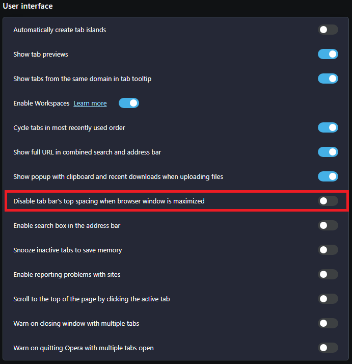
The grouped tabs/tabs in a tab island now have a smaller "hitbox"/area to click on than the other tabs. So if I quickly move my mouse cursor all the way up to the border of the screen and click (as it worked before), nothing happens. I'm so used to doing this in my workflow and now it's really annoying. My solution so far was deactivating/not using the tab island feature. I like the idea of that feature, but in its current state it drives my crazy.Weird border around the browser window
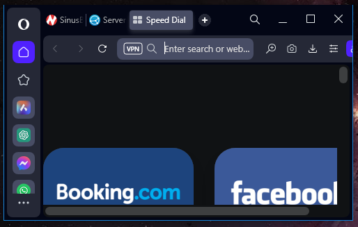
As another user has posted, the whole browser window now has a border, which imo is not necessary and looks not great on some websites depending on its colour.Speed Dial icons can look ugly
Maybe it's just me, but I don't like how the Speed Dial looks now. Fields with small icons depending on the website? Some icons are not made for this and are stretched (I guess the fault of the website), other icons don't look great in general, etc. It imo looks just terrible. I have also some dials to different branches of a bigger website "conglomerate" and they all have the same icon and colour. As a result the dial fields all look the same and my first visual impression opening the speed dial page leaves me searching for a moment. How it was done in the old version or in Opera GX works much better for me. -
NotVeryHappy last edited by
@tuneout I got an update today and flow button has vanished for me, most of other bugs are still there though
-
tuneout last edited by
@notveryhappy Thanks for telling me. Just got the update myself and flow is gone too. Now I just wish Snapshot was the same, but at least it's one button less
-
A Former User last edited by A Former User
Why does have Opera some strange 1px blue line aroud the window from left, right and down side?

-
angelzx7 last edited by
@leocg said in General Opera One Feedback Topic:
There isn't.
Well, it's time to say goodbye to opera...
What a pity -
A Former User last edited by
@leocg I wonder if there is some sort of feedback for users. I mean we give feedback to developers and what about feedback to us users? Something like... yeah we will change that or this will be fixed or no planning to change that etc.
Do you have something like that? -
A Former User last edited by
@airforce25228 said
Something like... yeah we will change that or this will be fixed or no planning to change that etc.
If you are on Stable, you can look into the future and see coming versions/change logs via Beta and Developer.
-
tuneout last edited by
With the new update some streams on twitch lags.. does not occur on other browsers
-
tuneout last edited by
Switched over to gx browser and streams are fine compared to Opera One, so there is def. something up with the new One
-
rocendroll last edited by
Guys, I think I can provide substantial support as of the productivity of the browser. New Opera One is great but it needs these small tweaks:
- New tab bar is great, but it has some kind 1px empty space up top with pinned tabs. When I hover my mouse there to change a tab, I click and it gives me nothing. I need to specifically put attention into it, please change it as it was before! Normal tabs works fine - but it should be clear that if something is pinned, I will used it often therefore I need no obstacles
- New player is great, but one - if launched (eg. spotify) it should be visible right away when I hover my mouse to the left side for the side bar to appear from autohide. To change a song I need to. Could you make it so, when the ICON of the player is clicked and turned blue - the player would be pinned to the autohinding sidebar? Therefore I wouldn't need to make additional click do have it in full view? It would work like this, that when I would click player icon again and make it grey (unactivated) it would work as now, just a small song change window when hovering over the icon. It would also solve an issue about the player icon, taken all the way down on the sidebar. It would stay there, and it wouldn't matter to the user.
Basically we need some kind of functionality, to stop searching for player icon, but have full player just on hovering over sidebar somehow. Maybe second icon option to pin it, next to the option to pin it but with window dividing? - Aria needs shortcut change option to Ctrl+Shirt+A as of Aria
- Opera always had one great feature. This appearing small info-window with calculating currencies. This thing needs to be nurtured and advanced with lot of other options and customization, this is your selling point to me.
- We also need some kind fast-opened window to translate things. For example, I need to find what is some word in english. I could hit some shortcut and then window as for Aria would open with fast translator. Normally to find the exact thing, i need to open new tab, type the phrase to look for the word, then google would give it to me, and then close tab. It could be also very beneficial as a feature.
- Smooth scroll feature
- Blocks of news on the black page should have rounded corners.
- I would kill for an integration with Feedly for a main screen news feed. Like with divided screen option.
-
rocendroll last edited by rocendroll
1b. I also want to add to the first point. not only pinned tabs have this problem but also tabs in these new tab islands
- You can't close whole tab group with the middle mouse click as you can with a single tab. You also should have been able to drag it outside the tab bar to make a new windows as with the single tab
-
Kiny-Ohara last edited by
Whoever PM dreamed about this, and whoever UX and developer made it happen, please, perform the following:
- Browse some silly shit at 3 in the night in bed next to your significant other
- Innocently, like a lamb going to sacrifice, click "Update Opera"
- Enjoy the result
Seriously, people, don't you have people around you?
Either remove the sound or create an option to not play it.
